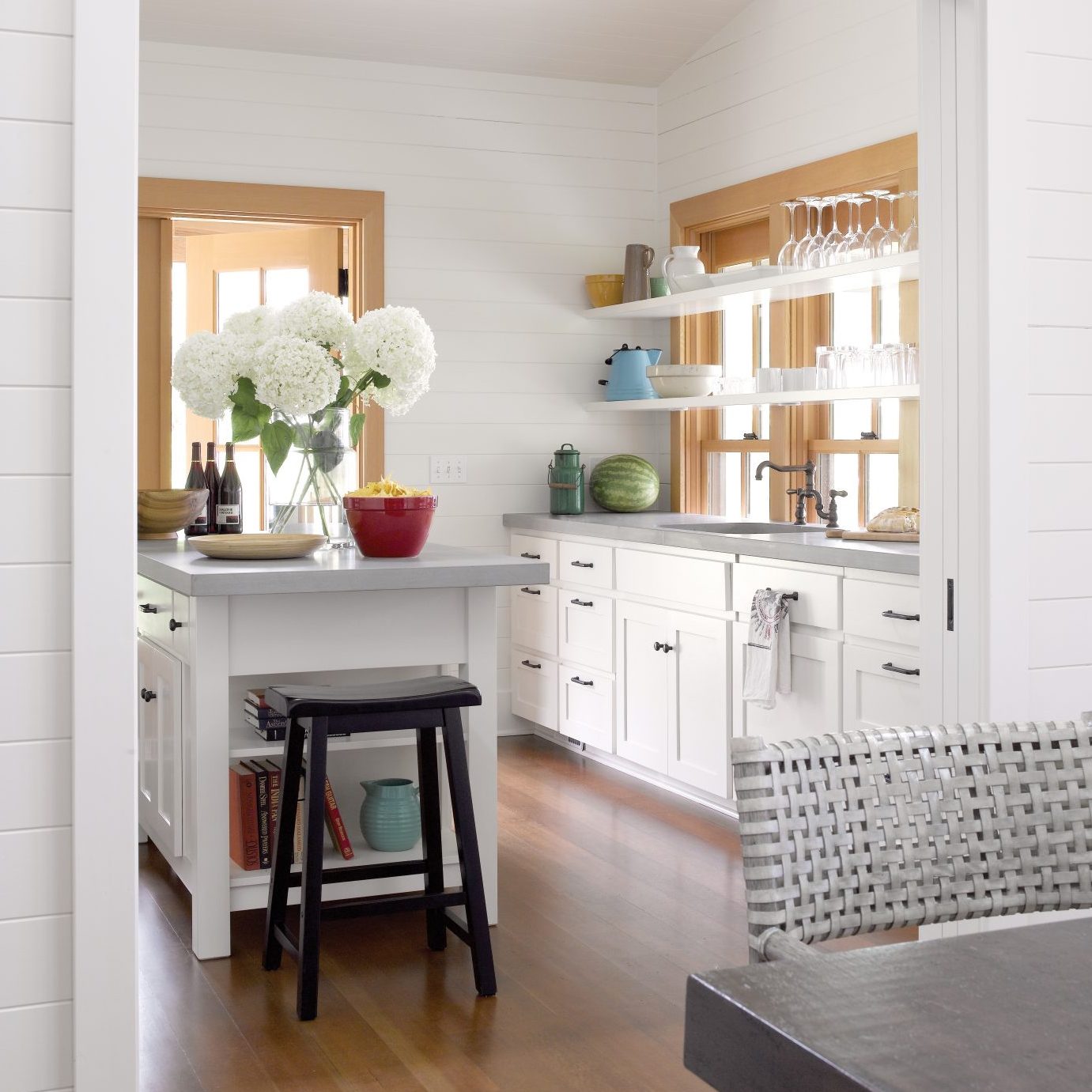
Nothing masks a shortage of square footage in a cottage kitchen better than ample natural light. This sunny kitchen on Decatur Island, part of the San Juan Islands in the Pacific Northwest, doesn’t require much adornment. White Shaker-style cabinetry and white-painted wood plank walls are a classic backdrop second only to the generously sized window and French doors that afford the homeowners an unencumbered view of the Puget Sound. To create this ethereal space, Seattle architecture and design firm Hoedemaker Pfeiffer had three main goals. Here’s how they achieved the look:

Goal One: Light and Bright
Principal architect Steve Hoedemaker says they were intent on using natural light to make the space both modern and timeless. They chose to place the kitchen centrally in the house to keep it open and situate it in the best daylight.
White walls and cabinetry carry the light and make the space feel bigger. Also, by omitting upper cabinets, the designers were able enhance the open lofty feeling of the space.

Goal Two: Form and Function
Its central location also puts the kitchen adjacent to all four primary living areas: the living room, yard, den and dining room. “The owner wanted a simple yet elegant space that boasted a lot of efficiency; a space where multiple people could work and access the room with convenience from primary dining areas,” Steve says.
The room also features resourceful details: a customized pantry, special drawers to keep prioritized tools at hand and innovative floating shelving in front of the large window that maximizes storage space without sacrificing an ounce of the room’s inherent brightness.
The small, footed island with extra drawers and shelving make up for any storage space that was lost by foregoing upper cabinets.

Goal Three: Make it Subtle
In order to keep the look fresh, the homeowners chose a soft-gray stone slab countertop to underscore the all-white color scheme. Tuscan brass handles and pulls punctuate the cabinetry and coordinate with the black barstool for the island. Colorful serveware adds dimension and interest, while the natural wood window and door casing frame the space. A large floral display in the center of the island serves as added drama to complement the simplicity of the surroundings. The dining room set in the adjacent connecting space is soft in appearance and ties in the soft gray element. Its location is near enough to the central kitchen space yet slightly tucked away into its own nook for a more intimate feel in a family gathering.
For more, visit hoedemakerpfeiffer.com or @hoedemakerpfeiffer on Instagram.

