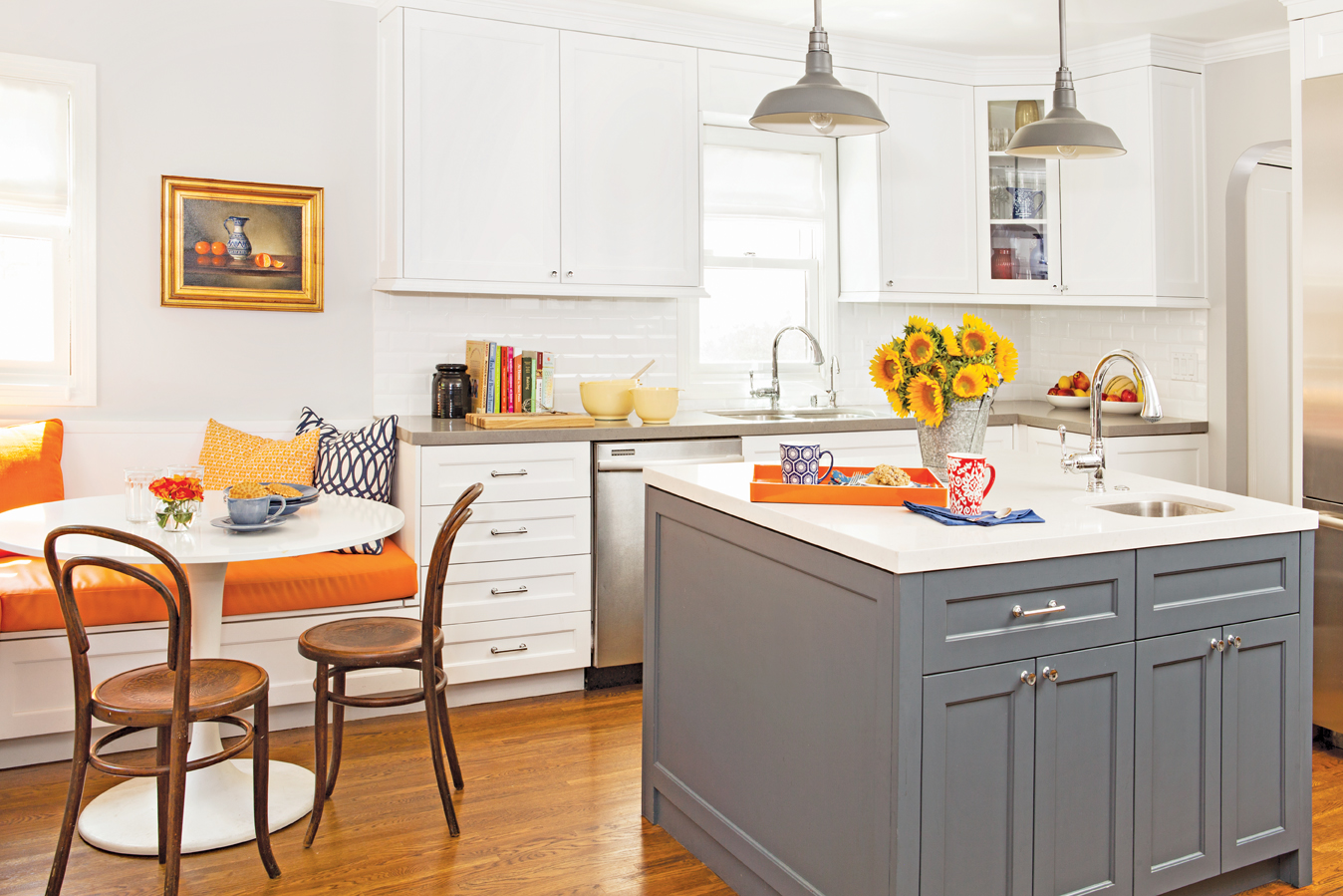
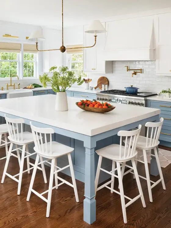
From the white cabinets, subway tiles, and paint, to its vibrant pops of color, this Los Angeles kitchen keeps a traditional feel while blending in modern elements. According to designer Georgette Westerman, the open-plan kitchen was not always this functional, however. Undertaking an expansion project and complete redesign led Georgette to create a sleek and traditionally styled kitchen while exploring the juxtaposition of modern touches. The result gives the kitchen a true transitional feel.

Georgette’s goal in designing this kitchen was to keep the integrity of the traditional house, expand and enlarge the tiny kitchen, as well as accommodate flow between the kitchen and the rest of the already remodeled house. Georgette addressed the design’s integrity by starting with a versatile cabinet to allow for the kitchen’s style to be modern and traditional, giving her optimal diversity. “White cabinetry gives the kitchen a larger feel, adding contrast to the dark Caesarstone pebble counter tops,” Georgette says. The Schaefer doors present a traditional base for the room, allowing the modern elements, such as the counters, to integrate well and play into the transitional design.
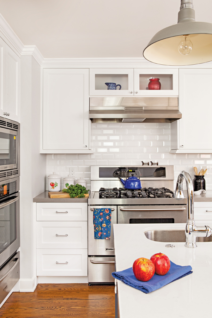
Directing the eye to the island in the center of the room creates an easy focal point. “Introducing a different countertop in the middle of the kitchen will add contrast to dark cabinets,” Georgette says. Here, the island breaks up the white cabinets by inversing the rest of the kitchen’s design. “The island plays a reverse role, with the light countertop and a dark counter below to open up the space.”
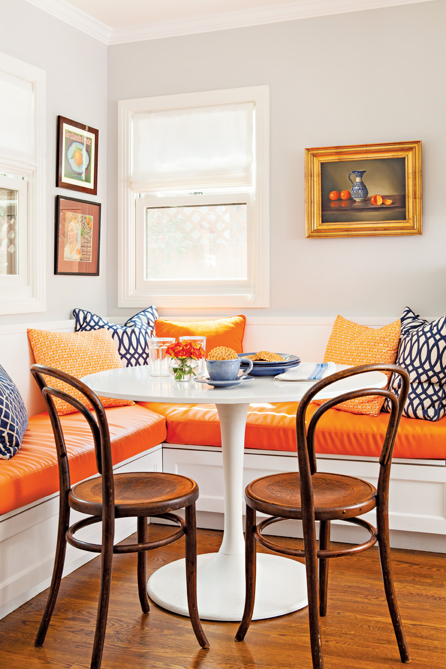
As long as there is a strong color palette to start with, such as gray and white, Georgette says splashes of color can easily be changed. The orange seat cushions in the breakfast nook are a vibrant color pulled from the painting above the built-in seating. However, the gray and white color palette allow for easy updates as time and trends pass, allowing for a timeless feel.
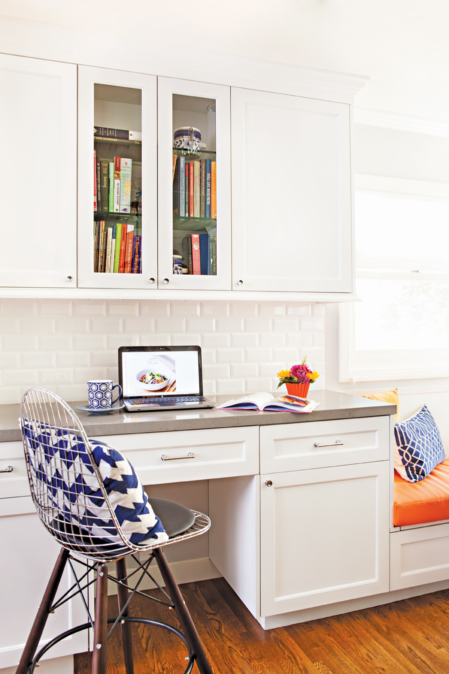
When designing the specifics of the kitchen, Georgette gave a lot of thought to spaces that offered little function. It is important to maximize the available space, as well as to ensure each work area is distinguishable from one other. With this in mind, Georgette chose not to extend the counters throughout the kitchen, but keep the desk area separate from the rest of the space.
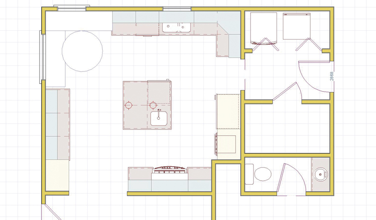
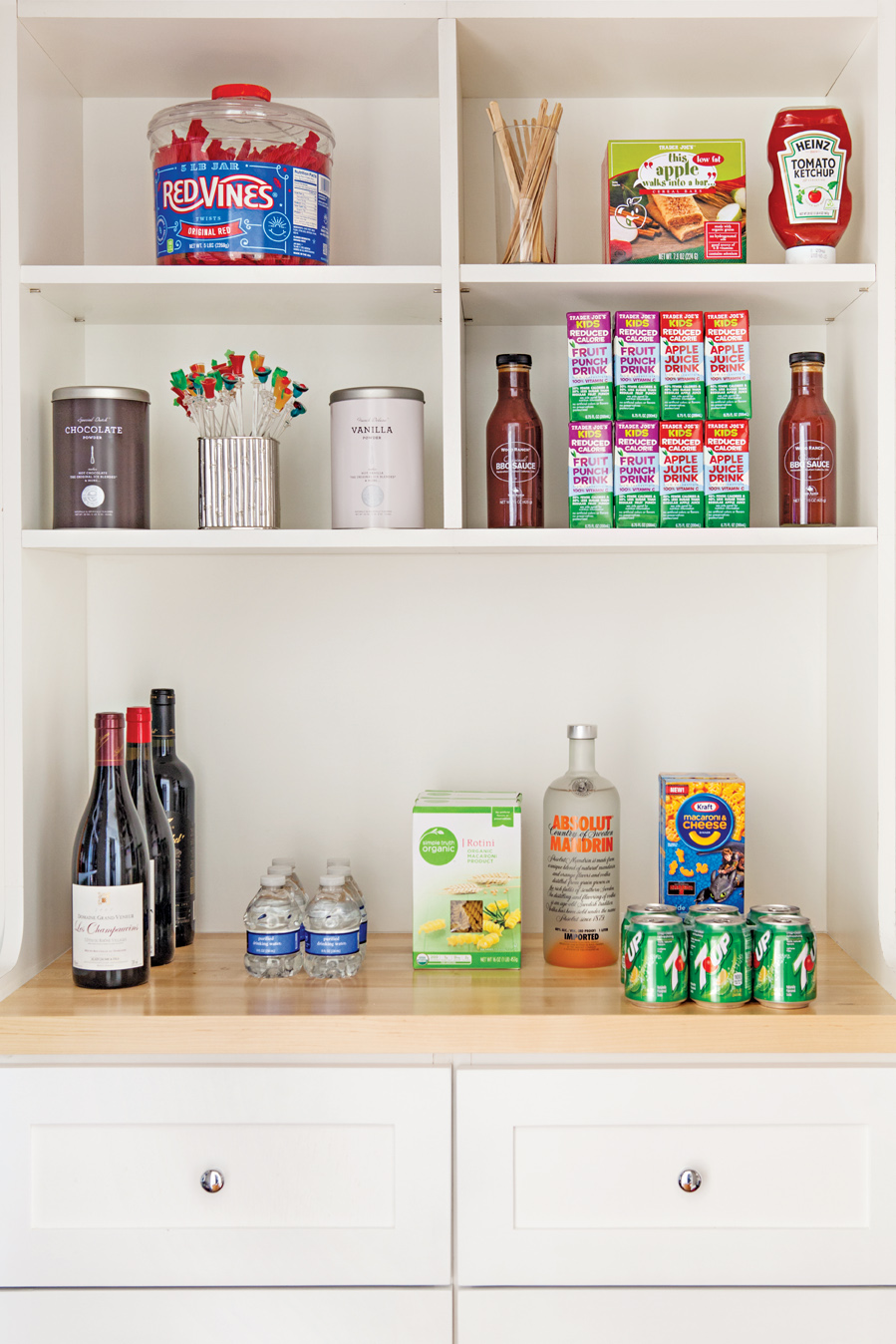
“The pantry to the left of the desk has pull out drawers,” Georgette says. “Above the window, over the sink, I added more storage to an otherwise unutilized space. There’s a corner area to the right of the sink with a rev-a-shelf, so that you do not lose the corner space. Underneath the benches there was also storage.” Georgette designed the kitchen to have optimal storage and function, giving practicality a polished look.
Here, the island breaks up the white cabinets by inversing the rest of the kitchen’s design. “The island plays a reverse role, with the light countertop and a dark counter below to open up the space.”
Any kitchen remodel is not without its roadblocks, Georgette says. “One thing the family had wanted was an island with barstools, but there was not enough room,” she says. “We had to make the bar slightly shorter than they wanted to fit the kitchen table and the island but still have room.” In the end, the family chose to maximize storage rather than keep the bar, to adhere to their original goal of functionality. The desk area and built-in breakfast nook serve the same purpose as the barstools would have, making room for everyone in the kitchen.
Sources:
Countertops: Pebble <http://www.caesarstoneus.com/.
Bench fabric: Merril<http://www.pindler.com>.
Chairs: Vintage. Table: Doksta <ikea.com>.
Knobs and pulls: Asbury <restorationhardware.com>.
Cabinet paint: Premium white lacquer <Valspar.com>.
Island paint: Pewter <Valspar.com>.

