An almost one-hundred-year-old home eases its way into the present without losing an ounce of its historic charm
It isn’t every day that a home is almost perfectly preserved in another era, but that was the case with this 1927 Renovated Spanish Revival. In true time-capsule fashion, the two-story Pasadena traditional provided a storybook ode to the 1930s: cue the yards of original chintz drapery, the wall-to-wall salmon-hued carpeting and a proliferation of original details, many in various states of neglect.
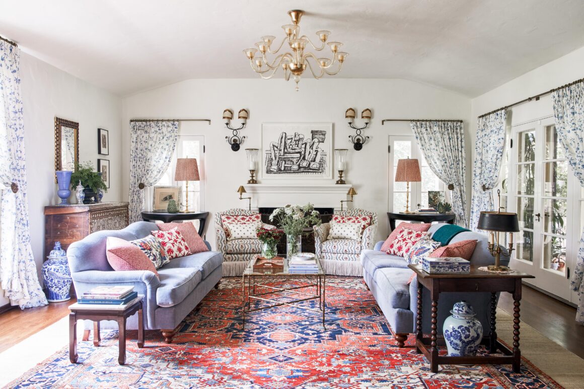
The new homeowners — a couple with three young children, a dog and busy lives swirling in every direction — were intent on honoring its historic beauty while coaxing it into the present day to suit their busy lives and dual careers in the arts.
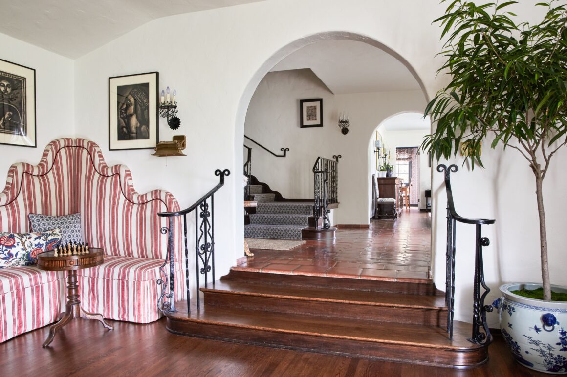
Enter interior designer Christine Zippert, founder of CC Zippert. The California native who studied fine arts as well as interior design, intuitively knew the project would require equal parts restoration, renovation and a carefully calibrated curation of old and new.
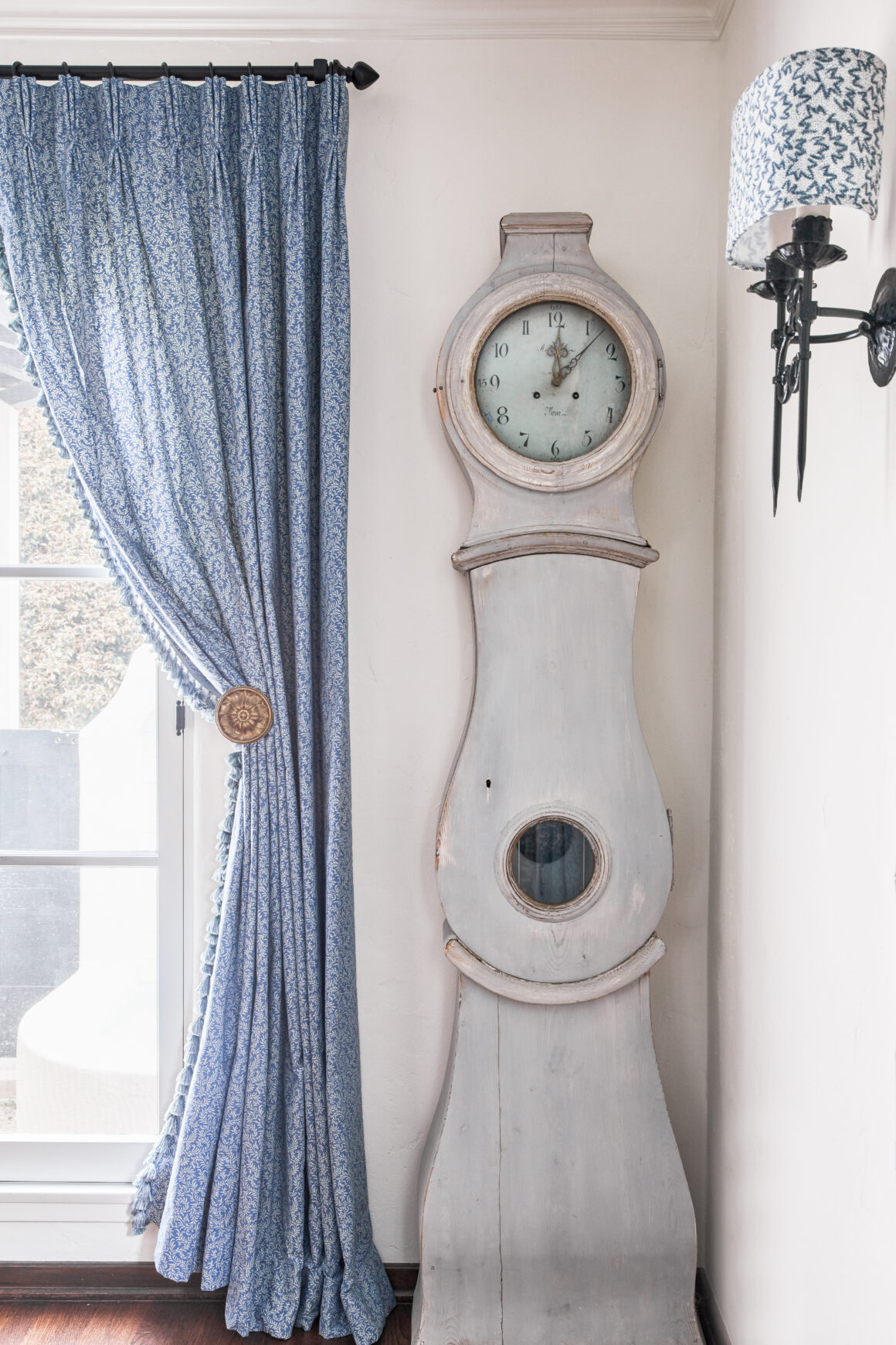
Key to her concept: To make the home look layered over years, not designed during the course of months. To do so, Zippert devised a strategic mix of flea market finds with pieces from antique stores and various elements created by modern-day makers with a nod to the past.
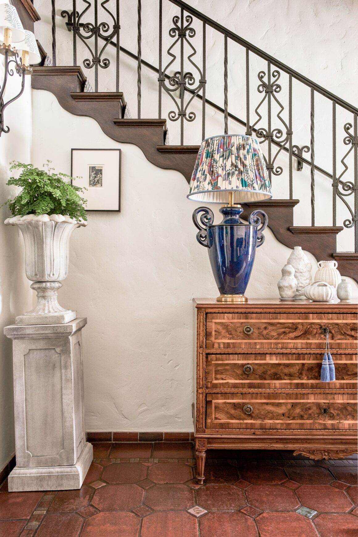
Looking to get the timeless layered look?
Here are the keys to Zippert’s success:
Think Character, Not Popularity Design trends shift and change, so don’t let a piece’s current popularity or its potential future value influence your decision to purchase. Do you love it? Will it bring you joy to look at every day? When it comes to vintage art and furniture, that’s what matters more than anything. If your house were a person, your vintage and second-hand finds are like that person’s unique quirks, experiences and character.
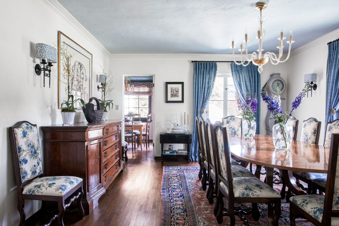
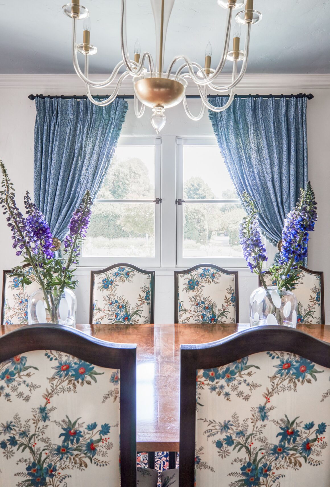
Enable Geolocation When mixing periods and patterns, it’s important to create a concept that helps create some ground rules to measure decisions by… Here we focused on a bulk of the items being European antiques from Spain, France and England or contemporary pieces inspired by these regions. We made sure what we acquired spanned several centuries so that the house felt like it had been there forever, built over time. It’s easier to mix periods when you do it consistently throughout a home. You can’t have all of your furniture be contemporary and then throw in a medieval chest or it will feel like an outlier. You have to make a conscious effort to mix old and new pieces from the get-go.
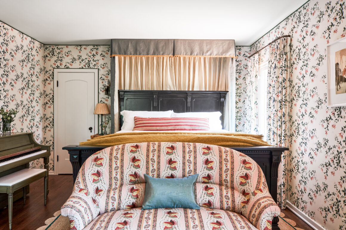
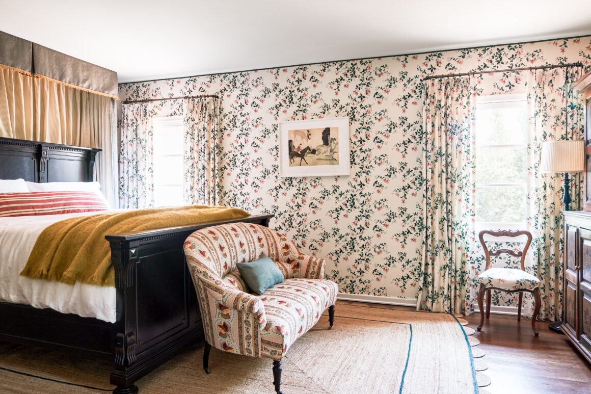
Act Local When buying antiques and vintage items, shipping costs can make an item too expensive to make sense. Set your searches within a small square mileage on websites like Chairish so that you can find items and then go see them in person. We’ve met some wonderful dealers we would have never known this way and now we can go see their latest treasures and acquisitions locally and in person.
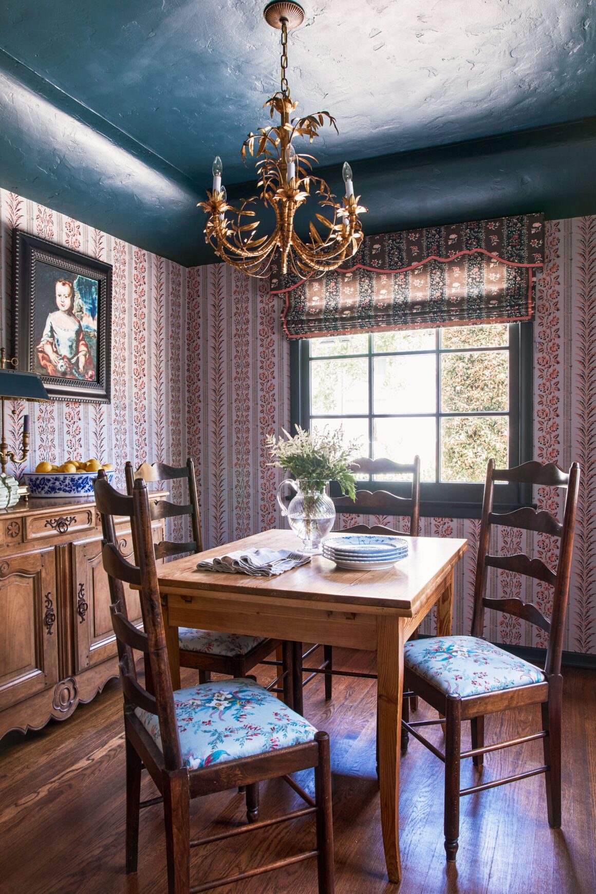
Sit a Spell The family hosts lots of gatherings so we selected the dining table and chairs with care. The table is a racetrack shape so everyone can face each other, and the chairs are upholstered with high backs so that you can sit for a long time. They are narrow and light to make it easy to pull the chairs in and out. Sometimes dining chairs can be so heavy it’s hard to maneuver them and you end up avoiding that space for everyday dining.
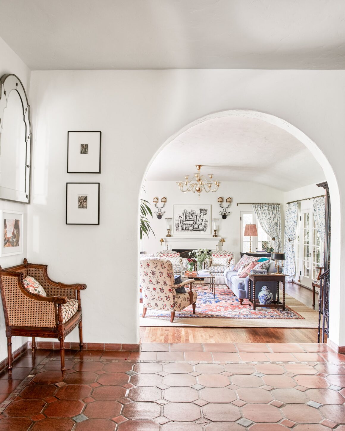
Practice Your Scales Scale plays a major role in a room’s success as well – if two pieces work well because they complement each other in size, then your eye is going to be ok with them being a different finish or style. If you have a huge bed made for a turn of the century estate and a small contemporary bench designed for an apartment, it’s not going to look right even if style-wise they are similar. But if you have a large bedframe and it’s anchored by a high back settee that can hold its own with the bed’s scale, you can have a lot more freedom mixing a bed and settee from two different periods or places. Scale is also important in fabrics: If you have a large floral print, a small stripe side by side they will mix well, but if you have a geometric pattern and floral print that are the same size, they’ll compete and make a space feel uncomfortable.
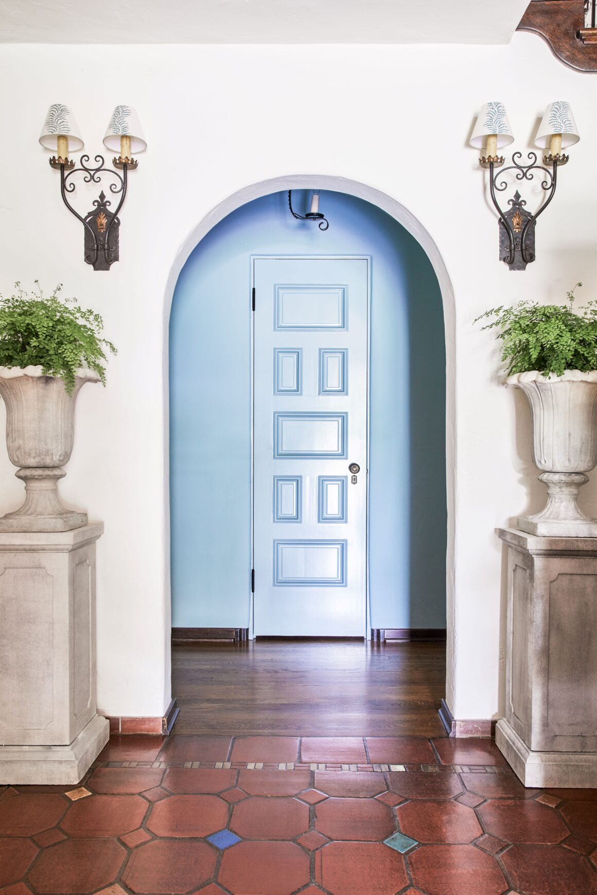
Keep It Consistent Repetition from one room to another is super helpful. The whimsey piece of our concept reminded us to pick pieces with interesting, curved shapes and forms. Whether that was a floral fabric, the arm of a chandelier or the leg of a chair, those playful curves moved seamlessly from one room to another adding another layer of cohesion.
To learn more about designer Christine Zippert visit her website or on Instagram.


