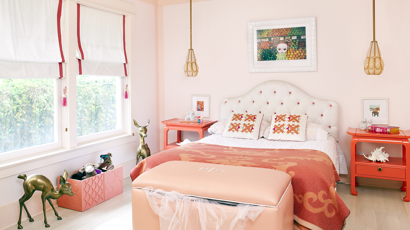
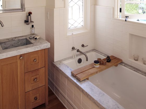
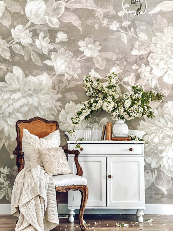
Think pink. As we watch the beginnings of life peer out from under frozen ground and we greet resting critters once again, it’s no wonder we want to be reminded of the beauty of life and new beginnings. Pink signifies health, which in turn signifies life–much like spring itself. Adorn every nook and cranny (or as much as you see fit) with varying shades of pink, whether it’s in a comforter, pillow, rug, wall, and so on.
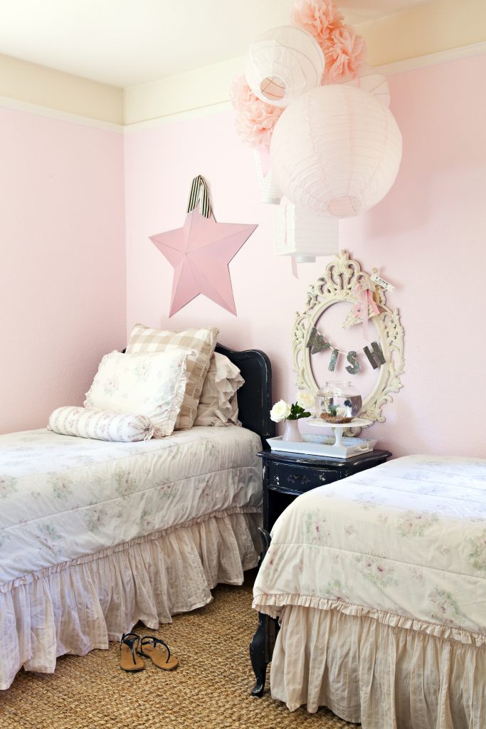
Less is more. You’ll want to use pink in your home as much as you can, but don’t overdo it. When applied too generously, pink can be overwhelming. Try to use patterns that contain pink rather than just the color itself. However, that doesn’t mean you should avoid solids altogether. Solid pinks are fine as long as they are offset by pink patterns or long stretches of other colors.

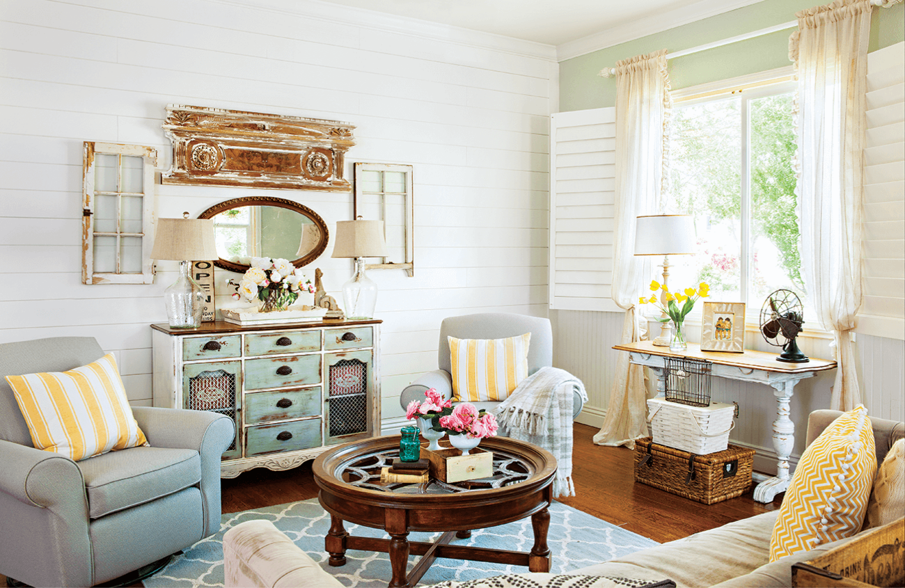
Go sheer. Pink is all over the place. It can be striking or it can be hushed. But despite the route you take, it’s always best to stay sheer, especially if you want your space to have a springlike quality. Sheer, lightweight materials will either complement muted tones or soften bold ones to avoid a harsh color combination.
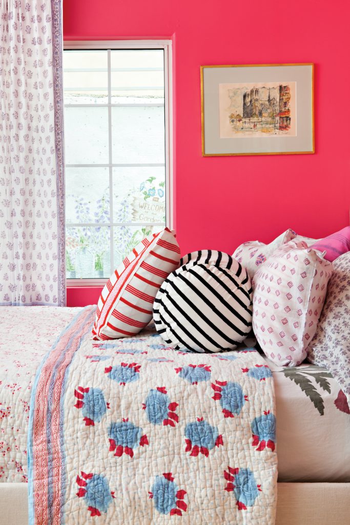
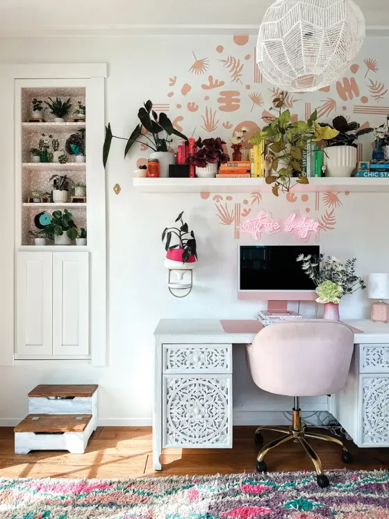
Have some fun with boho chic. Picking one shade of pink for the walls allows you to get creative with patterns and colors in the rest of the room.
Color accordingly. Just like your fabrics, the rest of your color scheme should stay light. A surrounding light color palette won’t overpower your choice in boldness and will harmonize pale pinks.

