When Claire Hooper first fell in love with the location of her Laguna Beach, California home, she knew the 2,000 square-foot space would require some serious adjustments to make room for her family of six. But Claire was up to the task.
Claire’s family had been comfortably ensconced in a bigger home, but it was the convenient beach access that drew her to the new property. Instead of dreading the task of fitting everyone into the new space, she made it her own personal project and began the renovations, putting herself in the role of not only homeowner but also designer.
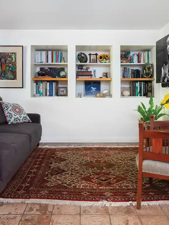
Claire used basic design and storage principles to help her through the process to get the feel she wanted. After refurbishing the home from top to bottom and overhauling its look, she found room for all of her family’s favorite things by using built-in cabinetry, dual-purpose items and other clever storage solutions.
Modern Marries Traditional
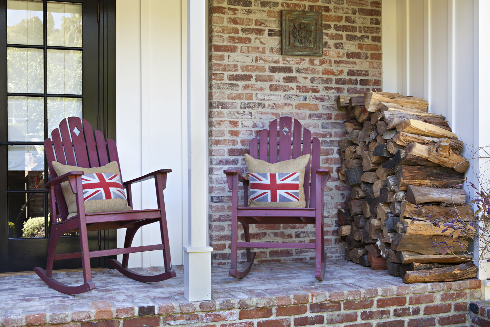
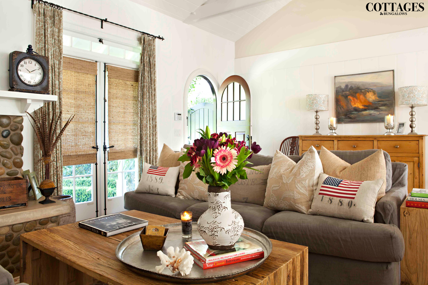
Although Claire knew she’d be updating the entire home, she still wanted to capture the charm of the older cottage, so she mixed modern and vintage looks. Her collection of graphic-printed linen pillows add an aged touch while classic artwork adds a splash of color and traditional character.

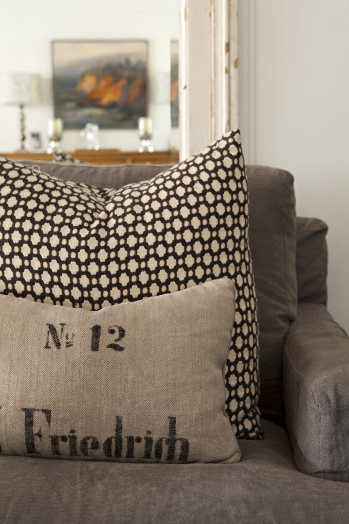
For example, her modern rough-pine coffee table in the living room melds seamlessly with the traditional entryway sideboard thanks to their common neutral color. Material can also add cohesion—a vintage patterned pillow will create a great statement piece against the background of a more modern sofa.
The other key, Claire says, was to add wainscoting and white paneling to the walls, as well as including beams and texture on the ceilings. These touches, coupled with modern appliances and furniture, give the home its distinctive allure.
Storage Solutions
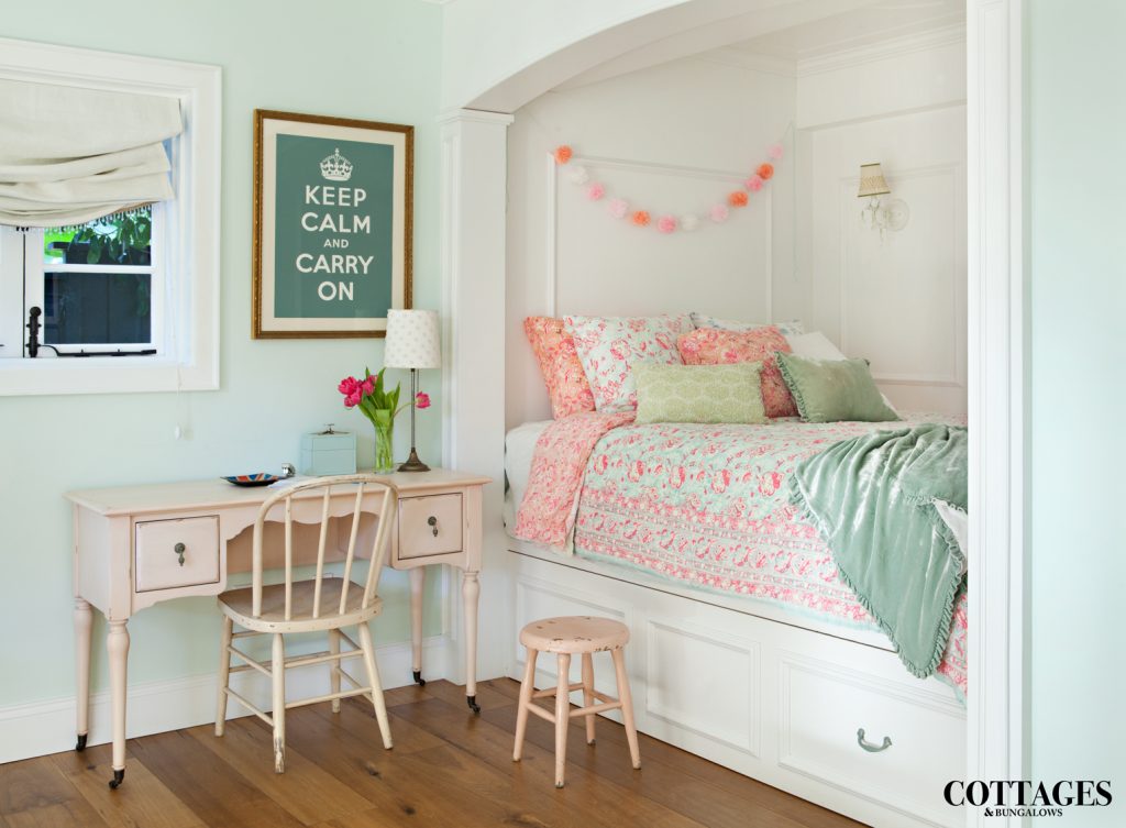
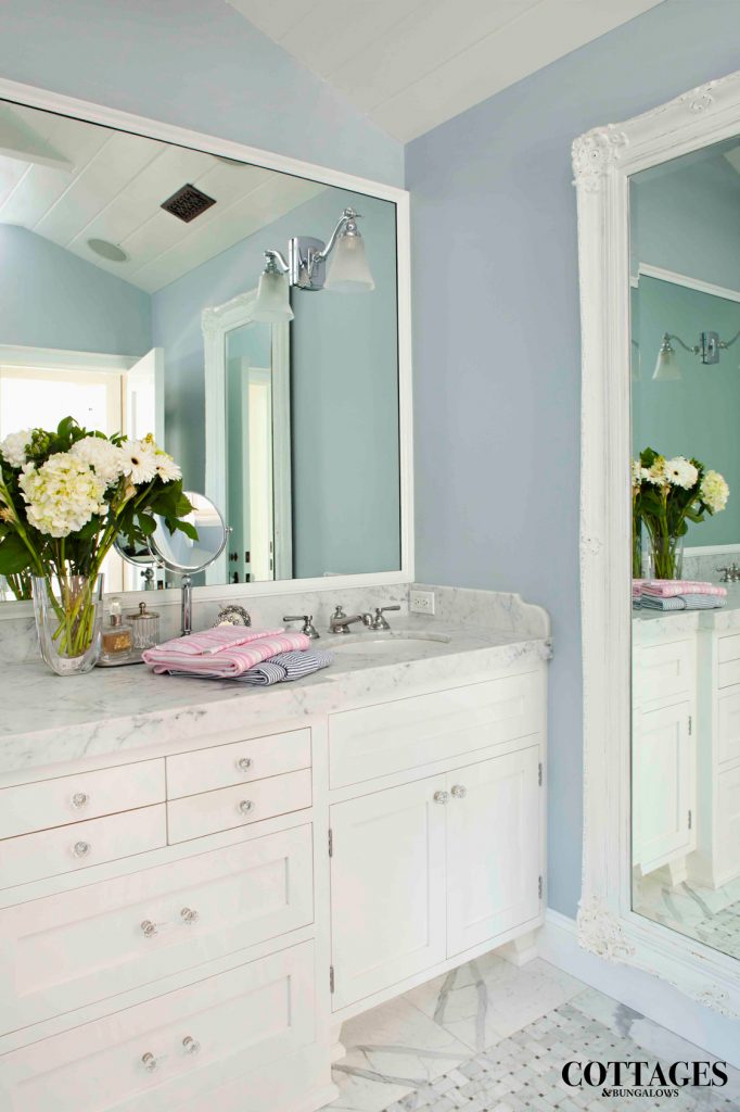
One of the ways Claire achieved her home’s clean look was to install custom built-in cabinetry to use for storage. “Every single thing we did was custom,” she says. With so many built-ins, Claire was able to keep the clean, neutral look and minimize clutter.
For example, her daughter sought a built-in bed, so Claire sketched out the basic design her daughter wanted and the family worked with a cabinet maker to create it. They added a set of drawers under the mattress to include more storage space.
Clean and Bright
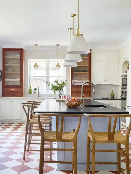
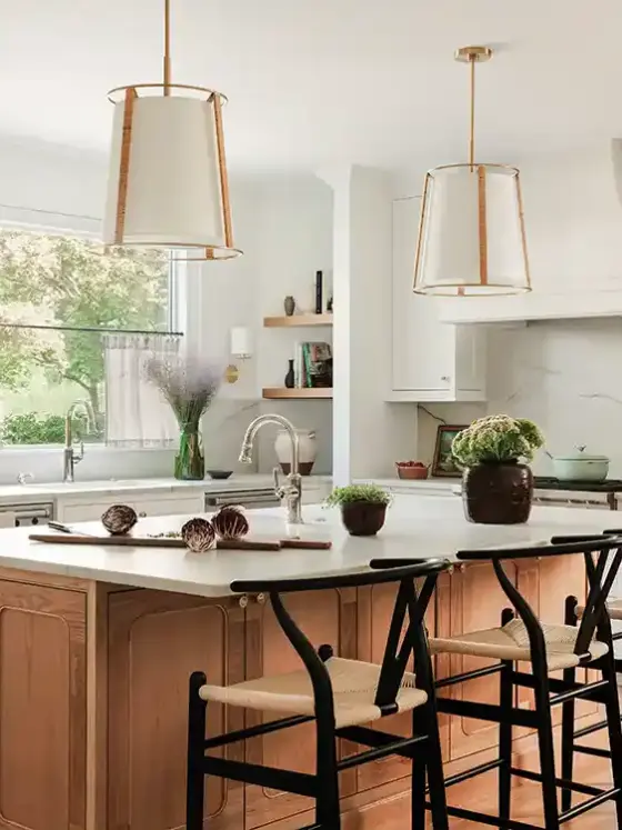
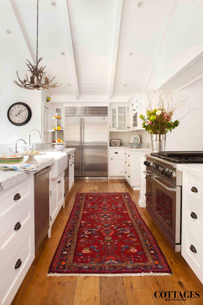
Likewise, the kitchen—formerly a drab, outdated look from the 1960s—was updated with extra cabinets and drawers that allow for more storage. Claire kept the narrow gallery kitchen white to emphasize the light and make it appear larger. A Persian runner warms up the space and adds back the traditional styling.
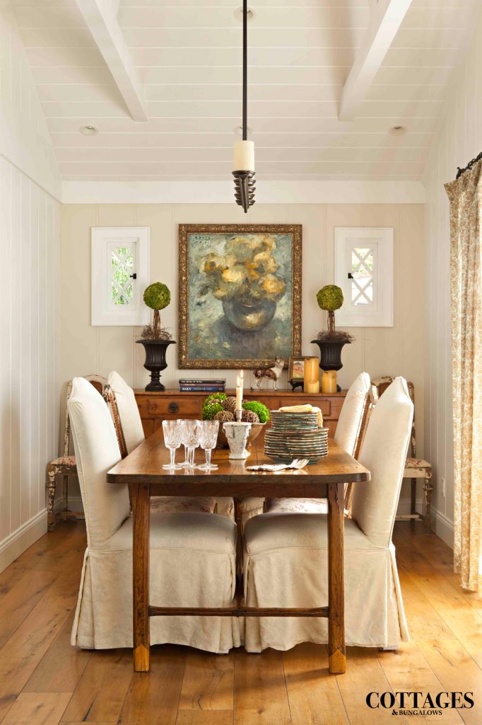
The dining room has an English cottage vibe that suits the small space well. A symmetrical arrangement and styling helps to keep the look balanced and clutter free. The dining chairs are covered with simple slipcovers, which Claire can quickly replace if her color preferences change or when the seasons shift.
The neutral palette of the dining room also leaves room for seasonal color, such as red during December and bright blue or yellow during the summer months. An added benefit, she says, is that the slipcovers are easy to wash when a spill happens during dinner.
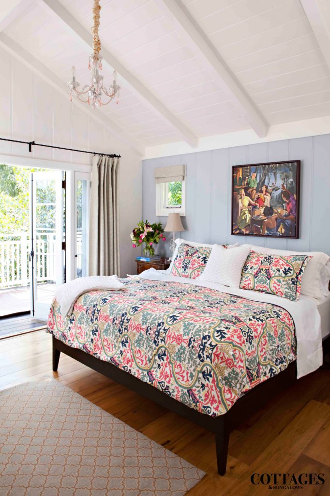
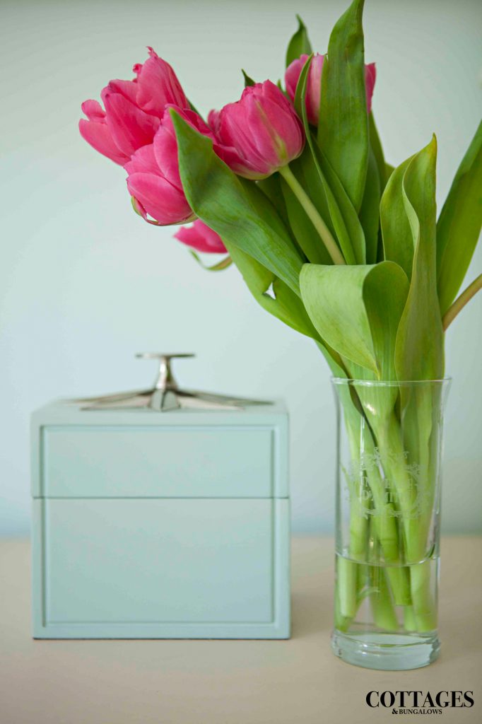
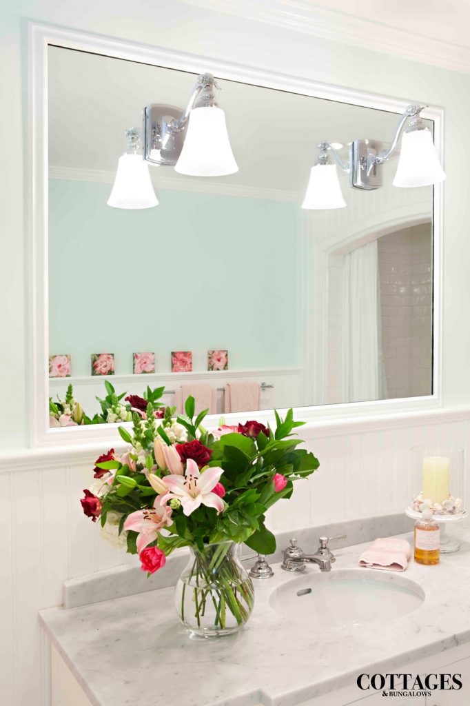
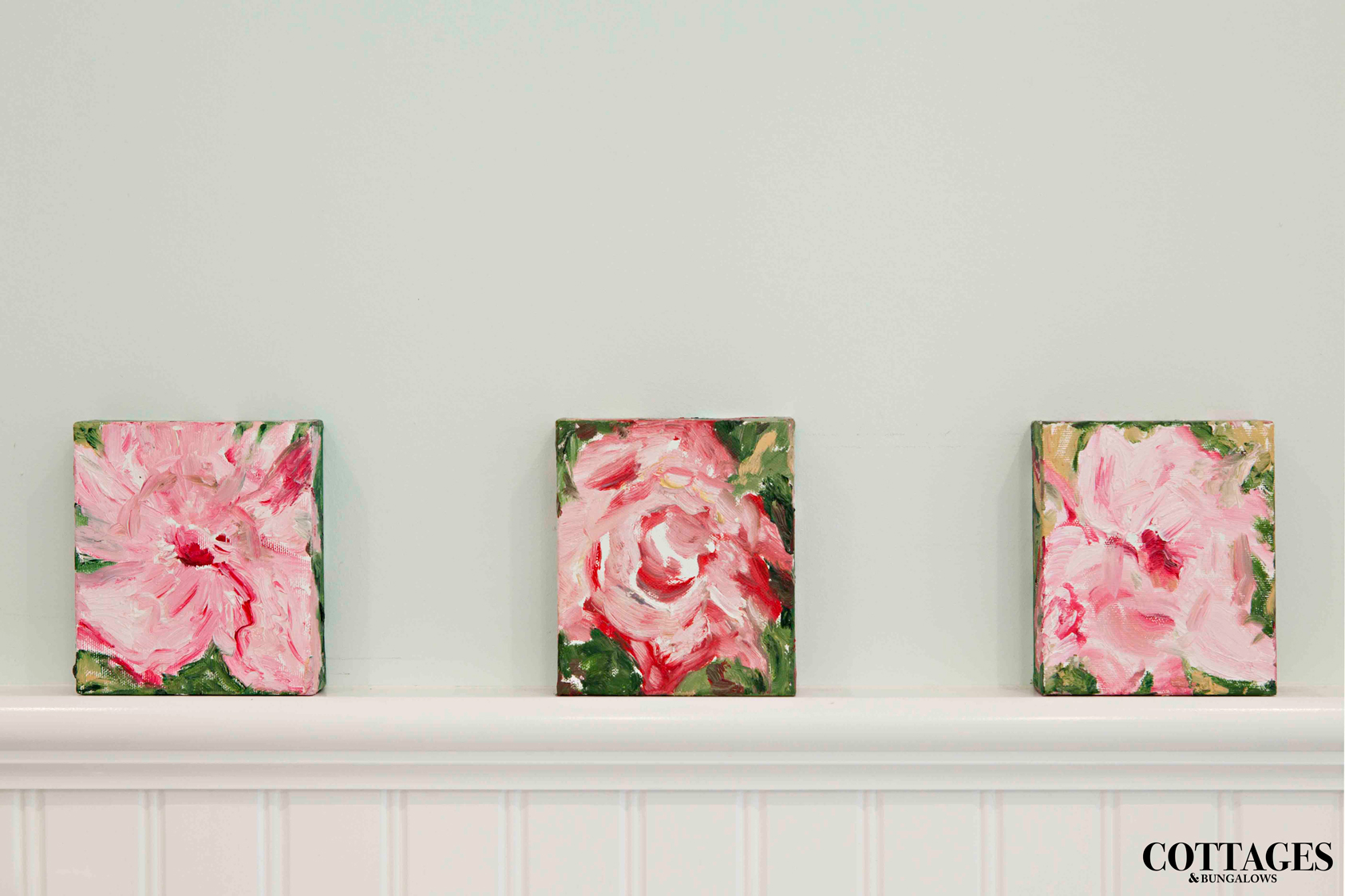
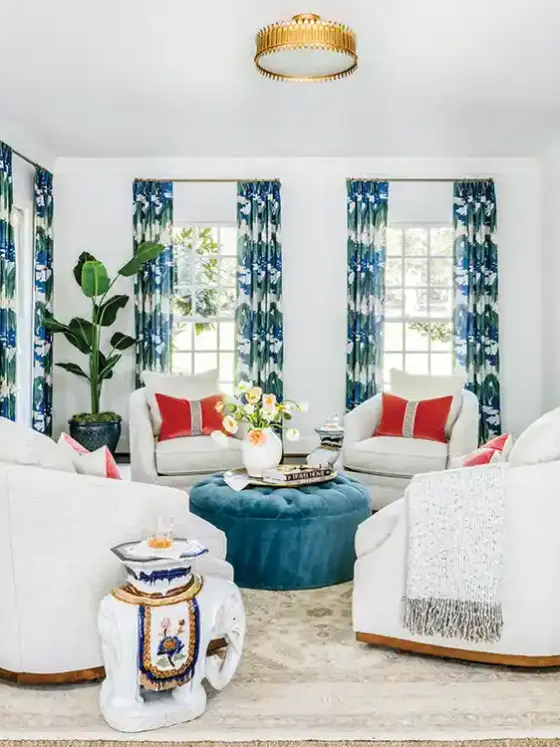
To maintain a clean look, Claire balanced the neutral palette with pops of color throughout the house. “Color can be achieved inexpensively,” she says. “In addition to flowers, artwork is another great way to add color. Plus, you can easily change up décor such as coffee table books or pillows from season to season and it really alters the look of the house.”
