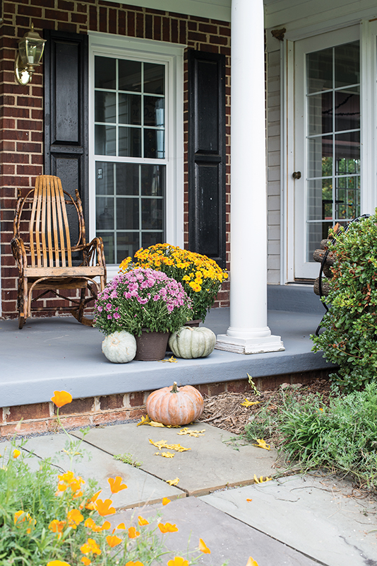
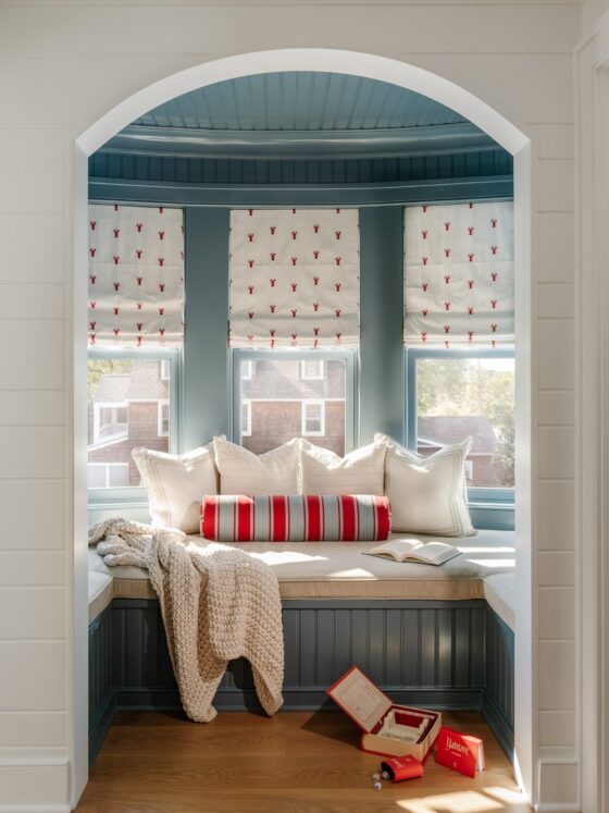
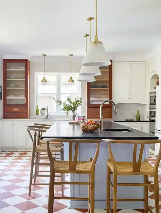
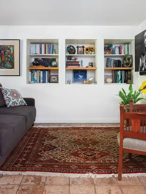
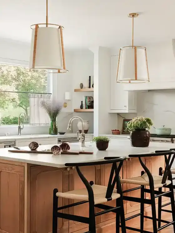
What happens when you’re a vintage lover and you move into a house with as much nostalgic appeal as a beanbag chair? You fake it. When Heather Turner of the blog The Heathered Nest and her family moved into the idyllic community of Green Valley, just an hour outside of Washington D.C., the draw was that her children could be raised away from the city. “It’s a classic brick-front colonial home and, being built in 1991, it was the youngest home we’ve ever owned, Heather says. “It was a real challenge for us because we tend to find contemporary design a bit bland and boring. We like older homes from the late 1800s that have little nooks and crannies, quirks and oddities.”
But the home, set on a couple of acres of farmland, gave her children the chance to roam free and gain exposure to country living, so she traded a historic home for a new one and set out to add back period charm and personality.
BUILDING BLOCKS
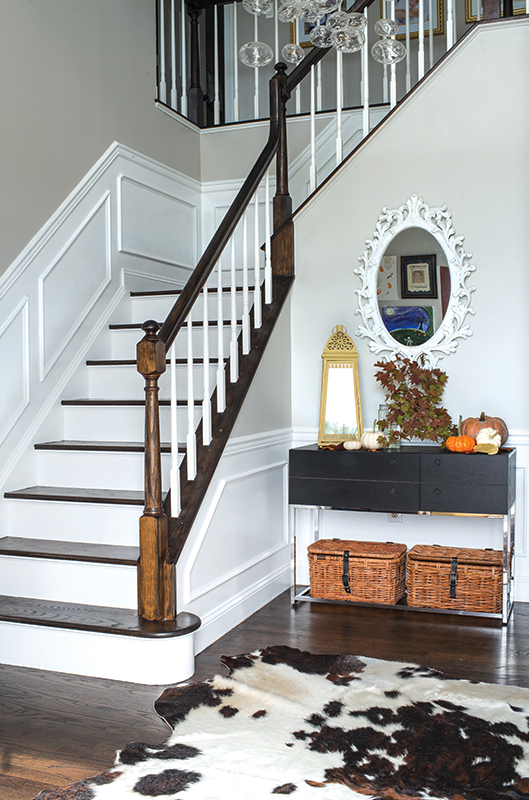
Rather than take on a major physical remodel, Heather found simple ways to make the home feel older using architectural embellishments. She added beams and decorative molding to the ceilings to make the house feel more hand hewn. Then she replaced some of the more basic fixtures with models that felt more representative of their tastes.
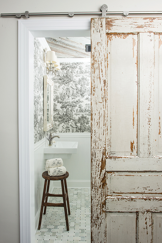
“I always cringe at the boxiness of newer homes,” she says about her first priority. “There are never a lot of architectural elements or ‘personality’ with new-home construction. So we buy things like ceiling medallions, faux beams, and beef up moldings in order to combat the blah. Anything to infuse some ‘wow,’ like removing the builder-grade bath elements and installing a vintage pedestal sink, or tile and lighting that is more unique and appealing.”
ADD IN AGED APPEAL
Heather, who describes her style as “a vibrant, eclectic, modern-vintage-hodge-podge,” chose décor elements that speak to her own individual tastes rather than a prescribed look.
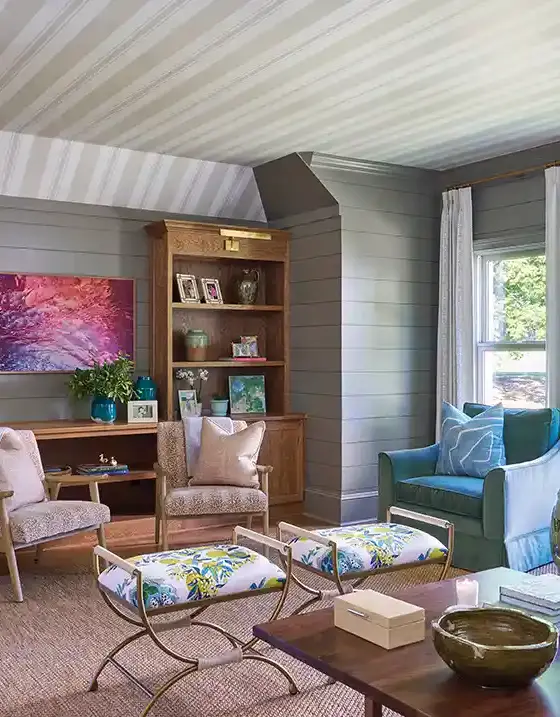
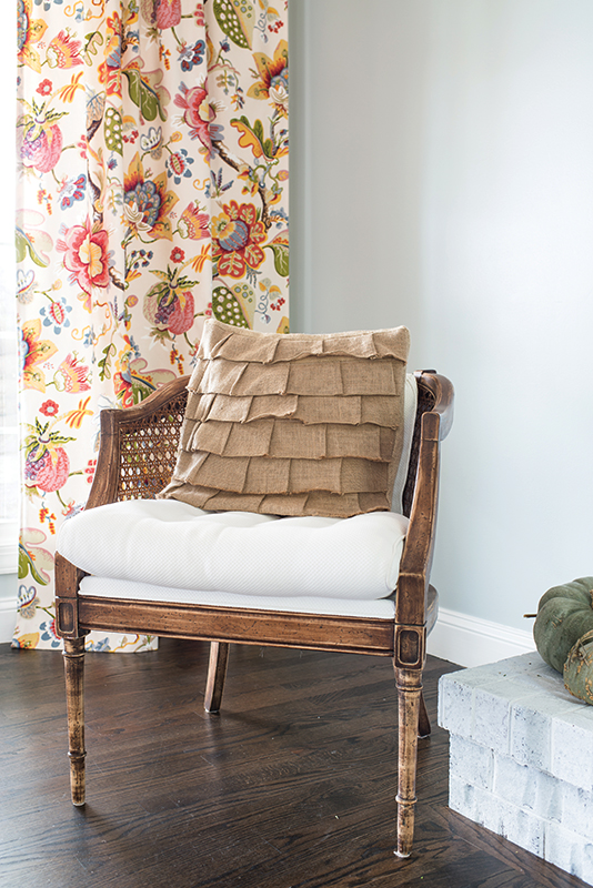
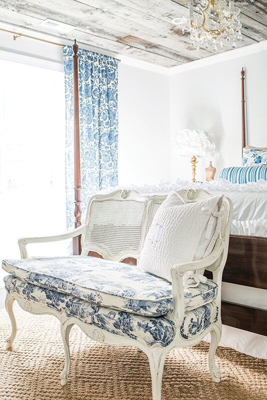
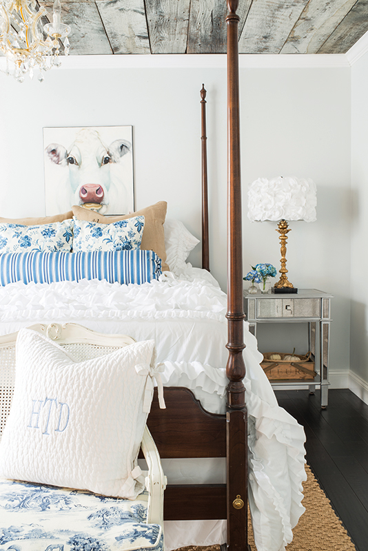
She filled the home with a mix of European- inspired furnishings, such as French settees and baroque mirrors, and layered in a bit of farmhouse style with rustic dressers and a few industrial-style tables. Everything helped to give her interior a sense of aged patina.
MIXED LOOKS, COHESIVE DESIGN
Admittedly, Heather’s biggest challenge has been working with the more modern open-floor plan of this home. “Having always lived in historic homes with lots of niches and closed off spaces where I could make each room stand independently of the others it was easier to approach each room separately,” Heather says. “That works great for me because I love so many different styles. I could put an Americana living room next to a beachy/coastal bedroom. But in this house, we don’t have that luxury, so I’ve tried to take one element from each room and carry it forward into the adjacent room.”
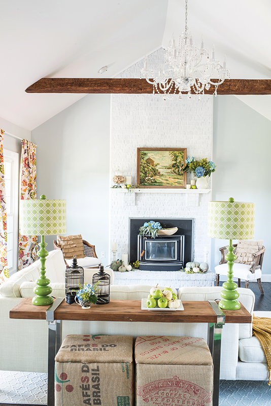
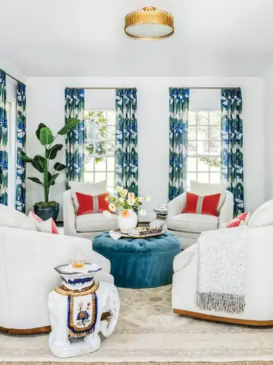
What are a few of her go-to ways of connecting the designs from space to space? “It could be something big, like the wall paint color, or something small, like a piece of fabric translating as curtains in one room and pillows in the next,” she says.
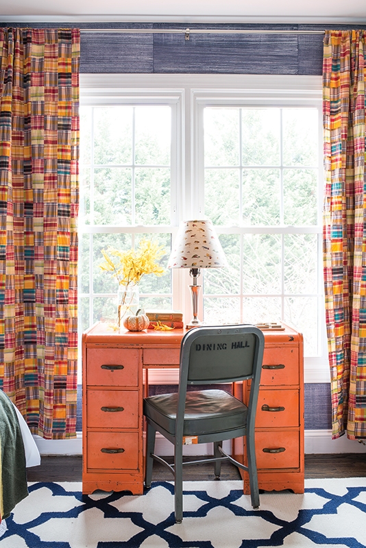
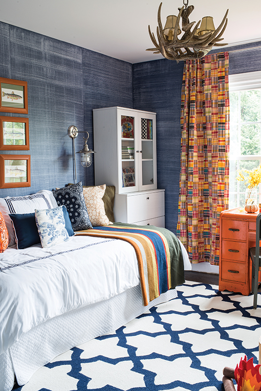
“Overall, I think juxtaposing something new and something old makes rooms really come alive. There’s nothing more beautiful to me than barn board next to a crystal chandelier or a sleek, modern sofa with chrome legs and straight lines next to a vintage cane chair with all kinds of curvy goodness.”
TIME FOR FALL
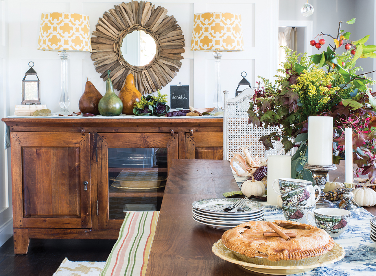
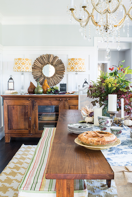
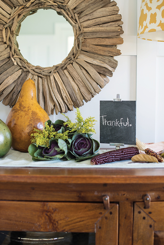
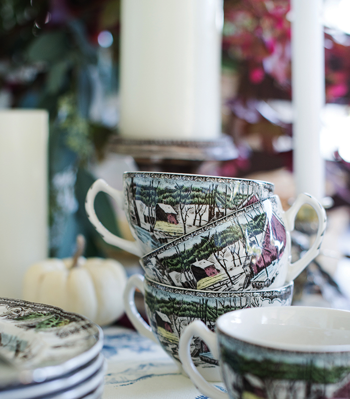
Transitioning her home for the season is all about natural elements. “I’m a big fan of bringing the outside indoors whenever and however I can; so fall branches and cute little gourds are go-tos,“ Heather says.
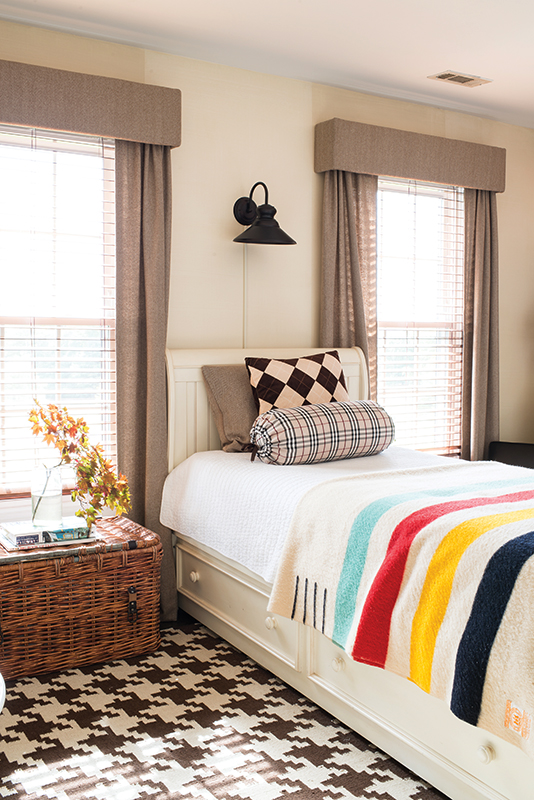
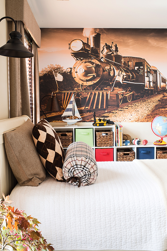
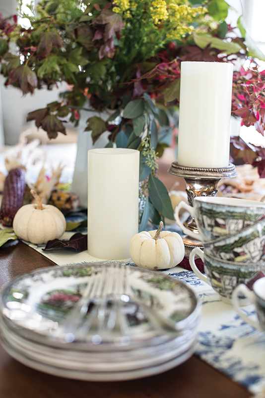
“We are lucky to live in a place where I can go out back and pick all kinds of fun seasonal décor like leaves, corn stalks—you name it,” she adds. “And use plenty of candles—just the plain ivory ones—they look great bundled together with some autumn leaves; they make things look so festive and cozy in the evenings.”
