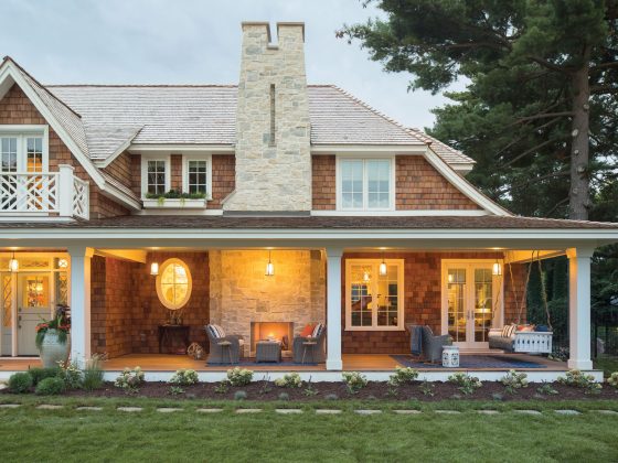
There are certain themes that traditional cottages beg for: exposed wood, garden ambience and classic silhouettes. The two-bedroom cottage, built in 1947 in the Cheviot Hills neighborhood of West Los Angeles, tucked amid winding, hilly streets with Scottish names, fits like a glove into its traditional setting. Los Angeles-based designer Georgette Westerman helped make it as functional as it is charming, using a mix of contemporary and traditional styles that the homeowners longed for to make it comfortable and personal.
To make each room truly comfortable for homeowners Marisa Westervelt and John Keith, Georgette needed to marry two sometimes- opposing styles: he likes traditional pieces; she has an interest in modern design. Georgette’s challenges were to create a cohesive style story within each room.
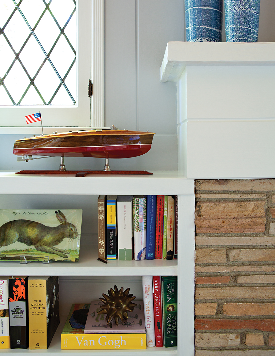

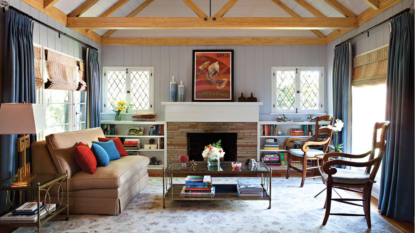
Approaching one room at a time, she and the homeowners began with a furniture. From there, Georgette filled in the gaps with complementary colors, reupholstering, décor accents and rugs. “I usually start every room with the rug and use it as inspiration to build a color palette,” Georgette says. The open, airy living room exemplifies this principle well. A lightcolored, large rug blankets the floor and sets the tone for the taupe sofa and the armchairs donning cushions in a similar hue. Along with a glass coffee table and side table, the lighter tones contrast the darker woods in the room, adding reflective element that brighten the overall look.
“I usually start every room with the rug and use it as inspiration to build a color palette”
“Rather than adding more wood, I felt that the glass furniture lightened the space, since you can see the entire rug pattern through the coffee table,” Georgette says. When creating a color scheme for the room, Georgette chose warm, “feel-good” hues, painting the walls in a soft blue-gray, installing blue window treatments, and adding pops of orange with artwork and accent pillows. Painted a crisp white, the mantel and fireplace transformed into a focal point with a fresh, modern look.
Also Read: What is Farm Cottage Style?
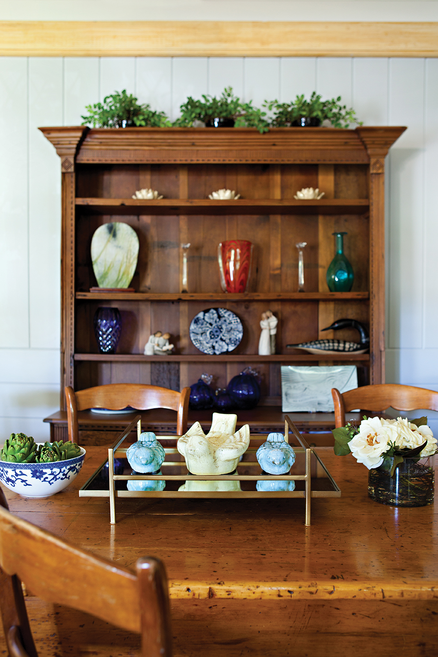
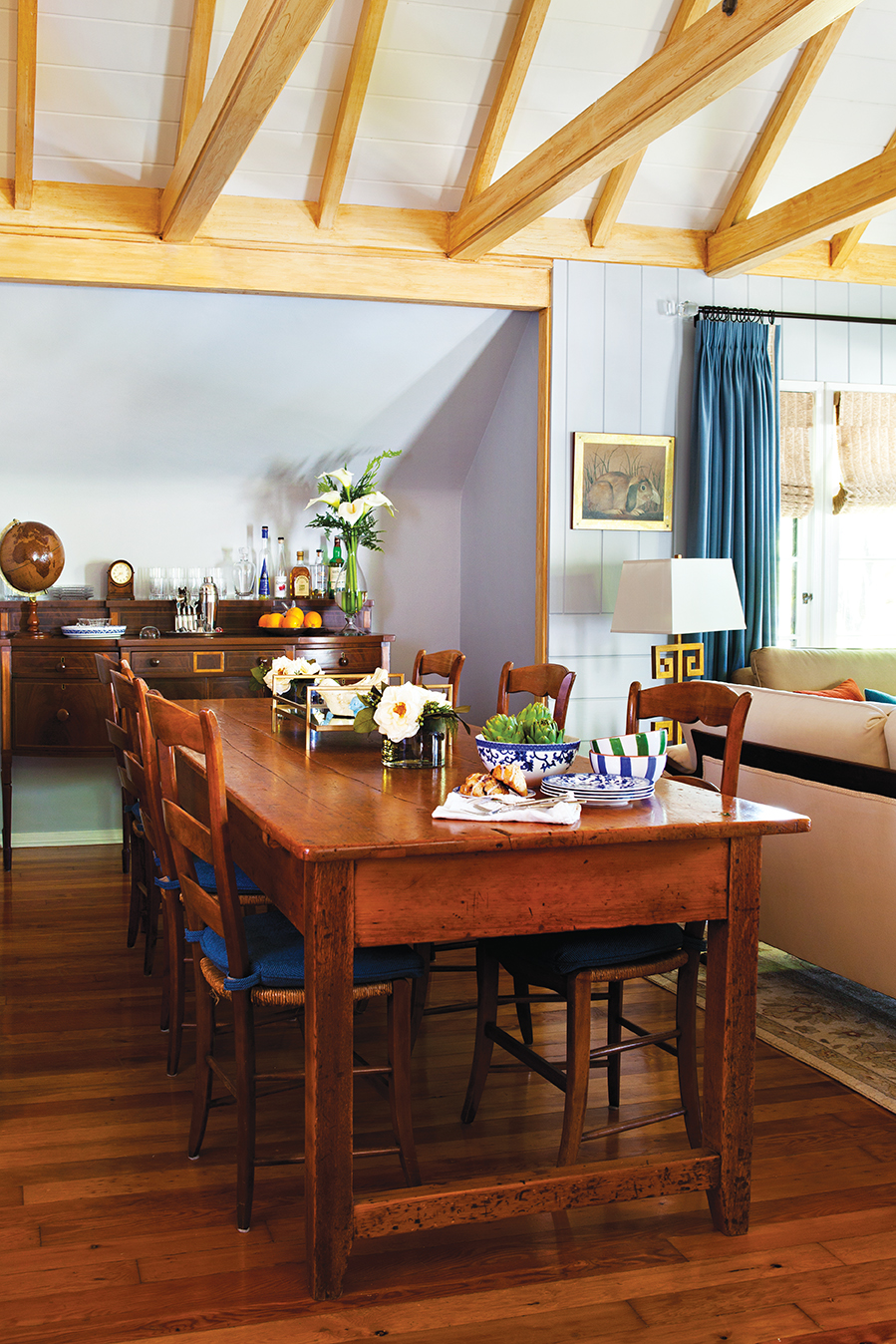
Drawing the eye upward, the natural texture of the exposed ceiling beams adds contrast, along with the rich pine flooring that runs throughout the home. Georgette sourced durable fabrics to reupholster the set of armchairs the couple had to represent both of their styles in the room. “The living and dining areas became our favorite places in the home. A comfortable blend of formal and relaxed, they work for everything from meals to cocktails and conversation, or simply reading by the fireplace,” Marisa says.
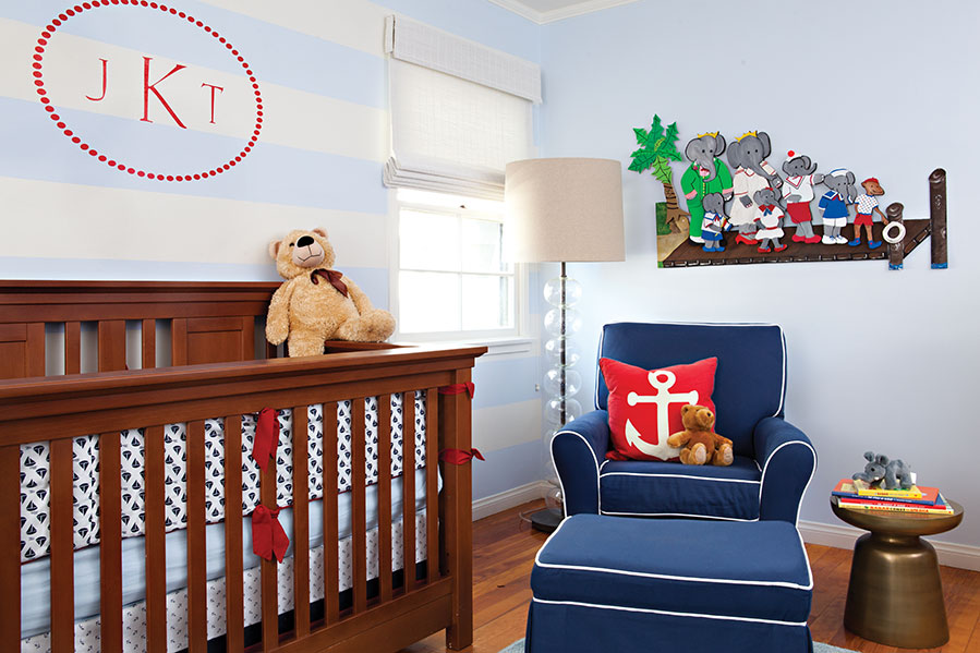
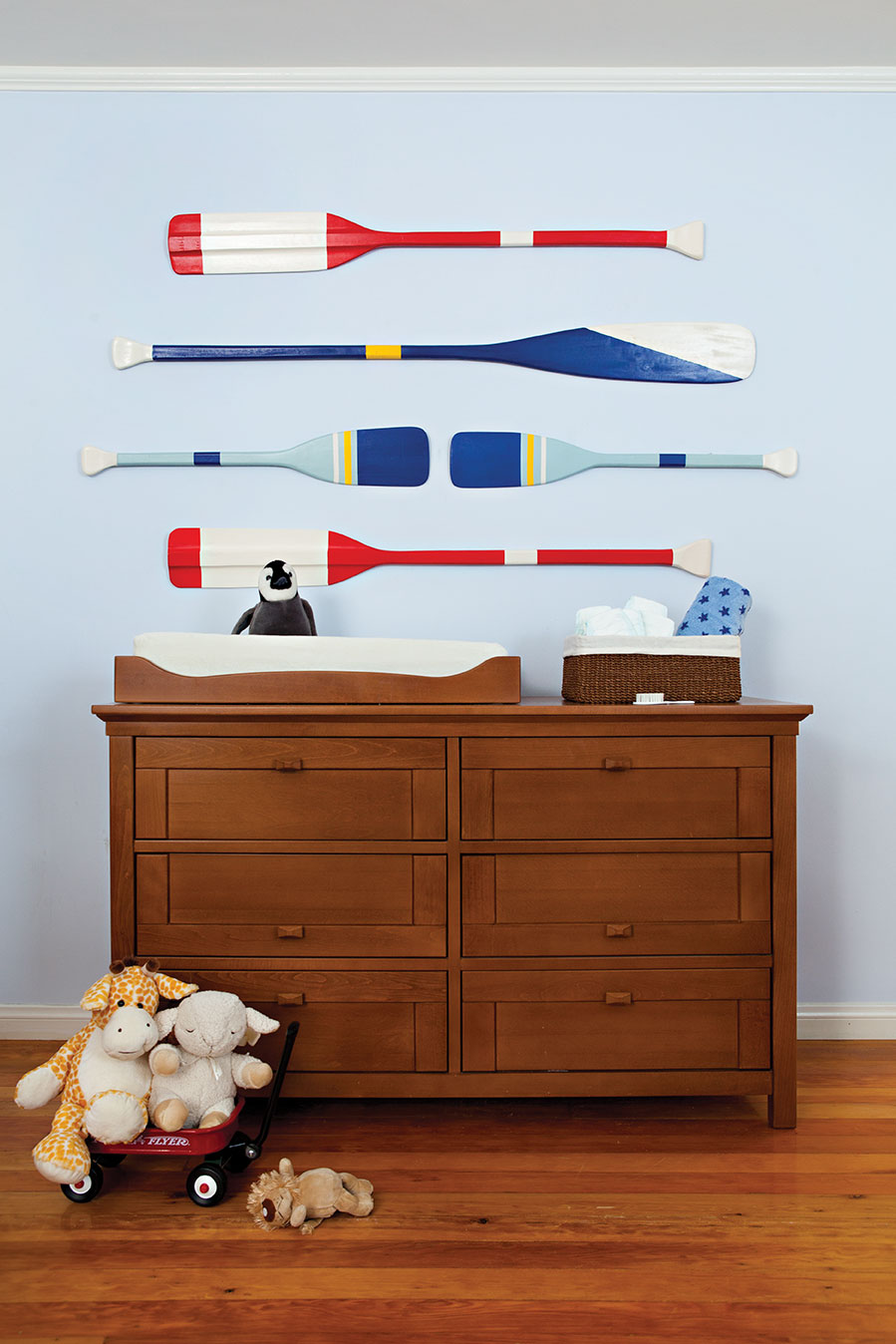
Modern touches continue to blend with traditional elements in the nautical-themed nursery. Bright, cheery colors make the space comfortable for both baby and parents, and painted oars from Pottery Barn adorn the wall above the changing table to add a whimsical touch. With a red, white and blue palette, the theme gives a nod to traditional Americana, while a wide-striped wall Georgette painted behind the crib adds a graphic punch.
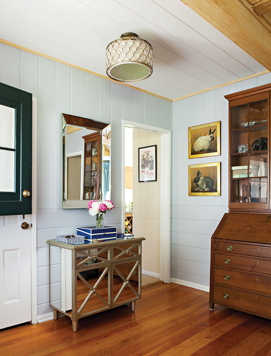
Often the smallest corners in a home, such as an entryway, can be the most challenging to style, yet when given a little attention create a valuable open flow from one room to the next. Georgette treated the entryway as its own individual space, keeping it both functional and free of clutter. One key way to accomplish this is including the essentials—a spot for keys and mail, and accessible extra storage. Disguised in the mirrored glass table, is a stylish storage solution, along with the decorative boxes that sit on top. Using boxes, trays or small bowls as a catch-all for stray items creates simplicity and a clean, polished look. Another way to keep a room or small corner looking fresh is with floral accents, like the small vase that finishes the tabletop vignette.

