The Harbor Cottages in downtown Harbor Springs, Michigan may transport you to the past, but you might be surprised to learn they were built today. A sustainable, period-sensitive development cottage house design project by The Cottage Company, a design/build firm in north Michigan, this new-old neighborhood was conceived as a way to take contemporary ideals of urban infill—building walkable dynamic communities that make the most effective use of space—and apply a vintage lens to them, proving that modern ideas can be executed with old-fashioned style.
“Here in northern Michigan you often see traditional East Coast shingle-styled cottages with a bit of Victorian influence,” says Rob Mossburg, founder and principal of The Cottage Company. “The ‘new urbanist’ approach to this overall development, which we really like to call ‘old urbanism’ is part and parcel of its architecture.” For Rob, what defines this particular cottage house design is a combination of how the lot is used along with the charming details of the extensive exterior millwork, trim and details such as flower boxes and finials. “[It’s got a] sensible scale and is adapted to a narrow in-town lot—we did a ‘campus style’ approach with designing the lot with a main house, detached carriage house, potting shed.” Here are a few of our favorite cottage curb appeal lessons from this project.
THE CHARM OF COLOR
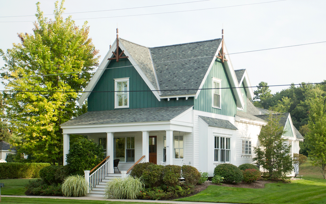
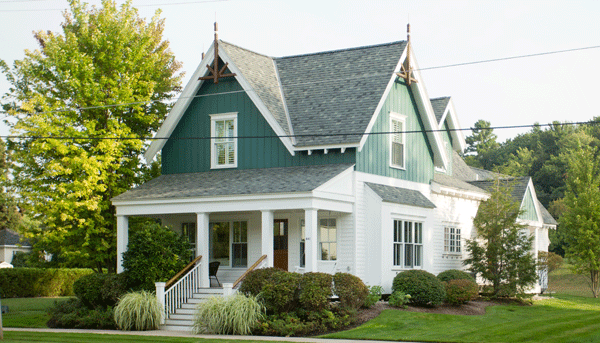
Paint is a powerful way to capture the essence of an era. This two-tone palette of white with a custom green shade revives a traditional color scheme and immediately communicates the period style of the home.
A GOOD FAÇADE
By changing up the siding styles (horizontal lap siding on the bottom floor, vertical board and batten on the top), the designers not only add more interest, but also they give the cottage curb appeal a rural farmhouse feel.
WOOD TRIM
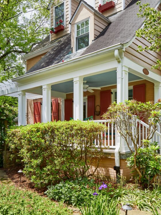
A natural-stained-wood finish for the porch step rails and the gable bracket punctuate the architecture and add warm contrast. The front door in the same look is the perfect finishing touch. What else highlights all the thoughtful detail work? “The simple 2-over-2 muntin bar window styles, the welcoming porch steps, the open rafter tails, even the way the dining room bumps out. There are no flat elevations; there is always interest going on and three dimensions,” Rob says.
MAKE IT WELCOMING
The large front porch and single front door create a cozy, inviting vibe. With the garages in the back, the emphasis of the façade stays strictly on the entry—just as it should be!
Want more cottage curb appeal inspiration? Check out this post on must-haves for Farm-cottage curb appeal. Or this one on the ways to get that Cape Cod Cottage look through smart exterior updates.

