What do you do when your entire kitchen is only slightly wider than a garden shed? Designer Kirsten Marshall of Palmerston Design Consultants says you start treating it like a train car and think of ways to have multi-functioning components. When the owners of this unique 1880s home in Toronto, Canada, set out to remodel their kitchen they had a unique problem: The entire kitchen was only 10 feet wide.
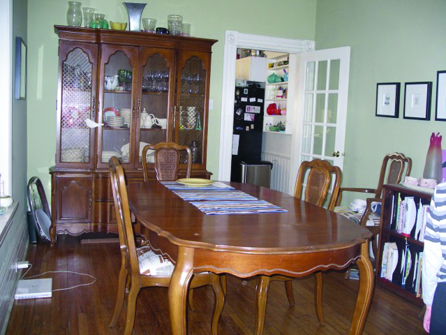
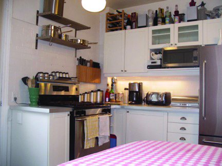
“The kitchen was very small and located at the back of the house,” Kirsten explains. “The dining room before it functioned more like a hallway because it was the only way to the get to the kitchen from the front of the house.”
The owners knew the first step was to tear down the wall that divided the dining room from the kitchen but rather than keep the dining room in place, Kirsten suggested they maximize usable square footage by turning both spaces into one long multi-use room. “I felt like we should treat it like a railway car,” she says.“They used the whole length for a functional kitchen since they both cook as well as wanted a space to eat in the kitchen.”
Creative Solutions for Unique Problems
This uniquely narrow space had even tougher challenges than the average galley kitchen. “The house wasn’t even wide enough to allow for seating if we went for a peninsula-style island with barstools,” Kirsten says.
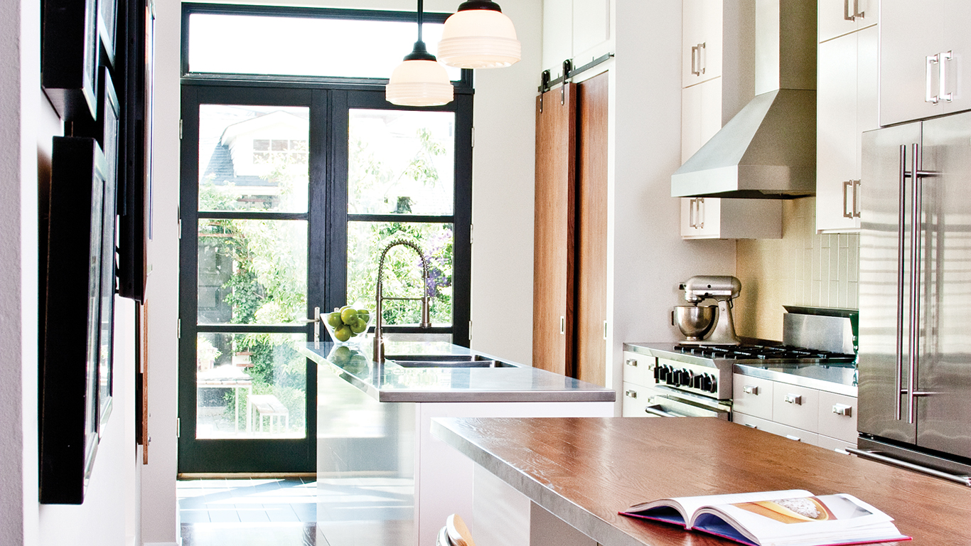
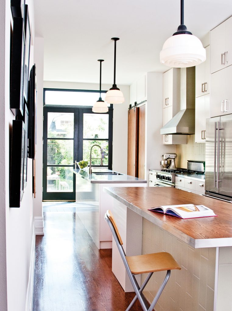
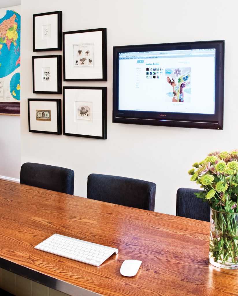
So instead, they decided to create two separate islands. One functions as a prep island complete with faucet and stainless steel countertops and the other was topped with the same wood used for the flooring to function as an eating island. Behind the eating island was a custom-designed 12-inch-deep pantry; they sacrificed storage space in order to gain room for chairs on both sides. The eating island also functions as a workstation—the TV mounted on the wall across from the island is a computer monitor. A wireless mouse and keyboard can be stowed away in a drawer beneath the countertop.
How to Visually Widen the Space
The dual islands not only create efficient work zones and give the kitchen extra function, they break up the space with walkways, making the kitchen look roomier. “The floating islands give the eye some breathing room as opposed to one long peninsula counter which would have cut off the space,” Kirsten says.
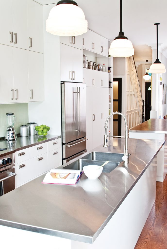
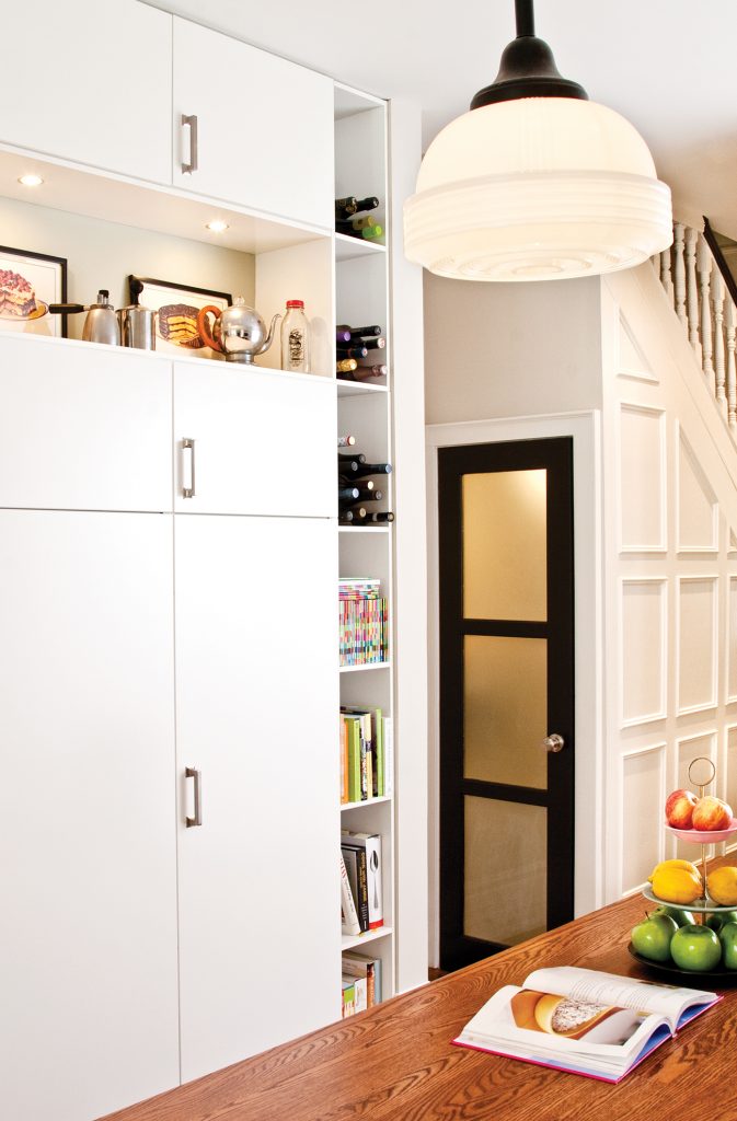
They chose simple white cabinets to reflect light and allowed for open shelving at the end of the wall to hide a few necessities (the cordless phone, a few cookbooks and bottles of wine) and display the homeowner’s collection of vintage teapots.
Kirsten had a few clever design tricks, too. She oriented the 4×13-inch backsplash tile to run vertically instead of horizontally to help deemphasize how long the room was. They also kept the materials to a minimum. The stainless steel countertops run along the back counter to match the island and even the wood island is trimmed in the stainless steel to tie the two together.
A Vintage Touch for a Modern Kitchen
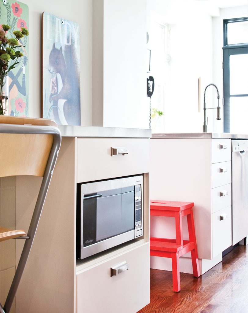
While the Ikea cabinets used to outfit the space look contemporary, the homeowners wanted to infuse a sense of history to match the house. Kirsten chose a vintage green color for the tile and schoolhouse style drop pendants add vintage flair. The designer also created a small mudroom area at the end of the kitchen by the garden door and used reclaimed wood barn doors for the closet to impart a historical touch. “It’s a Victorian so putting a very modern splash kitchen wouldn’t feel right,” she says.

