Flowers may bloom overnight, but your home décor certainly doesn’t. Sometimes, it takes a while for your dream space to blossom. When Lieve Saether from Turnstyle Interior Design met with the owners of a neocolonial house in Austin, Texas, they were on the brink of moving. Frustrated with the house’s layout and design, the Franks, a family of four, were ready to start from scratch in a new residence. However, Lieve knew that the fresh look they needed could be achieved right within the home’s existing shell, and that renovations and styling could give it a stunning second life. “We were given the opportunity to help them see differently, and now they love it long-term and plan to stay to raise their family,” Lieve says.
“They really gave us the reigns to explore what worked with the home,” she says. “Their request to us was to bring out its best; which was very much achievable.” The results were clean, airy spaces with unique design twists. And while the residence transitions beautifully through all the seasons, it wears spring particularly well with its light-drenched rooms and soothing color palette.
Creative Kitchen Moves
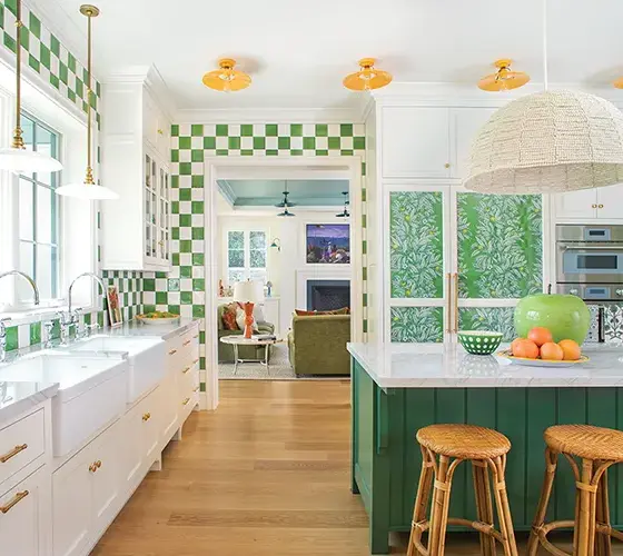
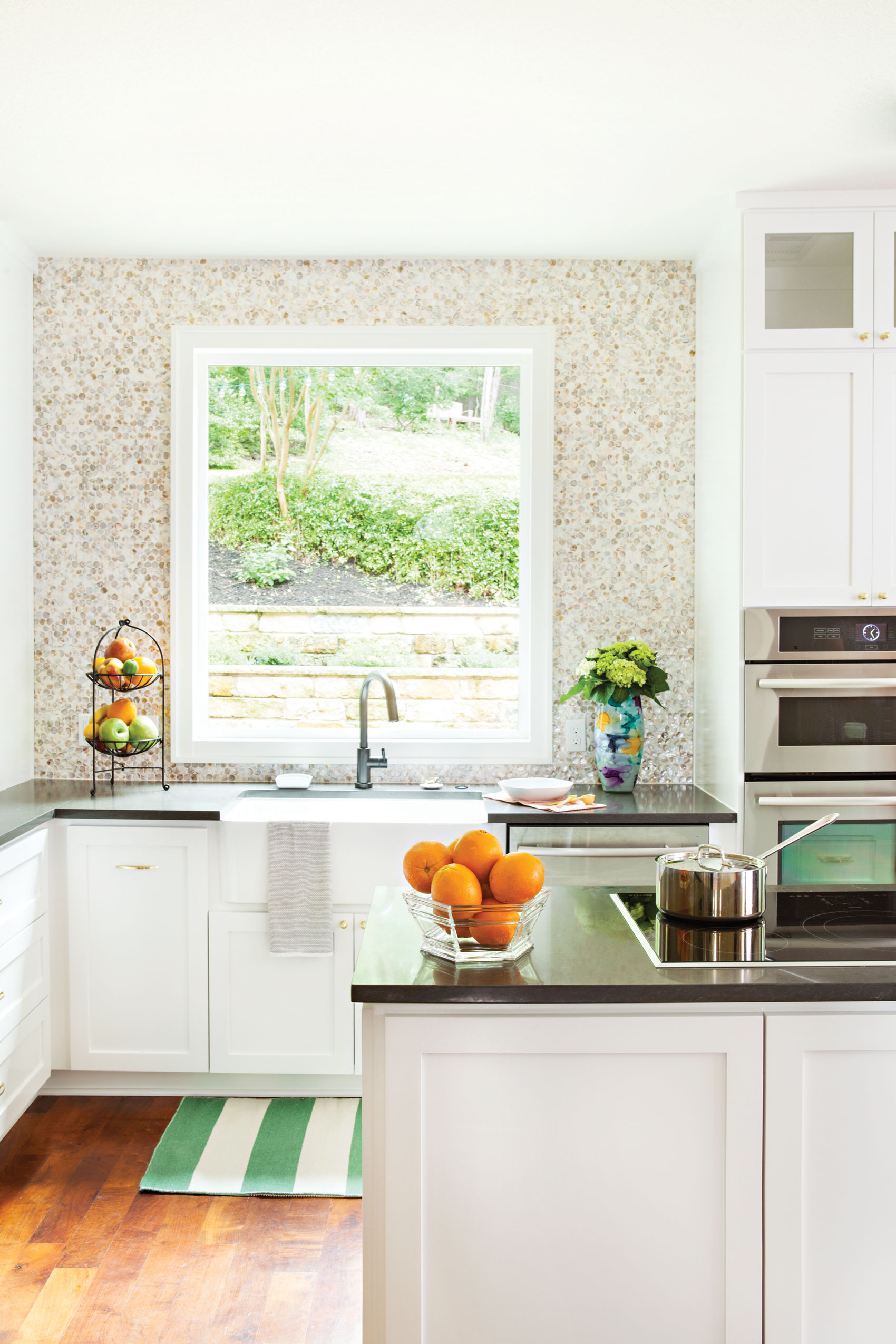
The kitchen was one of the biggest renovations. The original floor plan was cramped and had too many walls. Lieve changed the window sizes and added a door for patio access.
“By tearing down the walls, including the one between the kitchen and dining room, we enabled the homeowners to experience the house as a whole but also gave them convenience.”
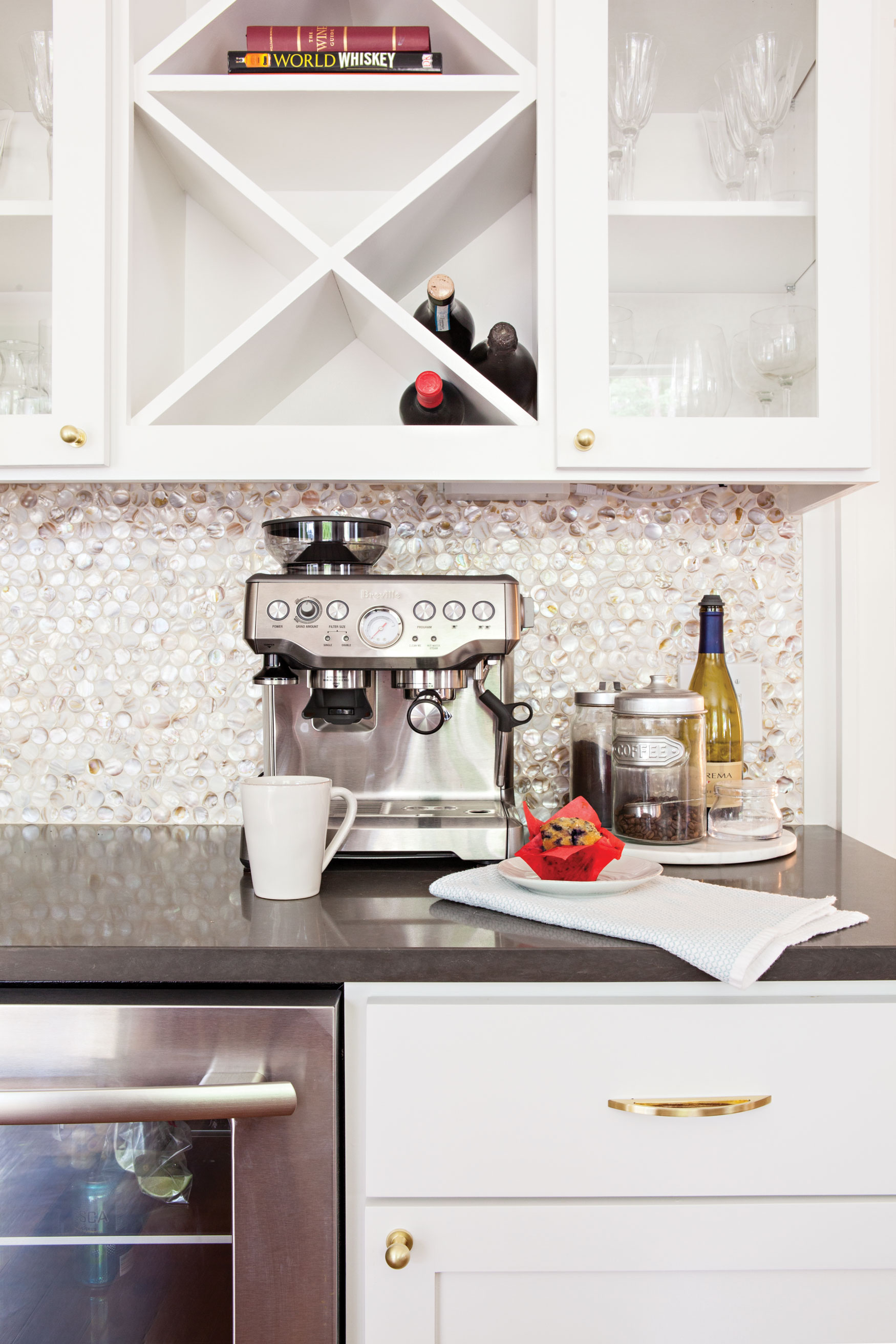
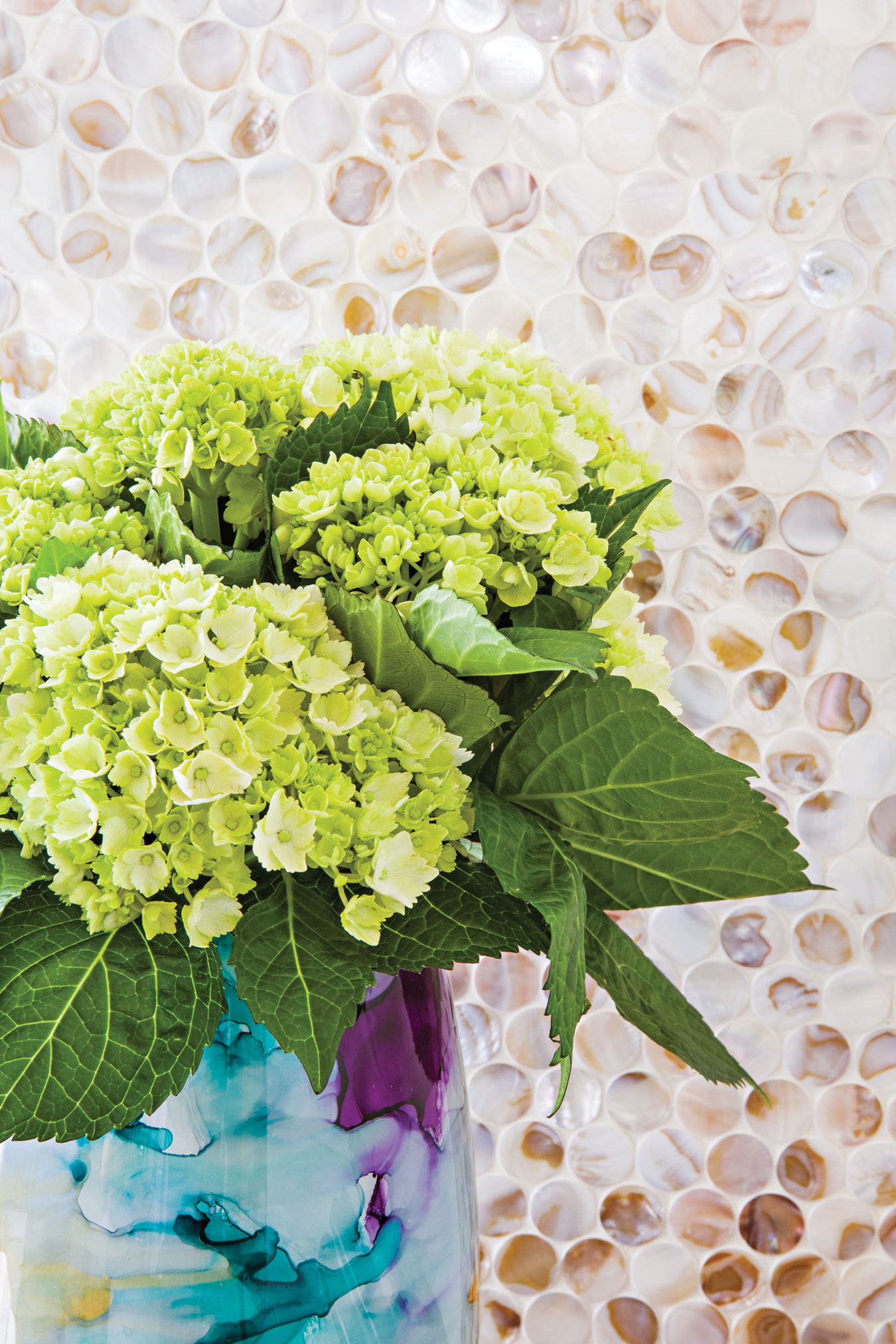
In order to keep the kitchen bright, she selected finishes with light tonal qualities for the cabinets and Silestone countertops by Cambria. For a dash of personality, she worked with the homeowners on an exquisite backsplash. The textured tiles from Design Elements were composed of pearlized seashells in a penny tile formation. “That was one of my favorite parts,” Lieve says. “When we approach any project, we look for the identity of the homeowners and create something that becomes special and unique to them.”
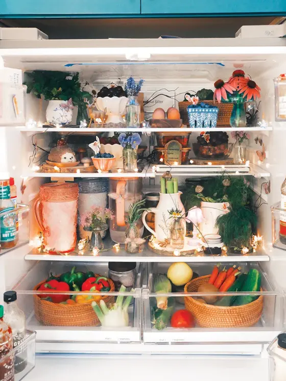
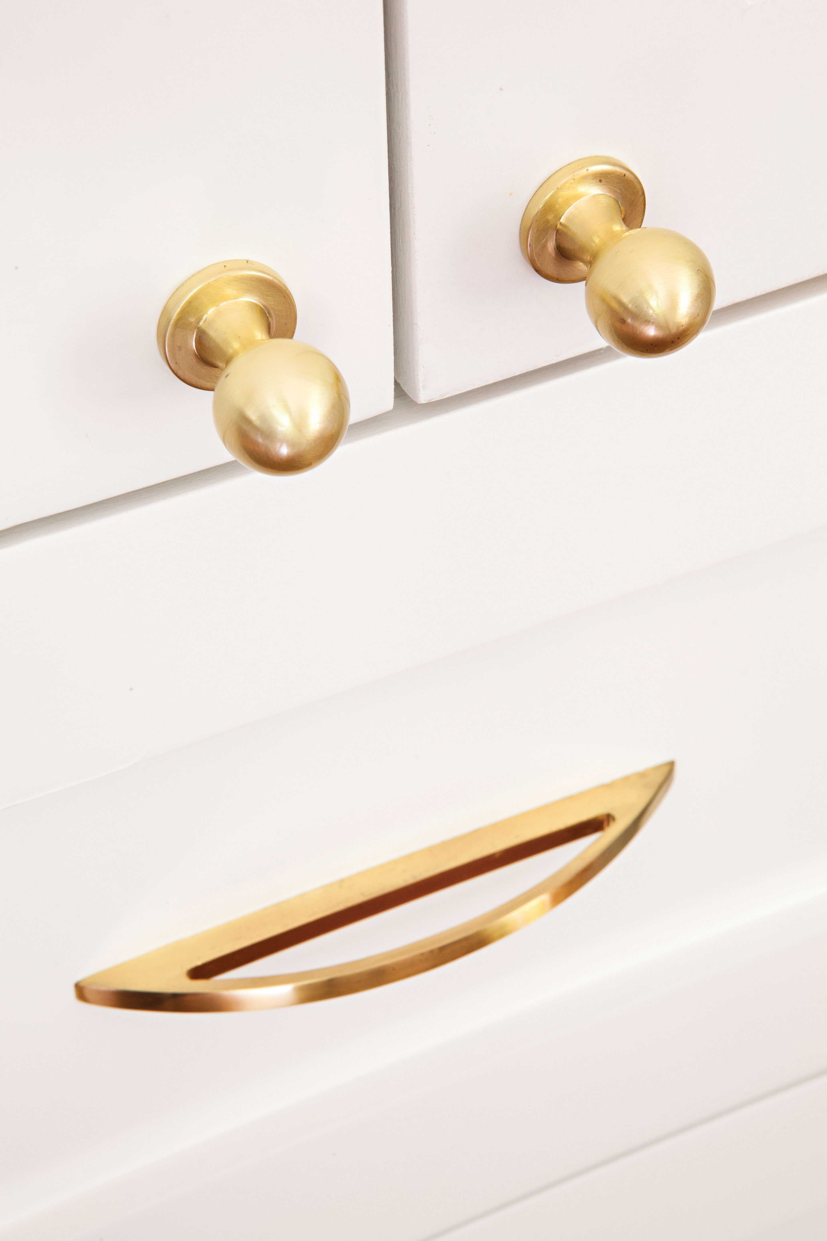
There are plenty of places for light to play throughout the day, from the backsplash’s shiny shells to the reflective gold Atlas hardware on the cabinets. During springtime, fresh flowers and fruit are used to create living displays throughout the kitchen.
Earthy Chic
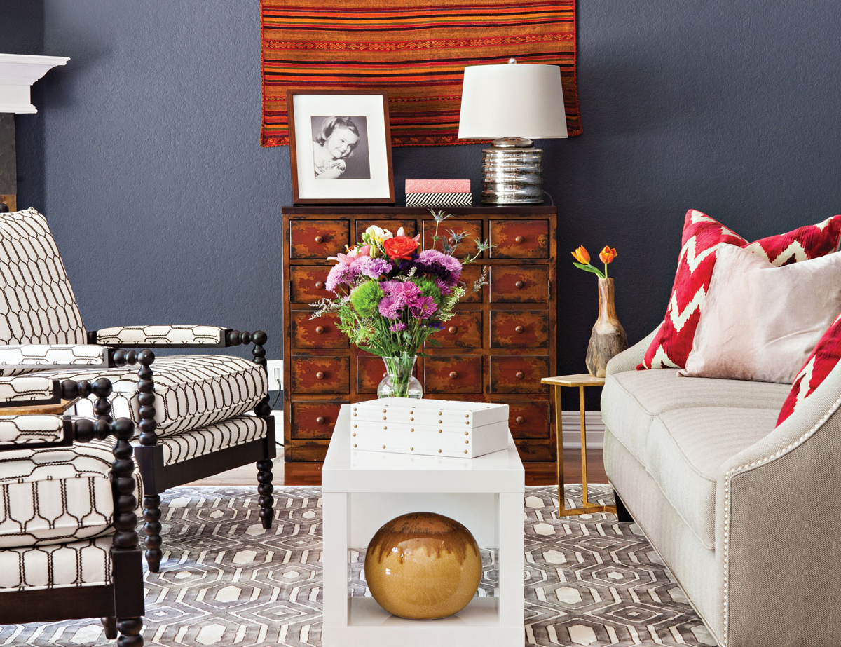
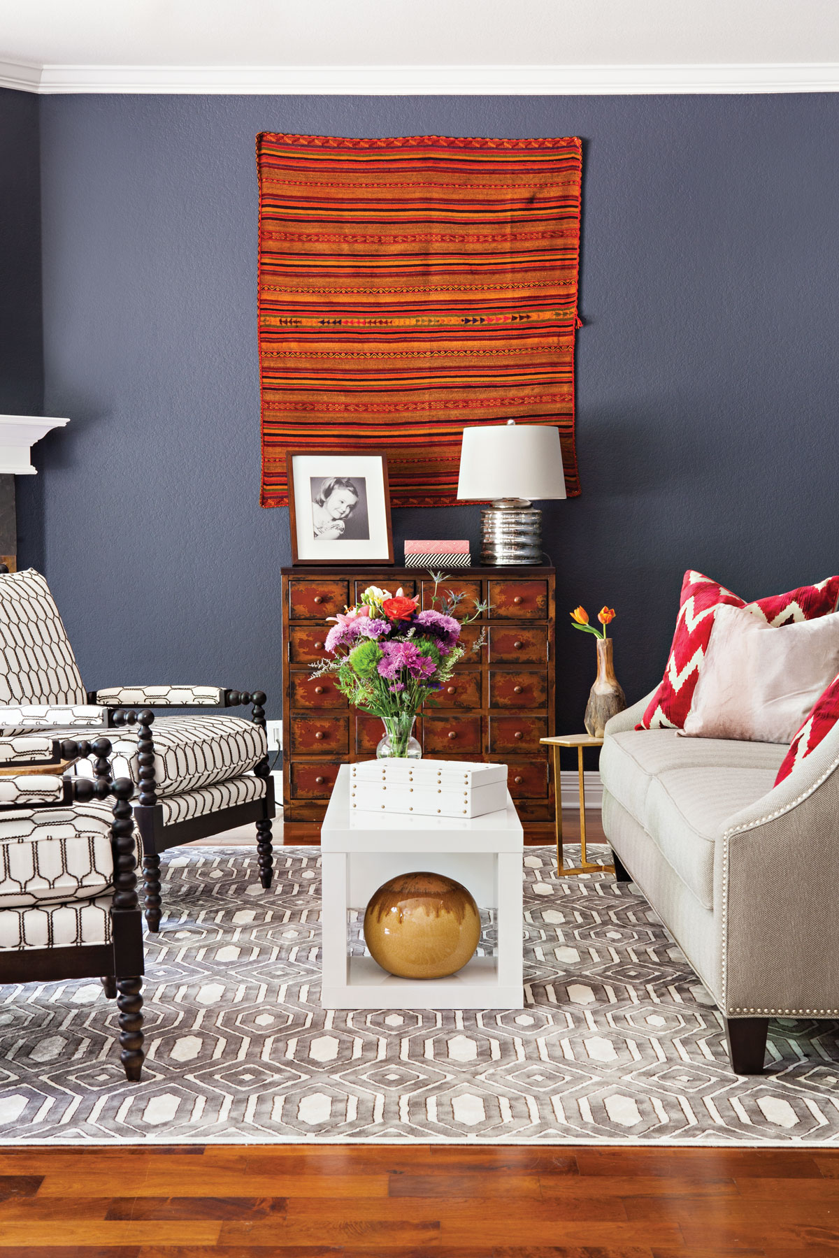
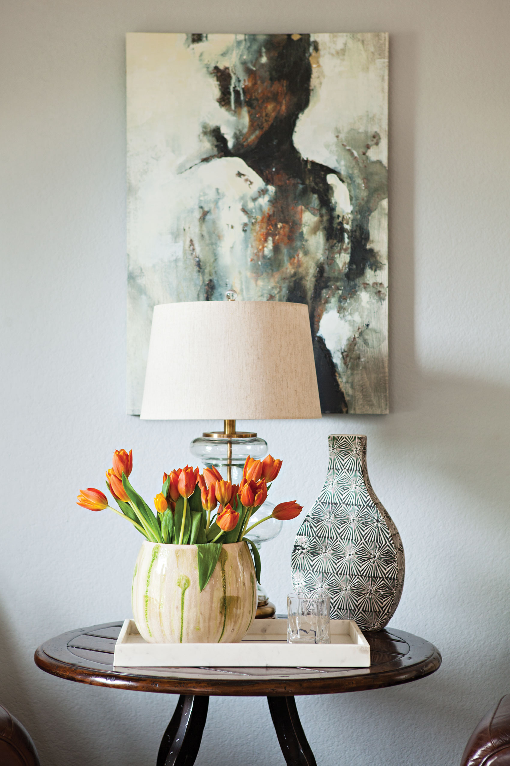
The kitchen now opens directly into the family room. Lieve made sure that the styling choices for the family room kept it distinct. She painted it a striking Benjamin Moore Graphite and then enlivened the space with artsy furnishings. She mixed and matched an Oriental Rug Gallery rug, custom Loft Home upholstered chairs, and throw pillows, finding balance in theme.
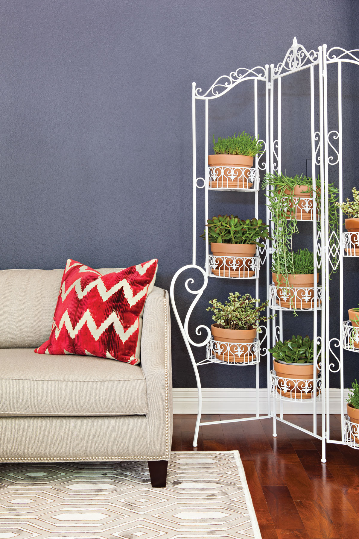
“These items come from a similar root—a tribal origin, a clean-lined nature,” she explains. “It helps them to play well with one another.” She hung an antique nomadic blanket on the wall in lieu of a traditional painting. The piece was originally used by Inca travelers and immediately added a sense of strength and history to the room. Since the kitchen and family room were interconnected, Lieve placed a wrought-iron gate holder by the couch to demarcate the spaces.
This One’s for the Kids
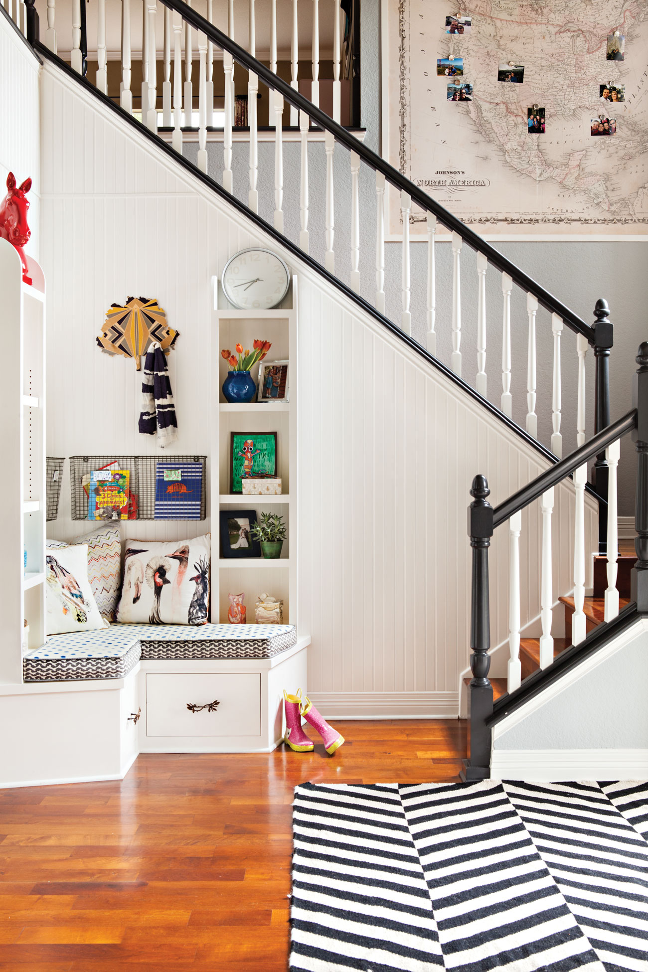
Lieve applied her same aesthetic style to the homeowners’ entry stairway. Once upon a time, the area was nothing more than an enclosed coat closet. “We opened up the space to allow for a much more welcoming entrance,” Lieve says. By removing the walls, the staircase was instantly more approachable and added visual depth to the space. In addition, Lieve prioritized functionality for the young ones. “Because the homeowners have children that come with lots of backpacks, lunchboxes and shoes, we custom designed this entrance area to accommodate things easily and tidily,” she explains. “Each child received a dedicated area for herself, which always inspires a continued love for keeping things organized.”
The walls were painted a combination of Witching Hour by Benjamin Moore and Behr’s Ultra Pure White for a simple finish. The colors were chosen to balance the classic staircase and youthful modernity of the black banister. The combination is the perfect embodiment of Lieve’s philosophy:
“When decorating, we mustn’t forget that we are not bound to the styles of our parents. Most young families are playful and energetic, and our homes should be the best reflection of that.”
Divine Dining Room
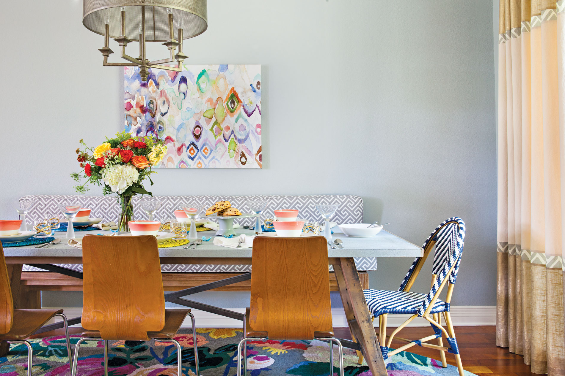
The dining room was another space that Lieve injected with a touch of lighthearted sophistication. She wanted the Franks to have a “dining room that appealed to the kids as much as the adults. With bright yet chic colors, its tones encouraged many long, lingering moments.”
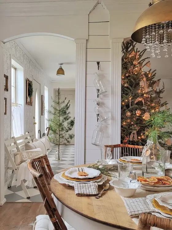
As with the entryway, Lieve paired style with functionality. She selected a sturdy zinc-topped table and graphic Riviera chairs from Serena & Lily. The lightweight set can easily be wiped down and cleaned while invoking a French coast café chair. An Anthropologie garden rug added a bold, fun feel underneath the elegant chairs, and the homeowners can enjoy the interplay of their tabletop décor with its colors.
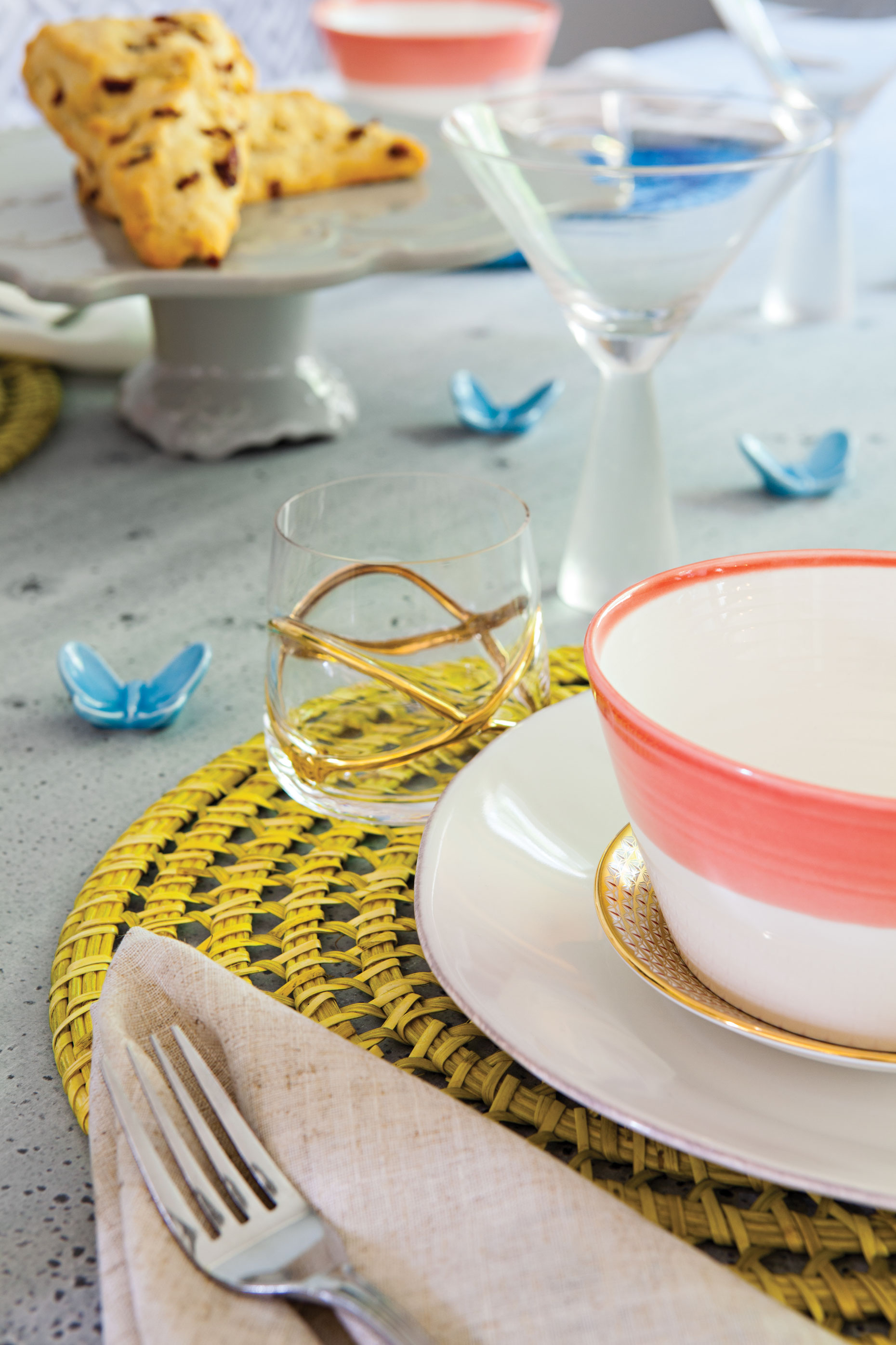
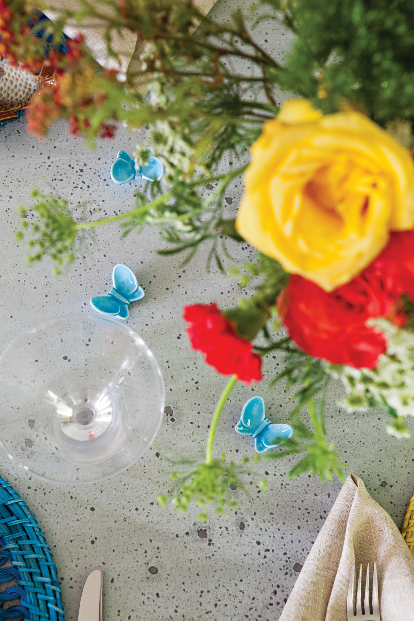
During springtime, Lieve loves to see the table decorated with fresh botanicals and whimsical touches like “playful dishes and patterned cloth napkins that make every- one feel at ease.”
After the renovations and styling were complete, the Franks fell in love with the home again and were excited to continue making new memories in the same place that had housed all their old ones. The finished product personifies the family’s priorities: a flowing place that was kid-friendly yet effortlessly stylish.
If you are looking to give your home a facelift—whether a complete overhaul or just some carefully placed new furnishings—Lieve suggests these principles that helped her style this Texas home: “Don’t take the process too seriously in that you should have fun with it. It’s OK to make a few mistakes, because they inform us. A little bit of kitsch never hurt anyone and only reminds us of how livable a home should truly be. I cannot underscore enough how important it is to be yourself in your home.”
