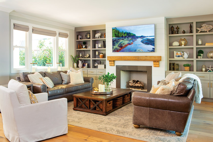
Sometimes you don’t have to travel far to find home. For AJ Olson Whitfield, a realtor and broker associate at Villa Real Estate, home is located just across the street from her family’s previous residence. However, even though they didn’t have to move far, it was quite a journey to get to home sweet home, one that included demolishing the existing house and building a new one-that exuded coastal farmhouse style- from scratch on the lot.
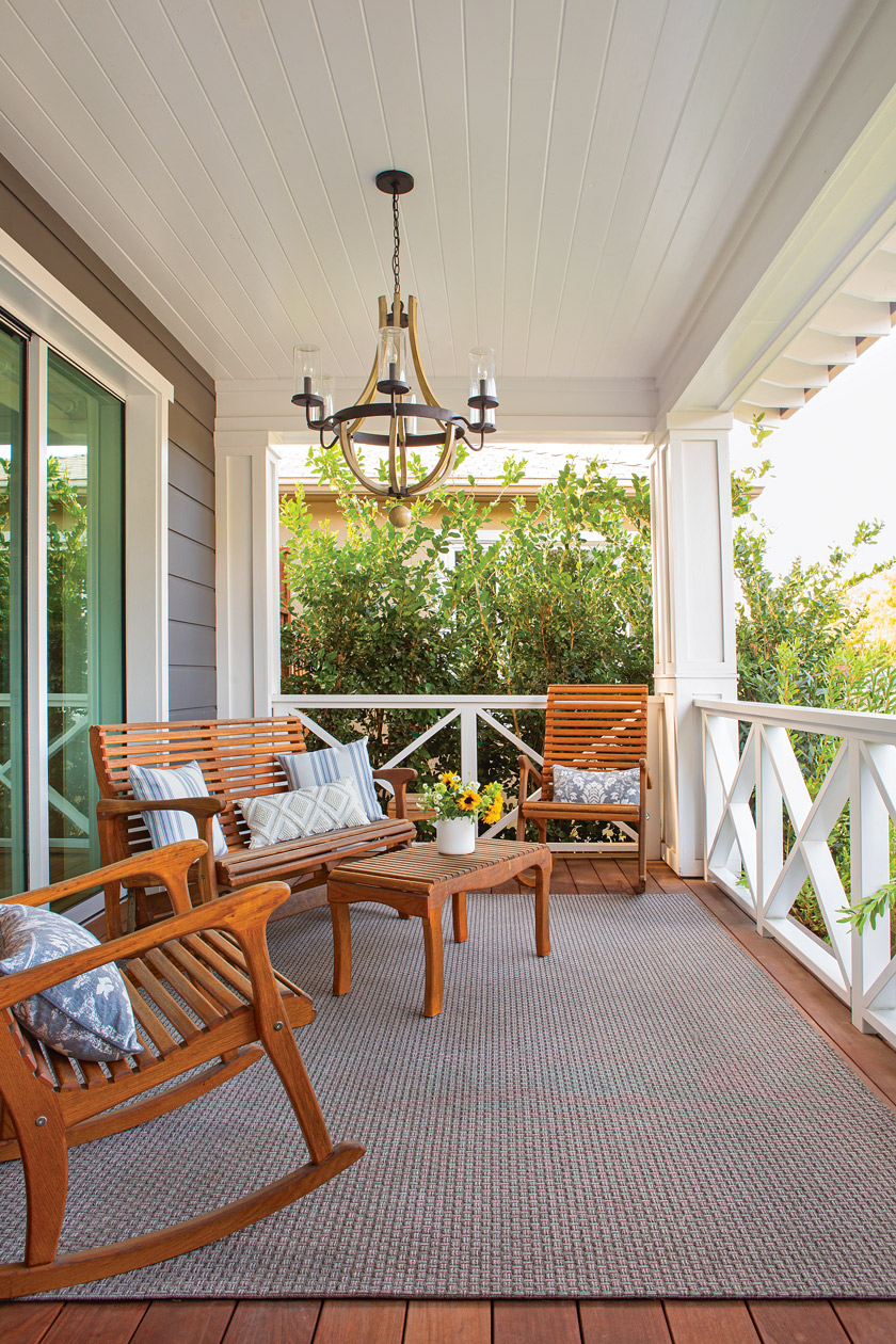

“My contractor husband, Garrett, and I love a blank slate,” AJ says. “We built our home from the ground up. I feel that new construction can sometimes come off flat, so it was important to bring in elements that gave life to the designs.” They did this by pulling from both their coastal and farmhouse styles and melding clean and purposeful lines with a welcoming touch. “Garrett and I are a great team,” AJ says.
“Most people think we are crazy … and this may be true, but we love having a vision and then turning it into a reality.” By combining their talents, they created a stunning coastal farmhouse with modern influences.
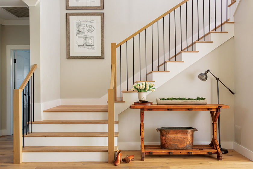
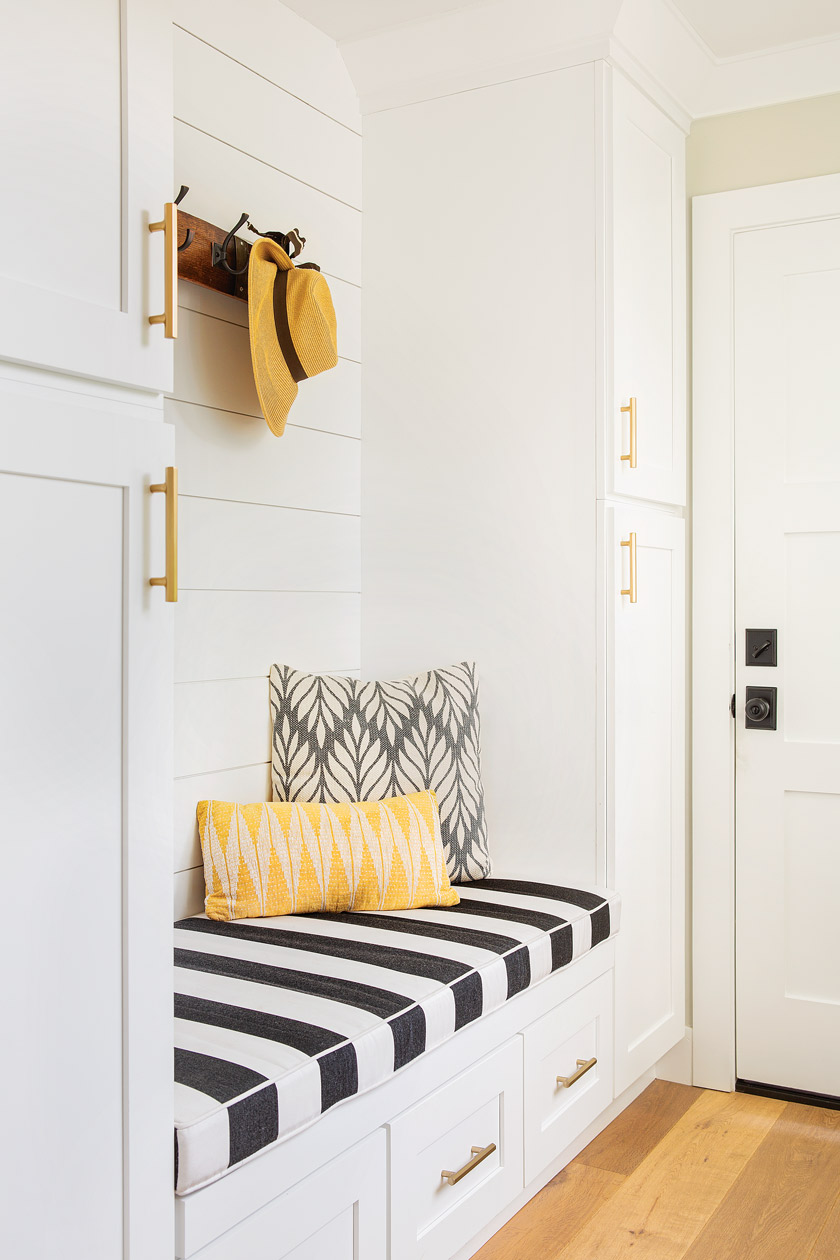
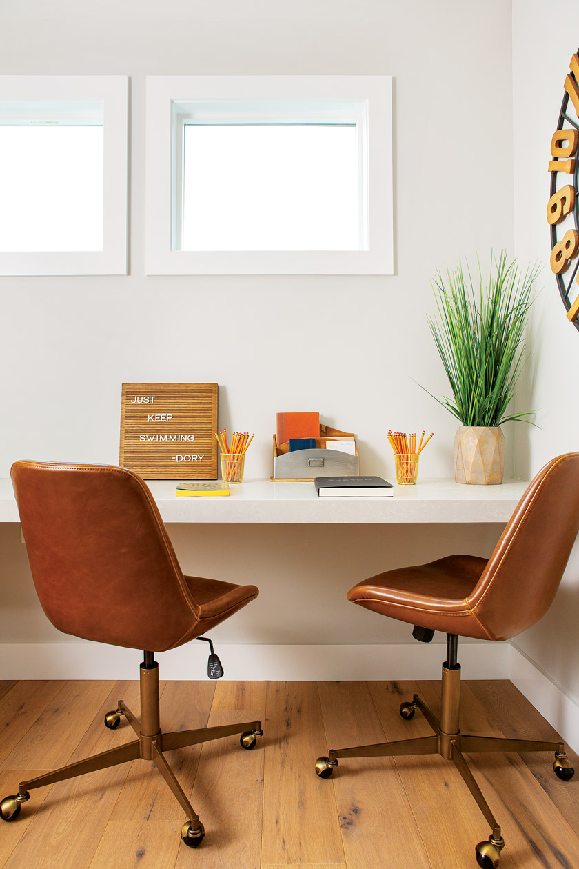
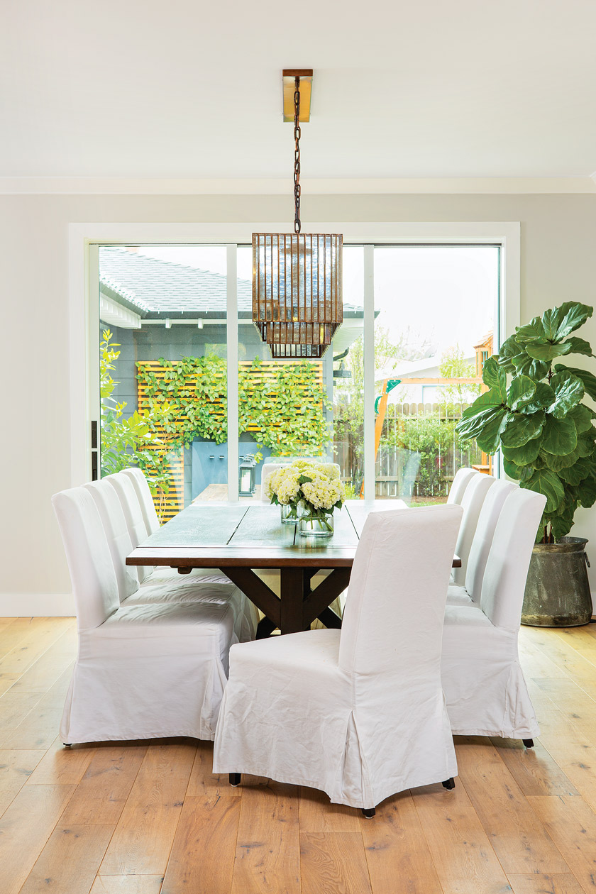
AJ knew she wanted an open floorplan with a clear line of sight from the kitchen. “When we were creating the floorplan, my husband came home to find blue tape all over the floor,” she says. “I had mapped out the living spaces and was walking around my make-
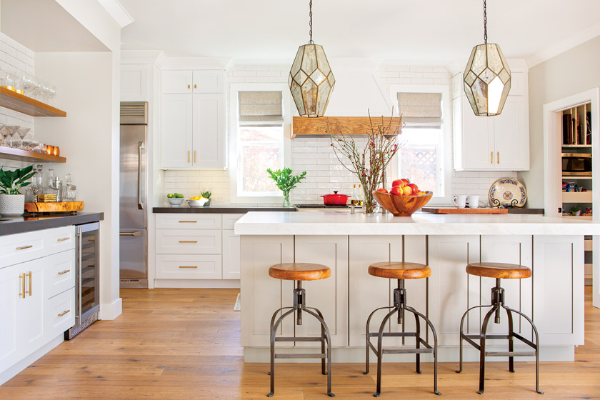
believe kitchen island.” Since the kitchen is a natural gathering space, she knew just what she wanted: a light color scheme reminiscent of the coast, warm wood finishes in true farmhouse style and accommodations for entertaining.
“I try to stay away from being matchy-matchy. Furniture should be cohesive, but it doesn’t all have to be the same.”
Related Reading: A Charming Beach Farmhouse
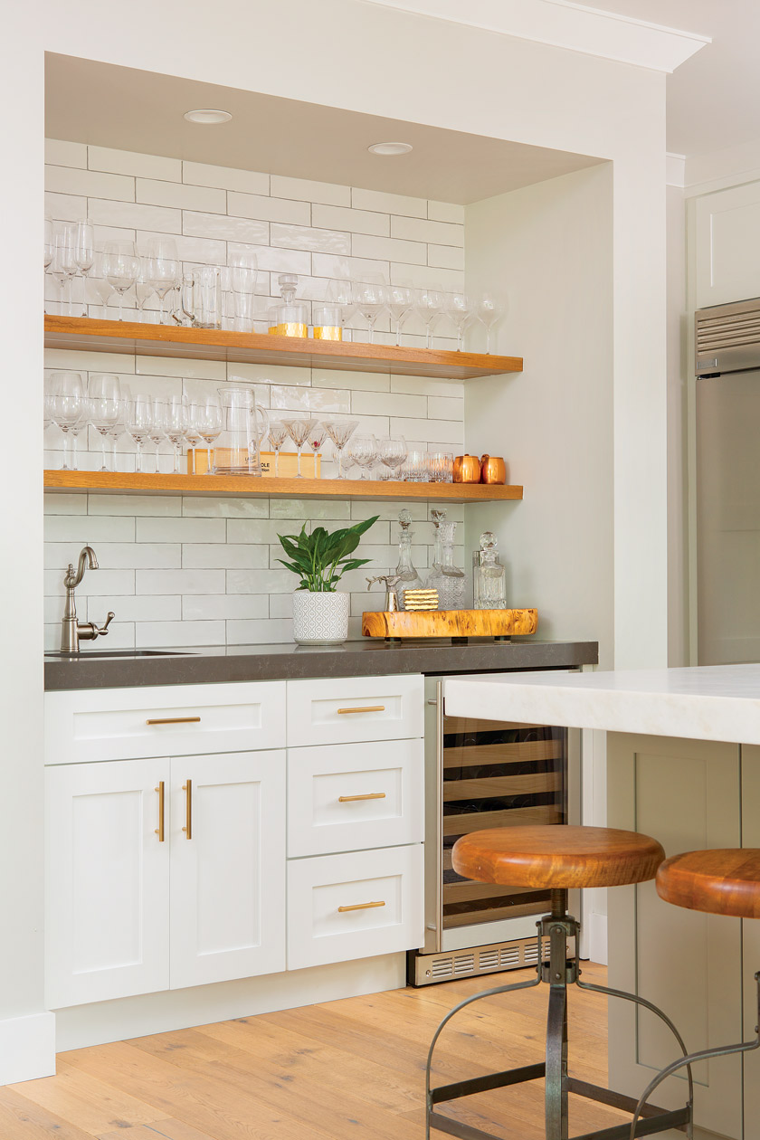
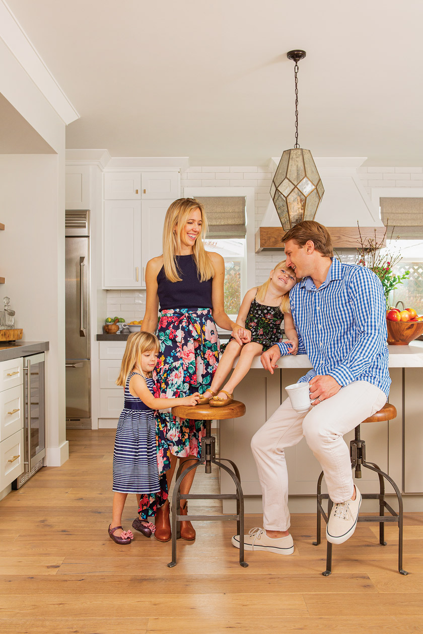
Style Radar. Barstools add extra functionality to the kitchen. AJ and Garrett came across them at their favorite local French bakery, Pandor. “People around us were just sitting there enjoying their coffee while we were flipping stools over to figure out who the manufacturer was,” AJ says. “They had the wood tops that I knew would pull the hood and open shelving all together.” The stools are from World Market.
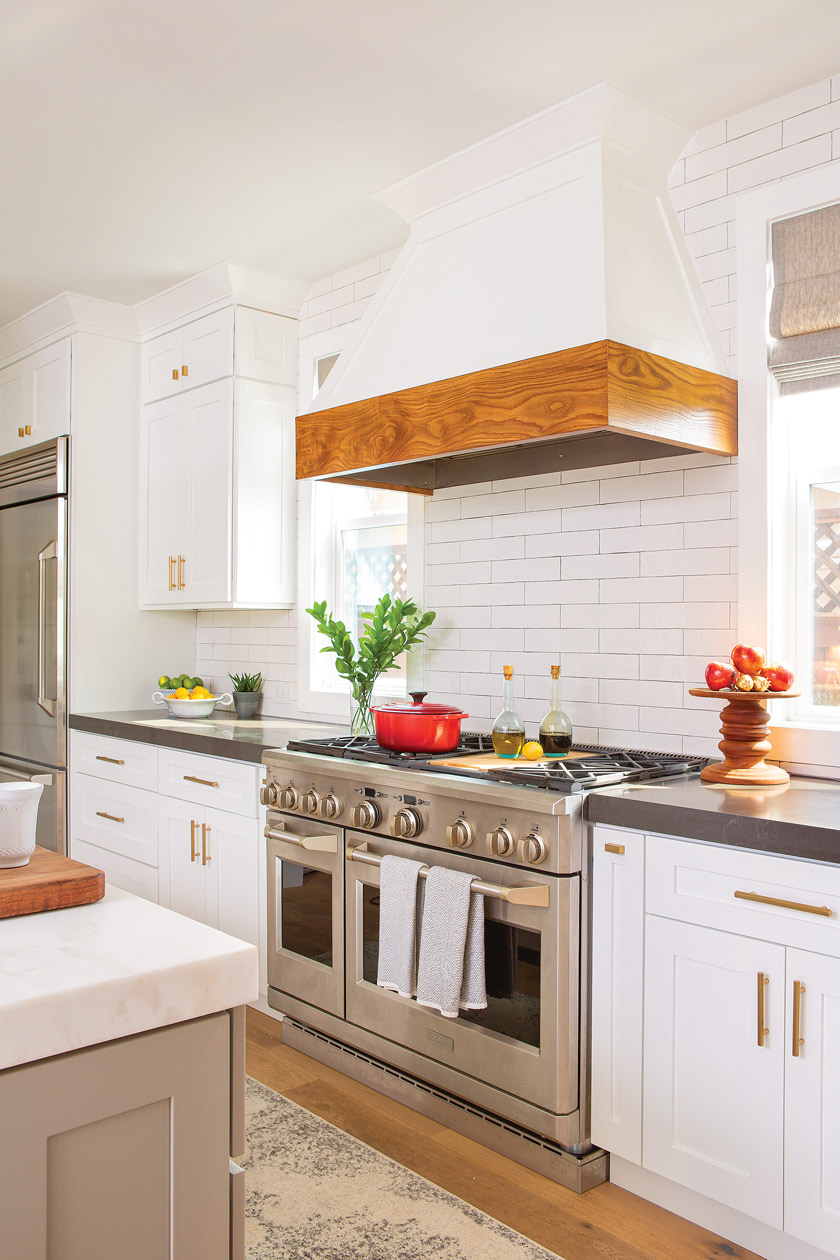
“The tile is a Walker Zanger white subway tile, and it’s crafted to look handmade,” she says. “We selected a gray grout to highlight its natural look.” AJ selected open shelves and a custom hood in natural wood finishes to contrast with the tiles. “The shelves are a white oak,” she says. “I wanted the hood to coordinate with the shelves because I love the warmth of wood.” AJ says that the kitchen is the heart of the home, and hers is both elegant and efficient.
Two sinks allow guests to grab a drink without getting into the thick of food prep, and there’s plenty of hidden storage in the island. “There is no wasted space in our kitchen,” she says. The kitchen orchestrates the movement and meaningful pauses in their active family life.
A Room for the Family
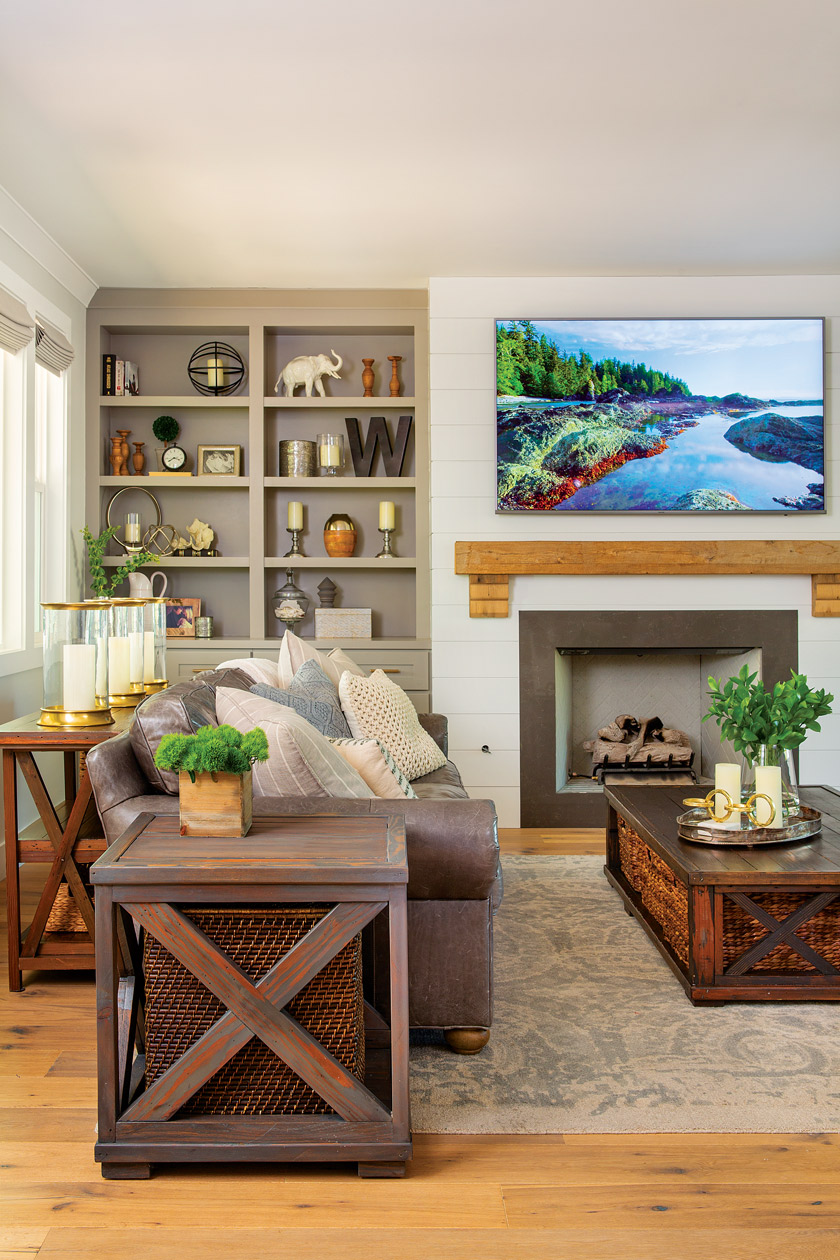
The living room is a large space but it’s still inviting. “It’s welcoming, which is important to me,” AJ says. She had matching bookshelves painted a custom color that took several samples to get right. “We wanted gray, but not blue,” she says.
A 100-year-old reclaimed wood mantel brings a rustic touch to the modern space (AJ rescued it from an old barn in East Mississippi), and shiplap siding on the fireplace adds texture. Couches from Restoration Hardware coordinate but don’t match—as AJ says, “I try to stay away from being matchy-matchy. Furniture should be coordinated, but it doesn’t all have to be the same.”
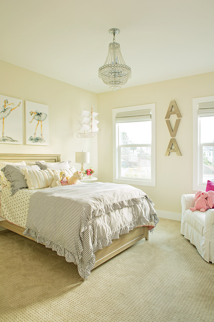
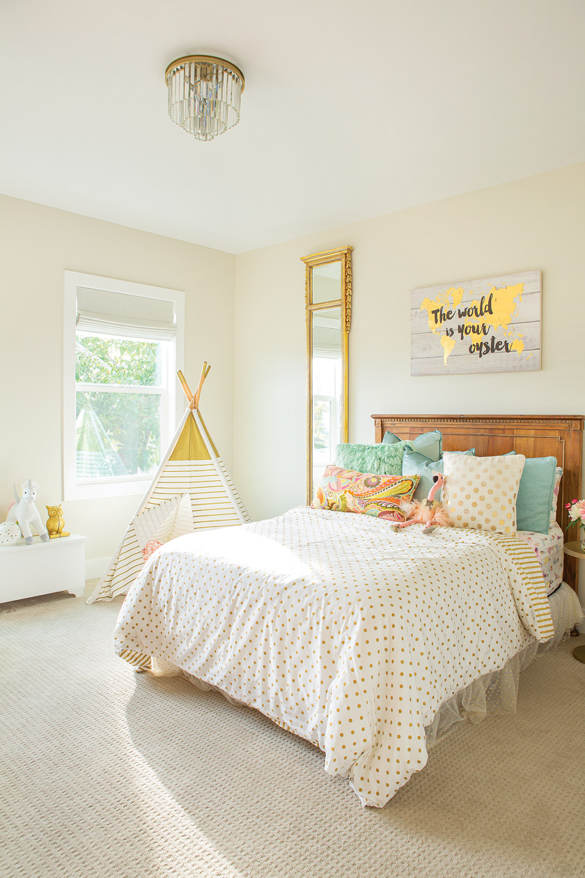
Since Garrett and AJ have young daughters, AJ made sure to build discreet toy storage into the living room. “All of the baskets in the coffee table are full of toys,” she says. “We wanted a space that the girls could play in but could still reflect us as adults.”
“I feel that new construction can sometimes come off flat, so it was important to bring in elements that gave life to the designs.”
A True Coastal Farmhouse Retreat
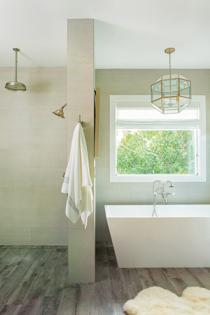
AJ describes the master bathroom as a “true retreat,” with its soothing color scheme and freestanding tub that invites long, luxurious soaks. “The color palette is neutral, yet it is anything but boring,” AJ says.
“The tile walls have a soft texture to them, and the floors are actually tile as well.” The soft colors bring rest to the mind and eyes and suggest that inside the tub is comforting serenity.
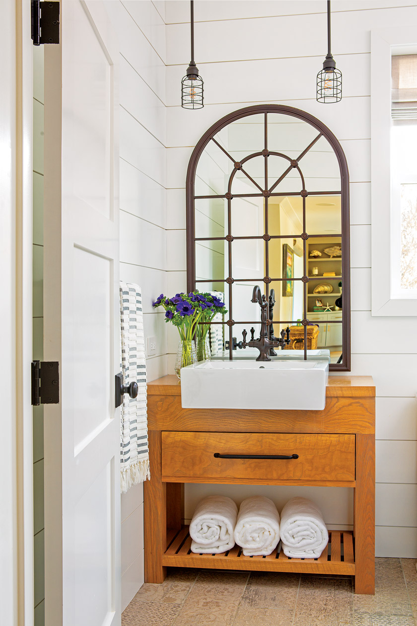
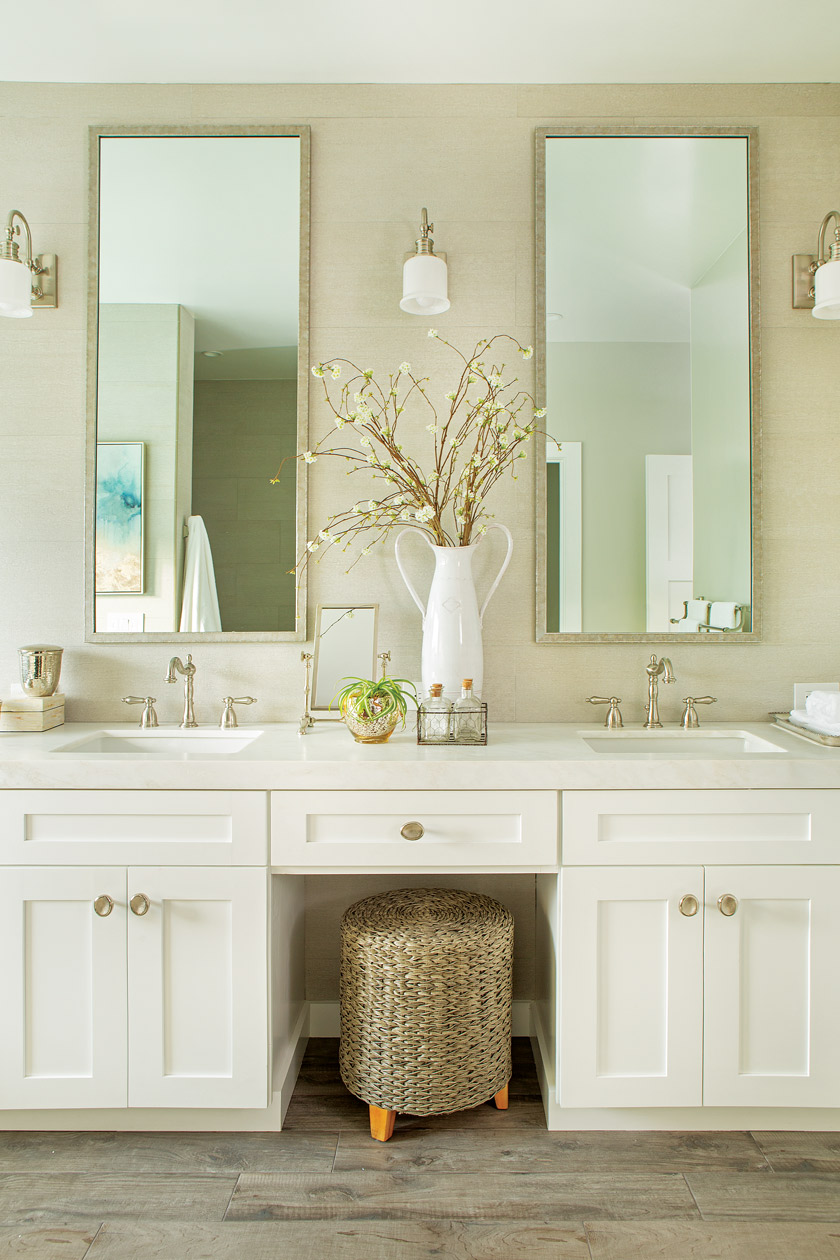
AJ knew the tub would be a natural statement piece in the bathroom. “A freestanding tub is an amazing focal point,” she says. “I knew I wanted to incorporate it into the design, but it needed to carry the angular, clean lines we have throughout the rest of the home.” The tub has clear angles (no rounded shapes here), and those lines are also found in the sink area of the master bathroom, where two elegant mirrors hang above an alabaster honed-marble countertop.
With all of AJ’s careful design decisions, the bathroom bookends the day, offering natural daylight to start off the morning with an invigorating shower and the spacious tub to end the day with a relaxing soak.
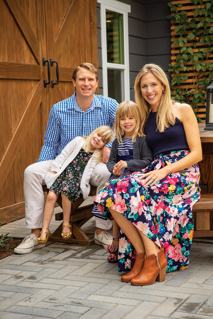
Even though AJ and her family only crossed the street to get to their home, the journey involved a whole new build. In the end, it’s a home built to hold all the love of a happy coastal farmhouse family—because that’s exactly what it was designed for.
Neutral Design Is Cool
AJ’s top tips for making a neutral color palette interesting
“Most people think we are crazy … and this may be true, but we love having a vision and then turning it into a reality.”

- Use natural elements. Their colors tend to be more versatile. “Wood, metal and leather are my go-tos for warmth and contrast,” AJ says. “Use metal (both gray zincs and warm brass) to highlight the grays and add contrast to tans. The right leather in a chair or couch can add a great deal of depth to the design.”
- Add texture. This is easiest to do with fabrics, (think pillows and throws) but you can also add it with a textured tile and finish surfaces. “For example, do a honed countertop instead of a polished countertop,” AJ says.
- Go green. “This is my best tip for bringing a neutral palette to life—literally.” AJ says. “Get plants!” You don’t need to go overboard, but a few well-placed pops of green can make the difference between “meh” and “wow.”
- Have fun with mirrors! They are neutral in nature, but you can add a great deal of character with the right mirror. AJ adds, “Be aware of what the mirror is actually reflecting.”
- Add a pop of color or something metallic. These you can easily change, like fresh flowers, a piece of art, a fun throw or pillow. It gives you a chance to punch up a design but takes away the commitment. “My favorite color when I need that extra oomph is a darker mustard yellow. It doesn’t fight with gray or tan,” AJ says.
For more on AJ Whitfield, visit her website or her Instagram.
Love bold lighting? Check out this post on Glass Pendant Lights
Of course, don’t forget to follow us on Instagram, Facebook and Pinterest to get your daily dose of cottage inspiration!

