If you’re in the mood to pare down and simplify your décor, we can help you get started. In the spirit of clutter free living and wiping the décor slate clean, we’ve gathered 7 of our favorite house tours that will inspire you to take the minimalist approach.
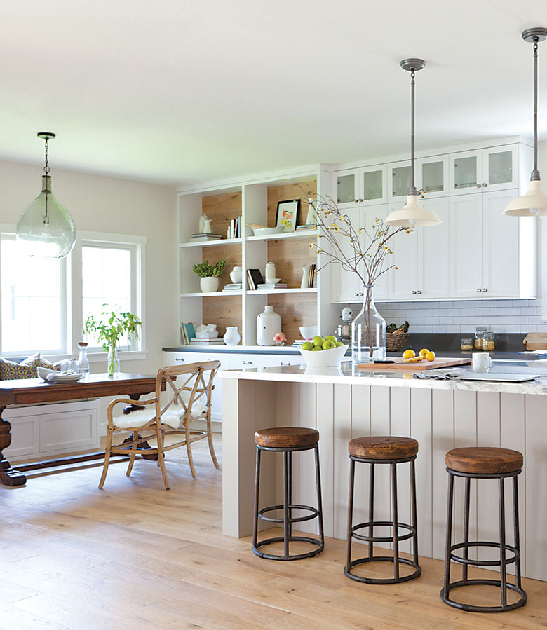
Rustic Minimalism
Sleek, contemporary lines, rustic finishes and a touch of nautical bring comfort and elegance to this beach lover’s dream cottage designed by Kate Lester. The parameters for the space were simple: make it open and airy. The open shelving by the dining room is a great example of editing your style and keeping the look simple and unfussy. “Limitations are what make you creative,” Kate says.
Click here to see the full tour.
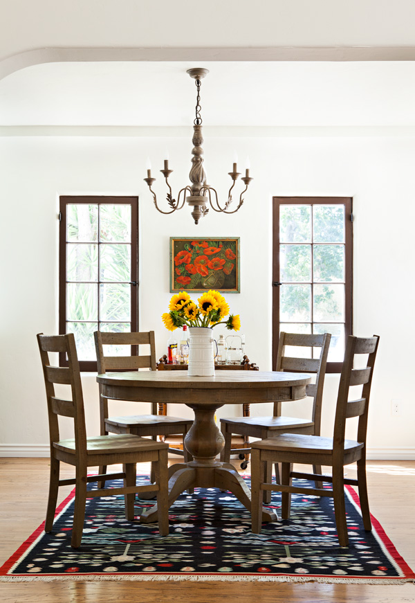
Minimal doesn’t have to mean modern. Julia Chasman designed this sweet and simple dining room in her Spanish colonial cottage in Eagle Rock, California to help give the small space an open airy feel. By omitting the window coverings (these windows get their privacy thanks to a high fence and shrubbery) and using nothing but a beautiful rug and elegant period-style furniture and lighting, she lets the age of the home shine through.
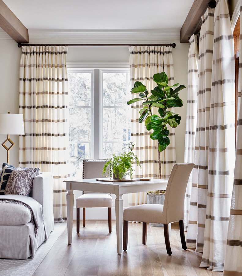
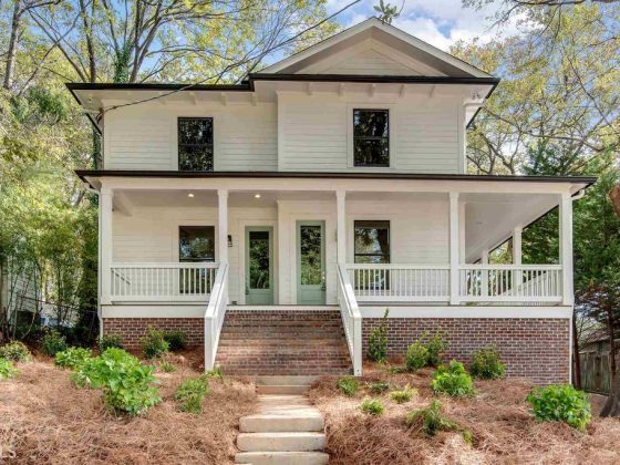
Southern tradition doesn’t always play well with modern minimalism. But interior designer Lauren Davenport Imber of Davenport Designs, Ltd., says all you need to create a contemporary look imbued with Southern sensibilities is a clear focus and a keen eye for balance. In this Atlanta home, she even moderated her use of color. “We used the color blue as our contrast color throughout the house; you’ll see it in the family room and then you see it in the bedroom,” Lauren says. “We did it sparingly so that it added some interest and some detail, but it wasn’t the main focus of the room.”
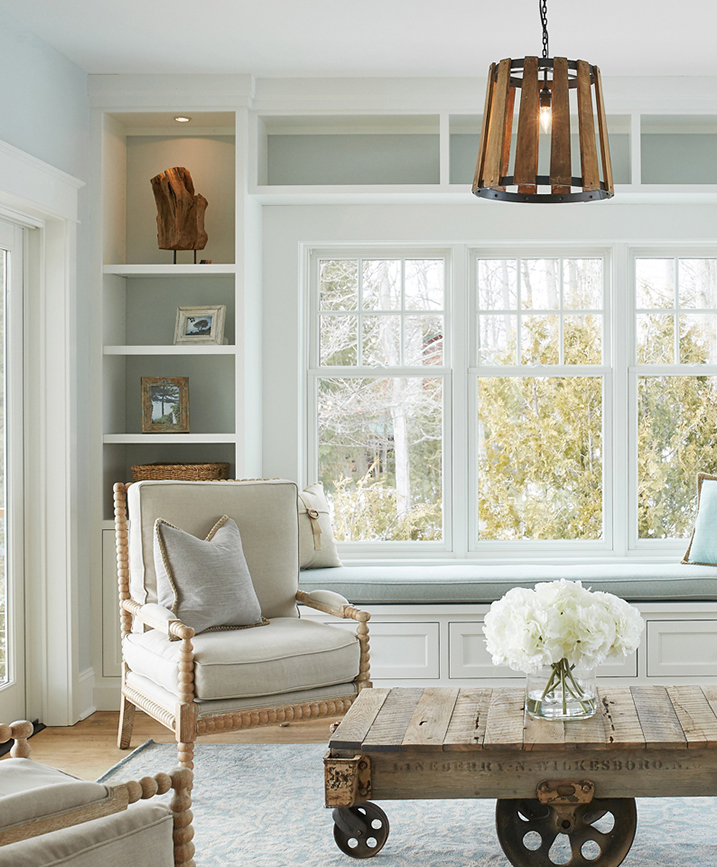
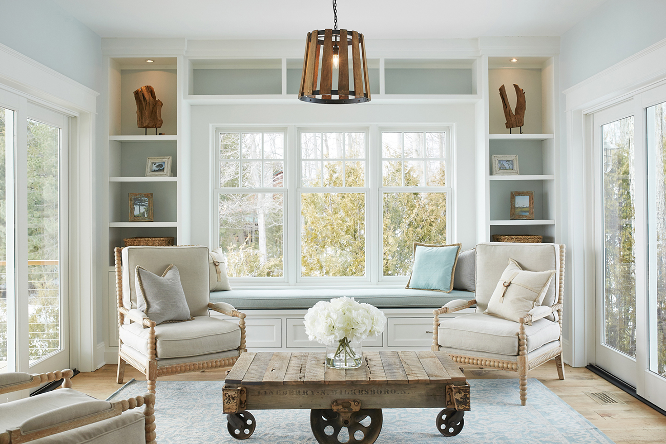
Forget everything you know about rustic and nautical style because the Michigan cottage on Lake Charlevoix breaks every design stereotype, making it a unique oasis of open and airy style. Bookshelves are a pitfall for over-styling. To avoid that, designer Amy Darooge, of Villa Décor says to think about using your display spaces to tell your story. “We feel that built-ins are places for storing or displaying cottage memories. I love going into old cottages and looking at what history is being displayed with a built-in shelf.”
Click here to take the full tour.
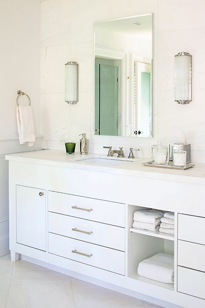
The great thing that happens when you edit down and pare back is that the investments in your room really get to shine. Nancy-Margarit Toon of Hound Hill Design chose updated but period-friendly elements for this turn-of-the-century cottage in Southampton. “The bathroom is completely white,” homeowner Elena Frigeri says. “The marble we used is a very white marble, so I didn’t want to do colored towels.” Instead of marring the effect, she enhances it by pairing white with white. The pristine glow captures natural light and makes the space feel light and clutter free.
Click here to take the full tour.
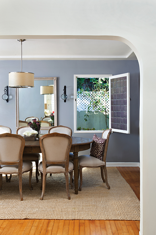
As a well-known jewelry designer, Amanda Keidan has an eye for aesthetics. So when it came to decorating her own Venice Beach, California, cottage, she achieved what many people find impossible: the successful combination of 1940s architecture with clean, modern lines and a clutter free design.
Click here to take the full tour.
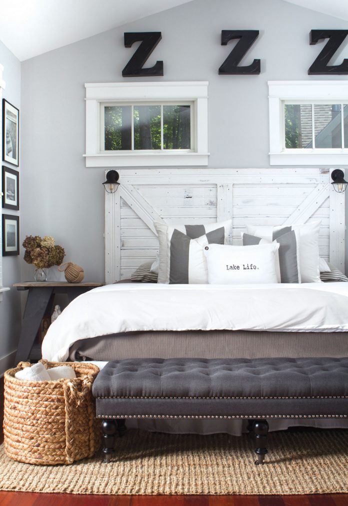
You don’t often think of clean and minimal when you think of vintage and industrial style, but The Flippin Designer Betsy Glass proves the two can mix. Betsy aimed to keep this 1920 lake cottage “light and airy” for a coastal feel. Part of what makes her signature urban cottage—“a farmhouse look with a touch of industrial” look work is editing.
Click here to take the full tour.
Want more ideas for cleaning and organization? Check out this post on clean and clutter free home offices.
Don’t forget to follow us on Instagram to get your daily dose of cottage inspiration!

