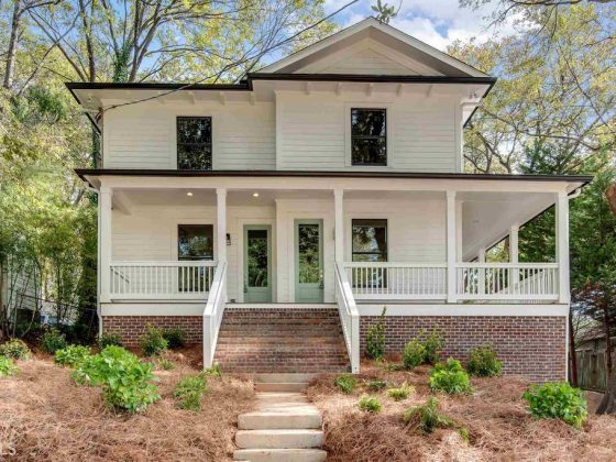
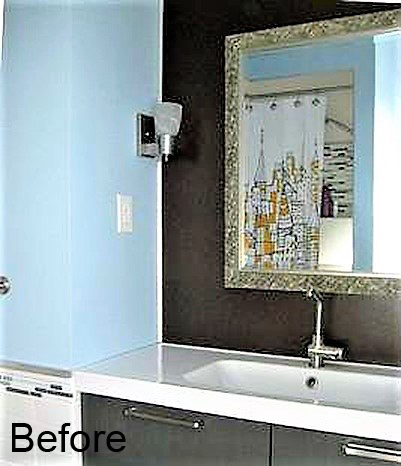
The State Street Statement! I’m excited to walk you through the main-level bathroom before and after where we completely opened up the walls and added a washer/dryer closet along with a curbless walk-in shower and a vanity double the original size. I was able to accomplish this by reshaping the closets in each adjoining bedroom. We, of course, could not lose closet space in bedrooms for resale value, so we reframed and redesigned the closets in both bedrooms. There was a hidden closet built into the bathroom from the master bedroom that had been closed off at some point, so I reused this space in the remodel. In the guest room, I removed the existing closet and gave the space to the new shower and framed in a new closet. But before we get into the nitty-gritty, here’ s a look at the bathroom before.
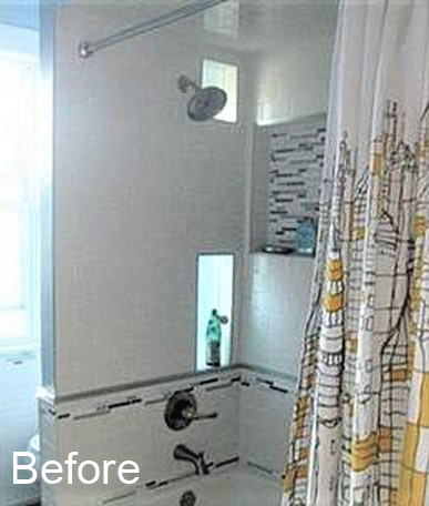
As demo started, we found some major electrical no-no’s. Since this home was built in 1920, electrical codes then and today have changed considerably. We found live exposed wires behind the shower panels that we demoed, it was truly a blessing to renovate this bathroom from a safety standpoint!
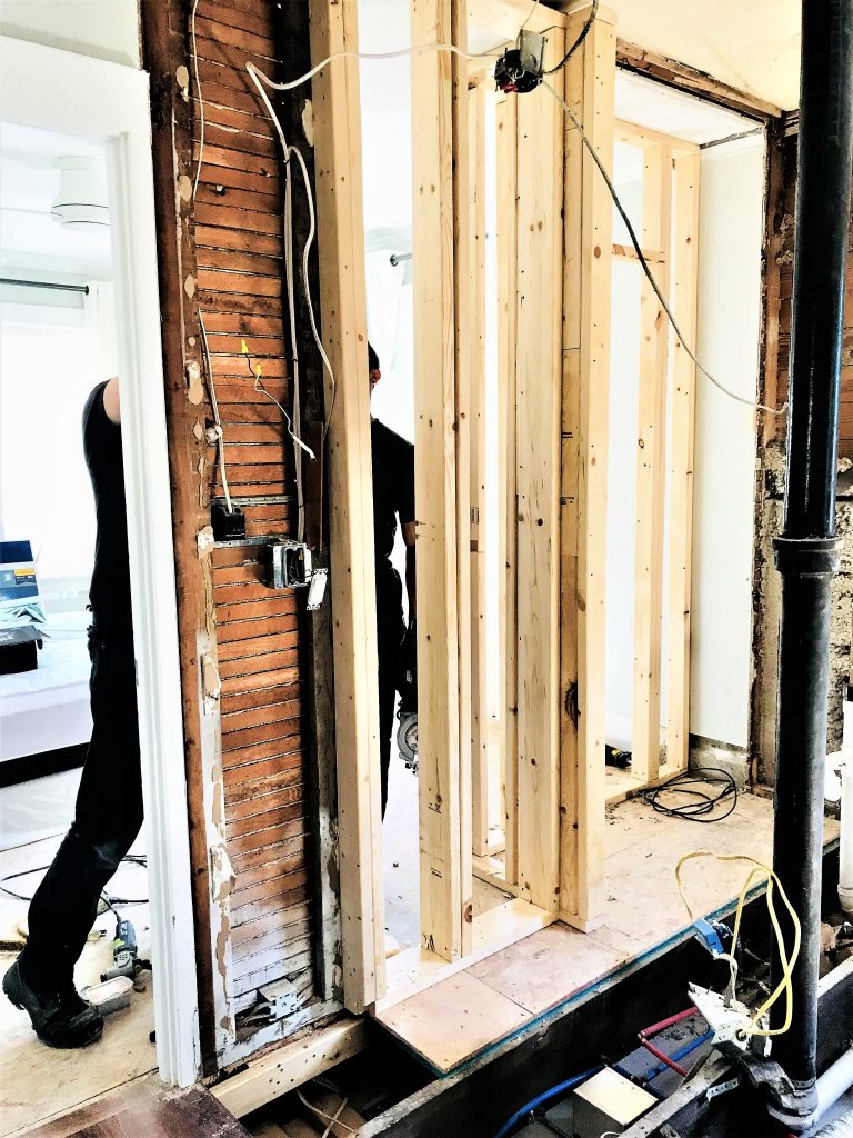
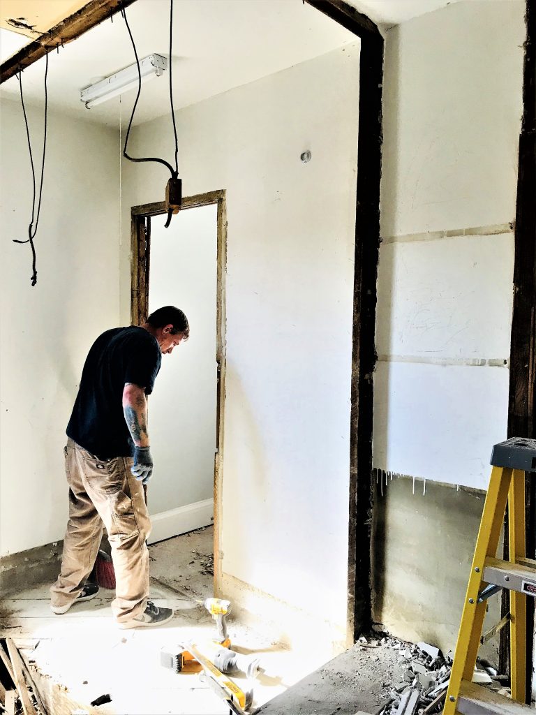
Keep in mind for all of you remodeling an older home, this is not the first house we have found exposed wires in so be safe. After demolition was complete, we needed to address the floor joist since I designed the new shower to have no curb and be seamless with the rest of the bathroom floor. This took some reconstructing, but knowing what the end result was going to be it was well worth it!
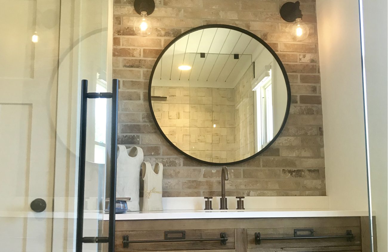
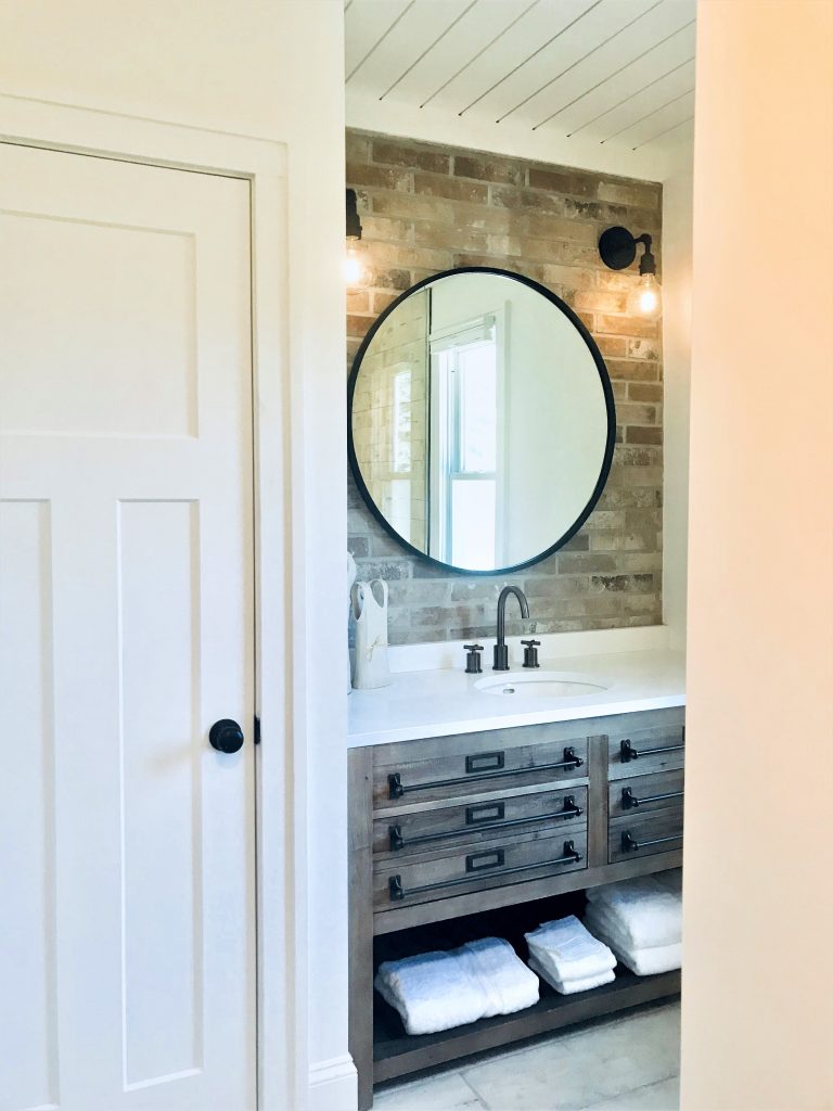
Keeping in mind the age of the home and the rest of this full house renovation, I really wanted to pull in character, warmth and charm! I wanted to pull in the vintage charm and farmhouse flair, so I decided to use a reclaimed wood vanity from Restoration Hardware with drawer pulls that made their own statement. I just didn’t want to paint, wood, or wallpaper the back of the vanity wall, I wanted this to really make you feel part of the 1920’s era. So I added a brick vintage looking tile that completely resembled the original brick that was part of the home, along with an oversized round mirror with black trim. The black trim on mirror really pulled in the hardware on the vanity to make a complete package. When picking out vanity lighting, I wanted to make sure to be simple, but classy and not take away from the brick wall. So, I went with a more industrial black teardrop lighting for each side of the mirror. I also added shiplap to the entire ceiling of the bathroom to give us the old school feeling…it worked! Here is the bathroom now!
When picking the floor and shower tiles my client really wanted to stay light and airy, but have lots of character. I decided to go with a very large 2ft x 2ft wall tile that resembled basket weave, along with 12 x 36 whitewashed tiles for the floor. This really flowed beautifully with the Simply White by Benjamin Moore wall paint, brick, and warm wood vanity. To make a statement, I chose Oil Rubbed Bronze finishes from Signature Hardware for the shower and vanity faucets.
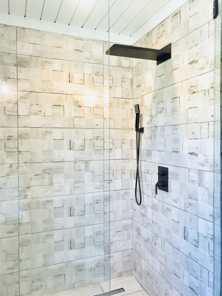
The amazing shower head is definitely as heavy as it looks and needed some bracing during construction. To give my client that wow factor shower, I went with seamless glass doors paneled from floor to ceiling along with a 2-foot door handle with the same finish. This really made this large shower look even larger. Now my client had everything she wanted on her wish list storage, large vanity and shower, linen/washer-dryer closet, and a toilet location that was not the center of attention. DONE! Hope you all enjoy!!
The Flippin Designer works nationwide via remote design services! Let us turn your house into a dream home! Check us out at theflippindesigner.com or follow us on Instagram & Facebook.
From all of us at “The Flippin Designer” we wish you and your families and pets a very happy healthy New Year!
Missed the first installment of the State St. Bungalow? Check out the overview here!

