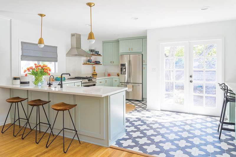
This 1940s Spanish home in the San Fernando Valley of Los Angeles was the winner of a House Hunters Renovation episode on HGTV. The young homeowner was granted a paid renovation to one of the rooms in her new house, and she chose the kitchen. That’s where Caitlin Murray of Black Lacquer Design stepped in.
Maximize Space
“The kitchen was in a pretty bad state,” says Caitlin. “It hadn’t been updated since the ’80s.” They did a complete remodel of the space that spanned four months and included major changes like knocking out walls and moving doors and windows. “The client is a young woman, and she wanted something open, airy and eclectic—nothing specific to one style,” says Caitlin. “The original kitchen was tiny and cramped with a strange layout.” A wall separated the kitchen from the dining room, and there was a washer and dryer in the corner. “It was a big waste of space, because there wasn’t any storage,” says Caitlin.
Small to Spacious
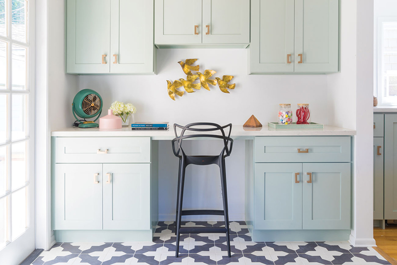
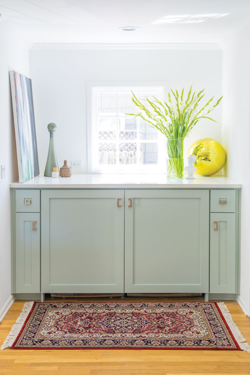
To improve the use of space, she moved the washer and dryer to the wet bar area right outside the kitchen and replaced them with a desk area.
“Due to the limited space in the house, every area has to serve multiple functions.”
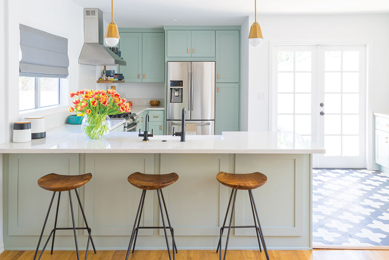
The desk is great for work, but can also be used for prepping food. The new washer/dryer area is a miniature laundry room and can double as a buffet area when friends visit. To open up the kitchen, they replaced a small window with French doors that allow light to shine through the glass. They also knocked down one of the walls, but were cautious to not create too a layout that was too modern. “We needed a balance between opening up the floor plan and keeping the integrity of the small vintage house,” says Caitlin.
Style Mix
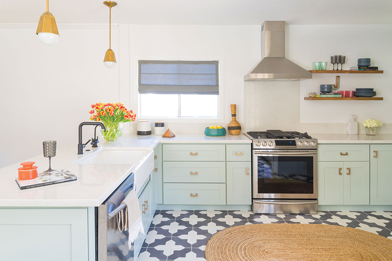
To complement the vintage feel of the rest of the house, Caitlin worked with a soft color palette. “I didn’t want anything to be too shiny or new, so we stayed away from gold and went with brushed copper accents,” she says. “The basic Shaker style is always the answer to in between styles.” When trying to achieve a fresh and eclectic style, it can be difficult to know where to begin. “Every element depends on every other element, so I have to design it all at the same time,” Caitlin says. When choosing the materials, it’s best to pick patterns that don’t distract from one another. “You have to pick what you want to be the star and the supporting cast,” she says. “The tile was the statement piece, and we went from there.” Caitlin also made sure to create a balance with the color palette. The walls, counters and cabinets are bright, so she added matte black plumbing fixtures, a chair, stools and black-and-white tile to balance the look and make the bright colors stand out.
Use Caitlin’s tips to achieve your dream kitchen
1. Cohesive Contributions. Before you make any renovation decisions, look at what you already have. “Consider the style of your home. It’s important to make things cohesive before you start,” says Caitlin.
2. House Bones. “Kitchens have architectural details, so start there,” says Caitlin. You’ll want to make sure the style you’re planning complements the existing details.
3. Black and White. Don’t forget to add some dark tones, even if you want a bright kitchen. “Fresh doesn’t need to be all light,” says Caitlin. “What’s fresh is the contrast of elements, so black will make the whites feel fresher.”
4. White Walls. “You can never go wrong with white paint,” she says. Not only will white walls make your kitchen feel clean and bright, it will allow you more creativity with your décor colors.
5. Function, Not Future. Don’t stress about choosing a design that will still look new in 30 years. “Everything changes, and everything is always going to look dated eventually,” says Caitlin. “Cater to your present life and what makes you happy now. Make it a reflection of who you are and how you want to spend your time.”

