Wouldn’t it be nice to escape your busy life to a serene setting of nothing but green pastures for miles and miles? On days when some rest and relaxation are in order, this family of four, who appreciate the calm and quiet of a small town outside of Austin, Texas, retreat to their midcentury ranch where they can enjoy the simple life. They rebuilt the home from its dilapidated state into a welcoming space that spoke to the family’s desire for comfort and togetherness and that also tips its hat to Texas style.

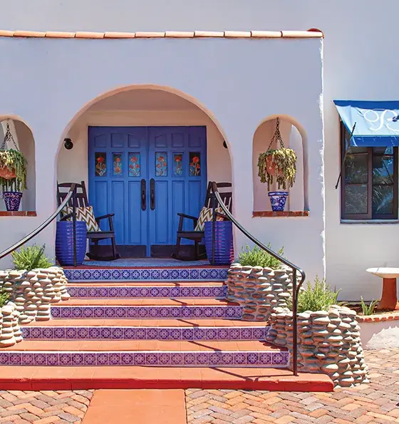
Exterior. Outside, the architecture blends classic pueblo style with a chic and sleek farmhouse look.
“They were looking for a place where their family could spend quality time and not be focused on the modern-day routine,” says Christina Simon, senior designer for Mark Ashby Design. She worked with lead designer Mark Ashby on the project to give the home its relaxed, “underdesigned” flair. “It’s based around nature … and stripped down in its simplicity.” Here Christina lets us in on the basic elements behind the home’s casual and comfortable aesthetic.

Entryway. This dutch door has quaint, old-fashioned charm, but—don’t tell—it was added in the remodel.

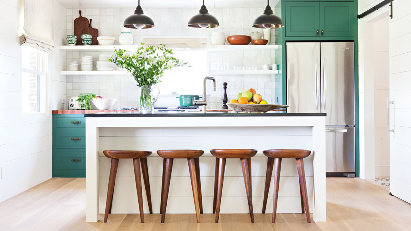
Kitchen. The kitchen and dining surfaces are all about variety, from the smooth marble of the Eero Saarinen dining tabletop and the sharp black island top to the looks-like-it’s always-been-there mesquite countertop. Special consideration was given to include handmade details from local artisans, including the wall hooks and bench in the entry and the industrial-style custom light fixture above the kitchen island.

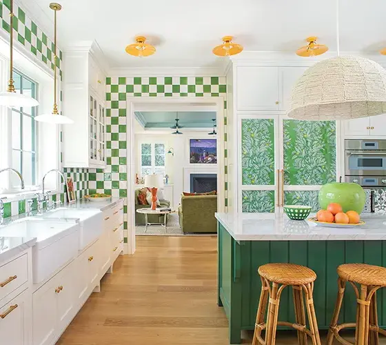
Kitchen detail. Shaker style cabinetry painted green looks like it could be original to the home, while matching green leather pulls add some Texas flair.
While the family has an eye for design, they were mindful from the beginning about keeping the vibe low-key and easygoing. Christina accompanied the couple on many shopping excursions to scout unique finds that capture a well-traveled look.
To pull off an effortless and eclectic aesthetic, they juxtaposed a mix of midcentury and modern furnishings with handmade accessories and artwork by local artisans. “They wanted to make sure that everything in their house resonates with them and isn’t merely for show,” says Christina.
Furniture in neutral shades, both midcentury and modern, warms up the interior and adds a stylish touch, such as Hans Wegner wishbone chairs gathered around the dining table, clean-lined wood bar stools, a super-soft leather sofa and a hand-built wooden bench in the entry. “That’s the great thing about modernism—the designs are so classic that they will endure as good design,” Christina says. “The simplicity of the lines is what makes them classic. They just feel good.”

Master bedroom. Another nod to bohemian influence, the master bedroom is a cozy nest, thanks to floor-to-ceiling draperies that wrap across the walls and a full upholstered bed with ample luxe bedding.

Kids room. A pair of twin spindle beds covered with bright Pendleton blankets give this kids’ room nostalgic timeless style. The shiplap walls capture a classic look while infusing the room with a treehouse-like coziness.

Guest bath. The guest bath reflects the owner’s love of modern art, with patterns and colors that reference fun pop-art aesthetics.

Mudroom. The back entry mudroom proves that in serene minimal spaces each element must be impactful. The Moroccan-inspired tiles sing in the space, while richly textured items like the bench and the hand-made iron wall hooks complement the space.

Laundry room. Christina carved out space to include a laundry area in a recessed portion of a hallway, where a sleek black counter (which pops out into a bathroom on the other side of the wall) and open white shelves provide stylish storage, and a cute curtain neatly hides the appliances.

