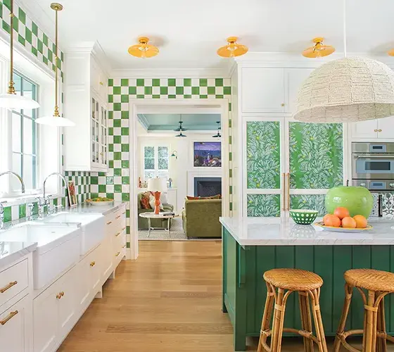
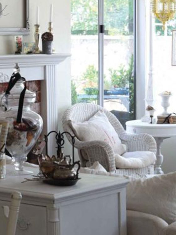
A design team helps a growing family turn their historic home into a whimsical place for their children and a comfortable place to entertain guests.
Homeowners David Samikkannu and Michelle Doctor loved living in their charming Colonial-style home, built in the early 1900s in Larchmont, New York. But with one young child and another on the way, they realized they need to update their Colonial home so that it could grow along with their family. They sought the help of designers of Lina Galvao and Erin Coren, principal designers of Curated Nest Interiors, during the renovation process to make sure their requests could become a reality.
“The homeowners reached out to us to initiate a renovation and interior design,” Lina explains. “When we met the couple and their son (plus baby on the way), we connected immediately. They had recently moved to Larchmont from New York City, and we met during the pandemic. They both worked full time and didn’t have a design vision, though they knew what they wanted functionally. They wanted their home to be comfortable for hosting and having kids play, and luxurious enough where they could feel comfortable there for years to come. The couple is super cool, with tons of world travel under their belts and an appreciation for enjoying their limited free time to the max.”
Inspired Ideas for the Colonial Home Update
The home’s location influenced the design team’s vision for the project. “Larchmont, New York, is a charming historical suburb of New York City in Westchester County,” Erin says. “This home is in an adorable, charming area of downtown Larchmont, with many historic homes. The streets have sidewalks and are walkable to bars and cafés downtown. The neighborhood caters to young families and feels alive. Homes are relatively close together, though home size is generous.
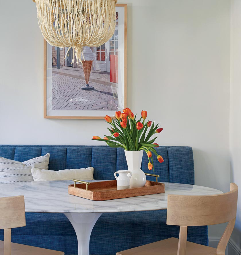
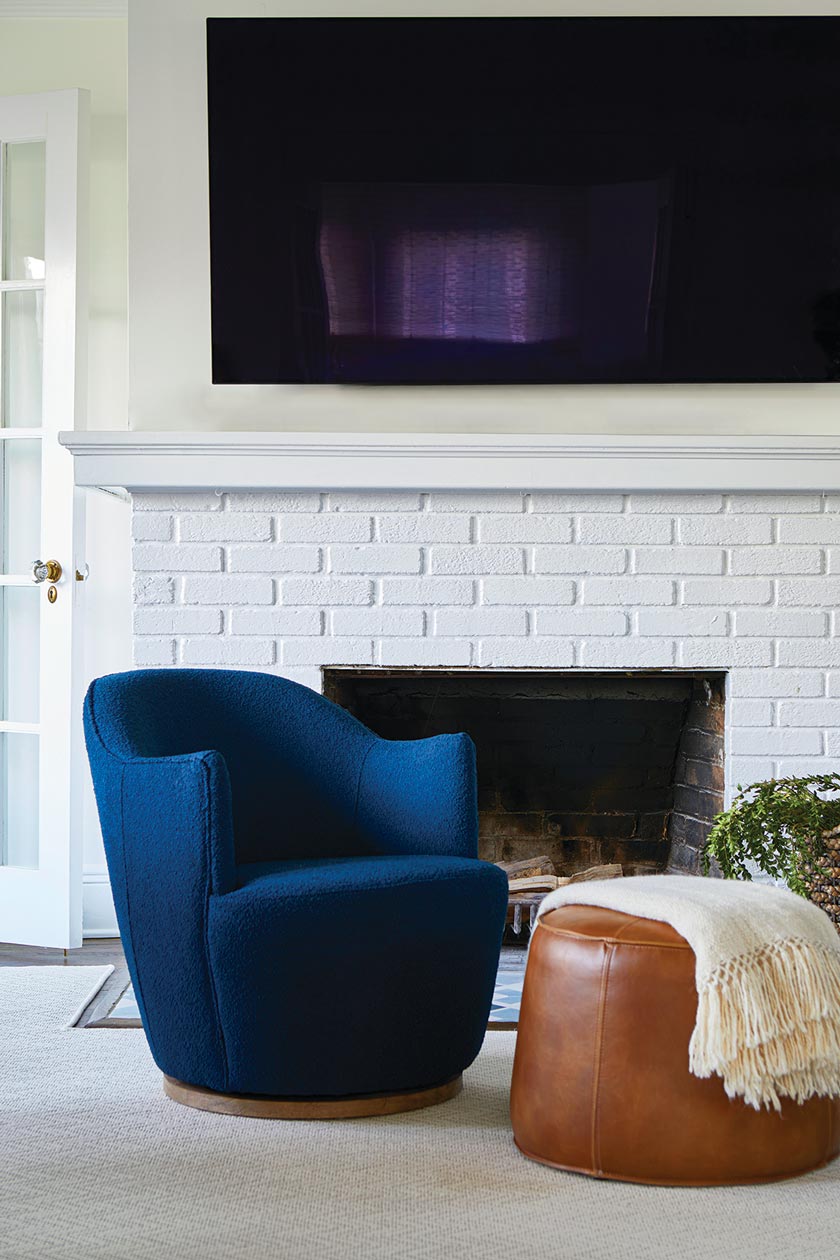
The area feels very ‘neighborhoody.’ Given the vibrant neighborhood feel, we chose fun artwork to bring in energy and whimsy. We also updated some of the historical features in the home (like the fireplace), keeping it relevant but still honoring its surroundings.”
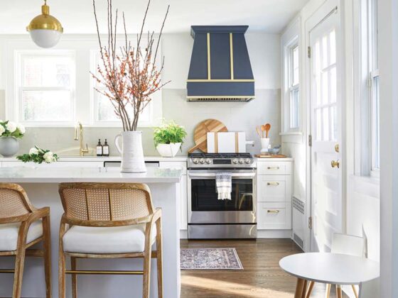
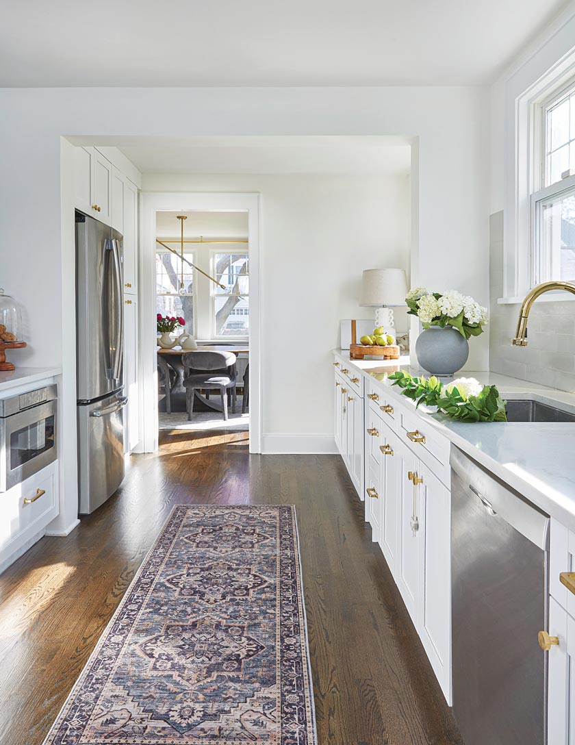
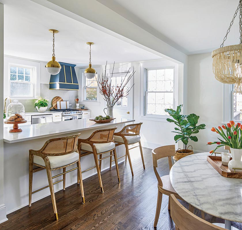
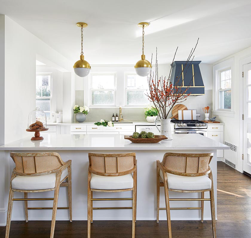
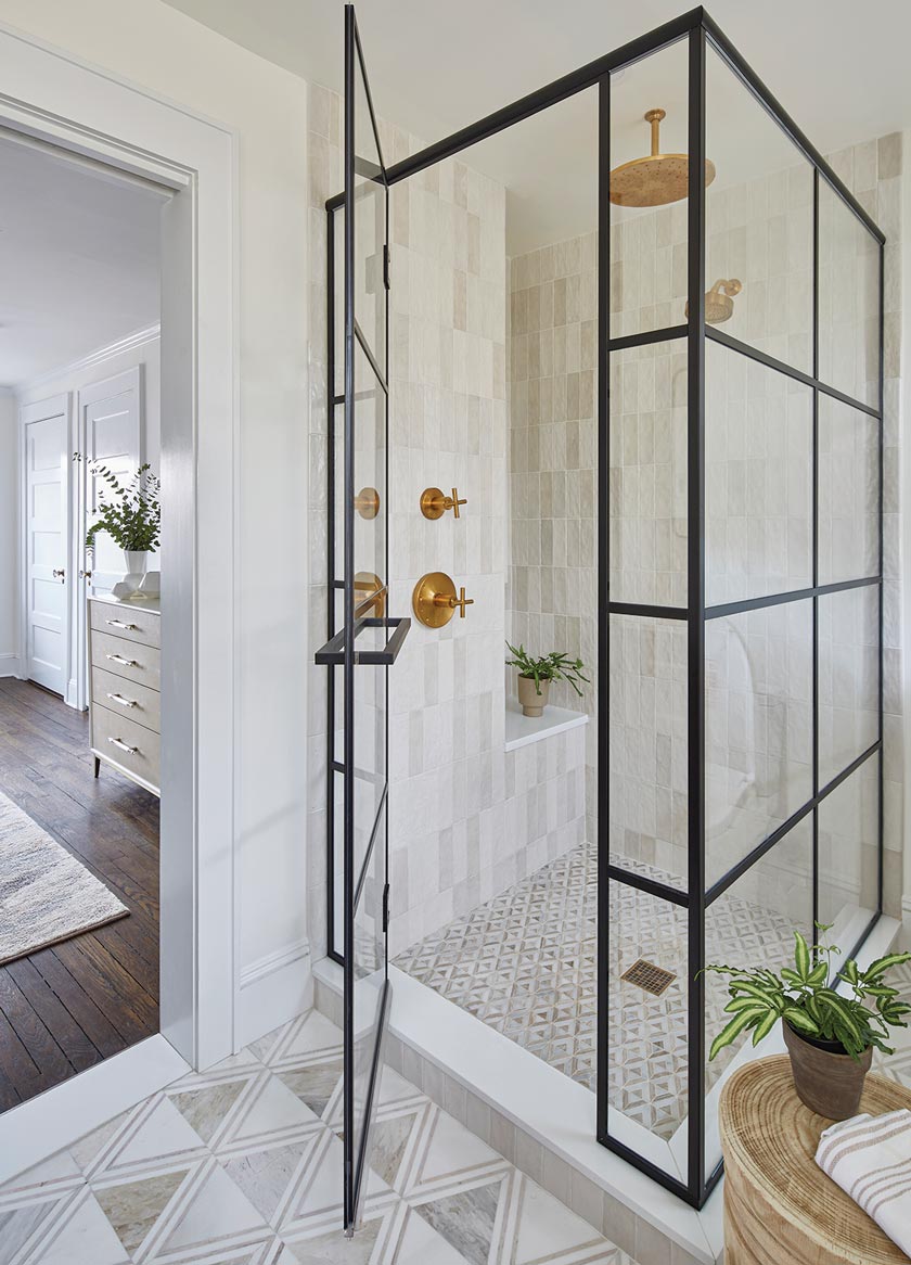
Making the century-old Colonial home update livable for an active family while respecting its history was the primary design goal. “We wanted a blend of modern while honoring the original architecture,” Lina says. “The kitchen especially had some more traditional features, such as the pendants and the range hood. The home has three bedrooms and three-and-a-half bathrooms. It is built on three floors, including a spacious finished attic that we designed as an office for the husband and a rec room/‘man cave.’ Many of our design choices were based on how to improve layout, flow of people in the space and functionality for the couple: two busy working parents. We were able to change a dysfunctional layout in the primary bedroom, outdated bathroom and unused bonus room into a gorgeous suite with a home office that is used daily. We also reworked the kitchen for more storage and counter space. There are now three large pantries.”
First Impressions
Colonial architecture can inhibit the flow of the interior spaces, especially with center stairs that divide the house into two sides, the designers say. “The home had a choppy layout due to previous remodels and the inherent layout of a center-hall Colonial,” Erin says. “The kitchen was dark and lacked counter space and storage, and was disconnected from the eat-in area of the kitchen. Living and dining spaces had ample space and the home had character due to its historic nature. The most jarring room was the primary bedroom, which was oversized but had a tiny bathroom and a large closet which was poorly laid out and mostly not functional. So, while the home had some clear issues in layout, we immediately saw that it had potential. The home also gets great light in many rooms, though our client had very little furniture to fill the home with, coming from an New York City apartment.”
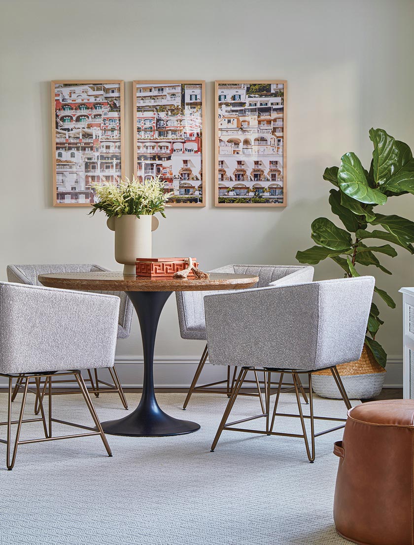
Residents’ Requests for the Colonial Home Update
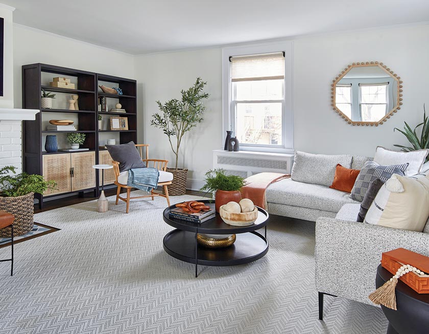
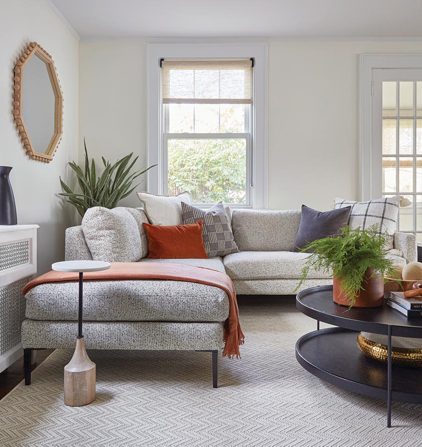
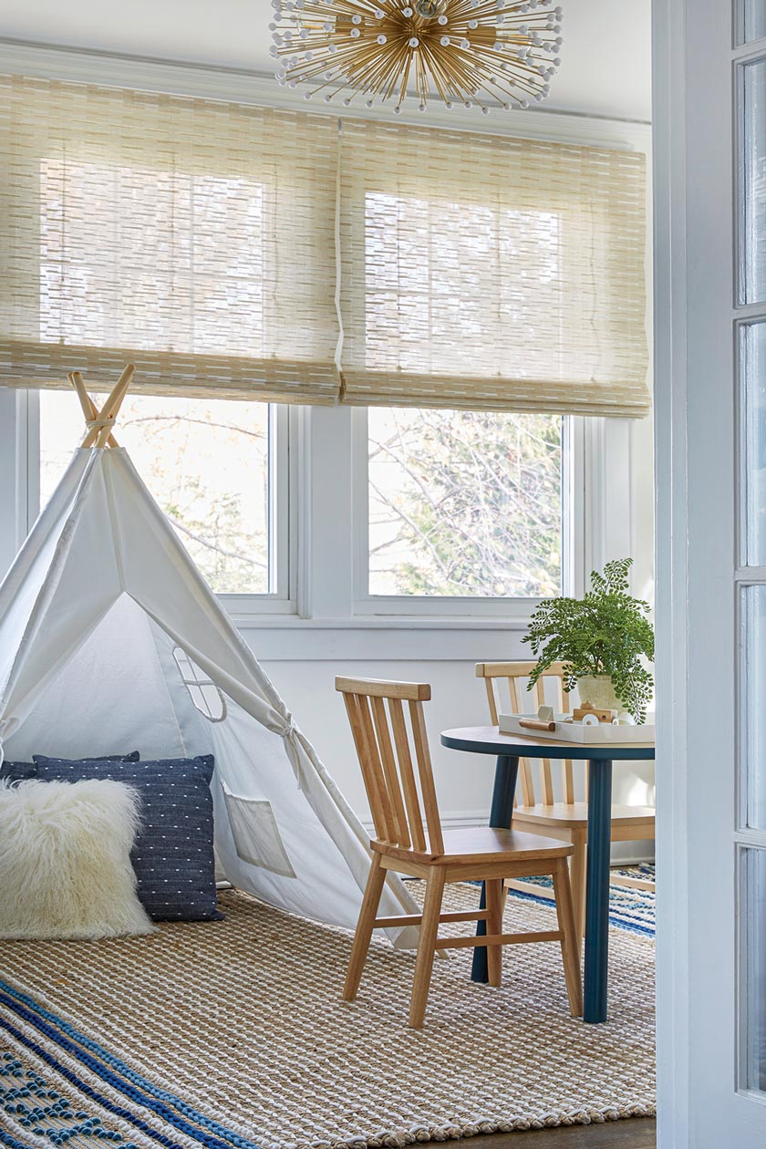
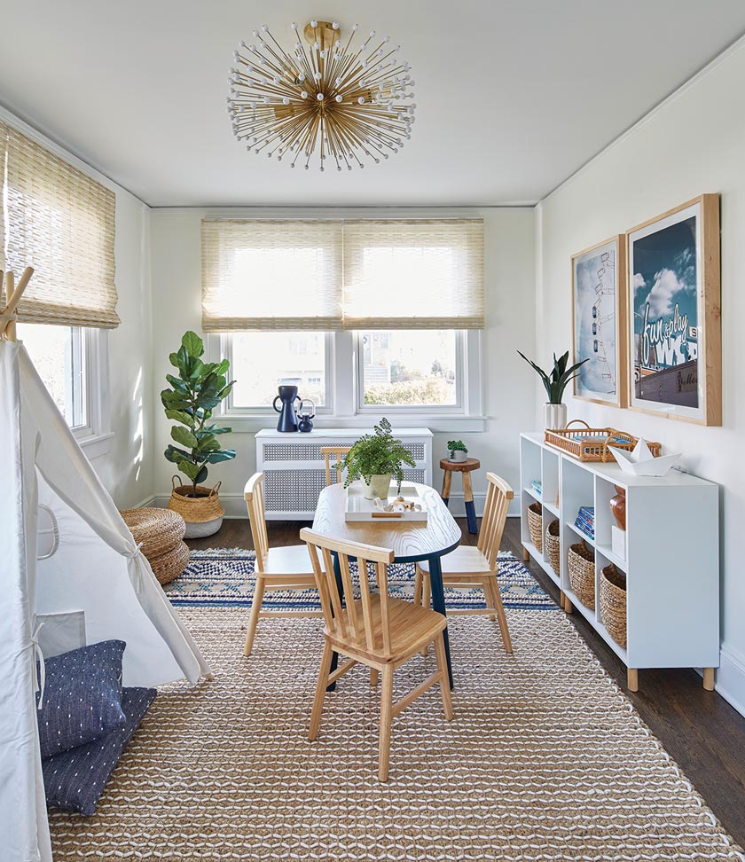
The designers had to flex their creative muscles to accommodate the couple’s different style preferences. “The husband loves leather, mid-century and bold color, while the wife prefers modern with light, airy neutrals and copper and rust tones,” Lina explains. “We had to find a way to marry two styles together and did so with a few masculine touches of earth tones and leather. We needed to bring in enough seating to entertain six adults and three children comfortably and frequently in the dining room and living room. The family needed plenty of concealed storage in the living area and a dedicated playroom for the two kids. Both parents work from home, so they also needed a home office. Finally, they needed a more functional primary suite, with proper storage for clothing and a more spacious and luxurious bathroom.”
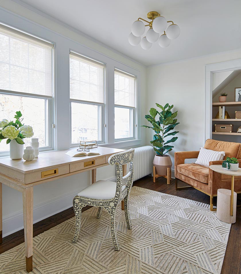
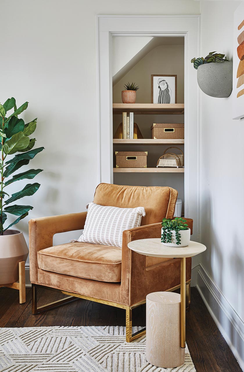
Since entertaining is a big part of the couple’s lifestyle, it was important for the designers to make the home’s flow and feel comfortable for hosting guests. “They love their big TV for watching sports with friends and family, and love the idea of an open kitchen,” Erin says. “This required us to be thoughtful about the layout. While we couldn’t remove the center stairs to create an entirely open space, we opened up the kitchen to the eat-in area significantly, all while creating a wide peninsula, which expanded seating. We used a banquette with a pedestal table in the eat-in kitchen to save space and improve circulation when guests are present. Further, we created a layout in the living room with a game table that doubles as a secondary eating area for when games are on, making it so guests feel comfortable and attended to in the space. Seating was also ample.”
Room to Grow
The designers’ mission was to find ways to have the home grow organically with the family, balancing comfort and convenience with an inviting ambience for hosting guests. “We sought to create a cozy, sophisticated and sometimes whimsical ambience throughout the home,” Lina says. “We felt these characteristics spoke to the personalities of the homeowners, who wanted a luxurious but ultimately livable space. To them, ‘luxury’ meant having convenient storage, seating for their many guests on hand and elevated moments throughout. They wanted to be able to host holiday dinners as well as frequent get-togethers with friends, so a formal dining room was a must. We also wanted the living room to function more like a great room, so we opened it up and created zones for eating, movie nights and a space to cozy up by the fireplace. There was also a dedicated kids’ zone with plenty of concealed storage.”
Reimagined Room Designs
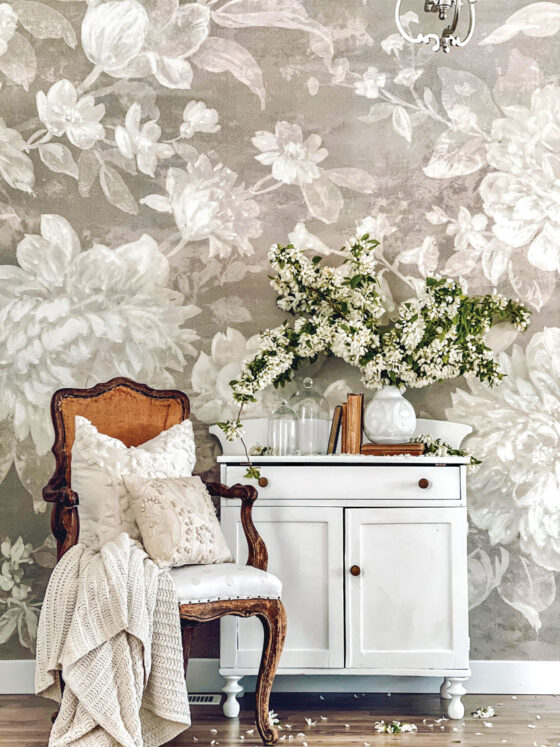
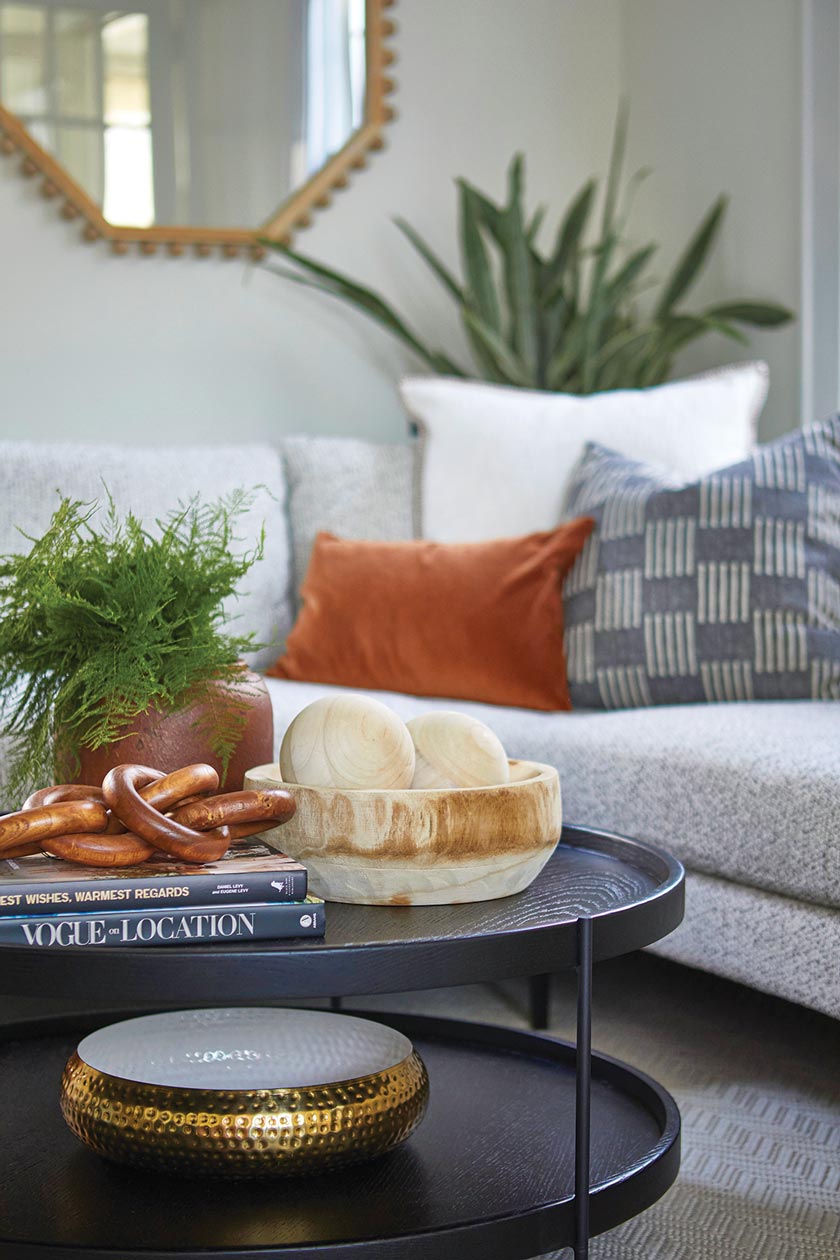
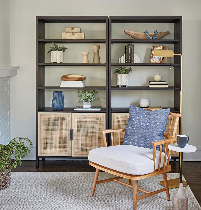
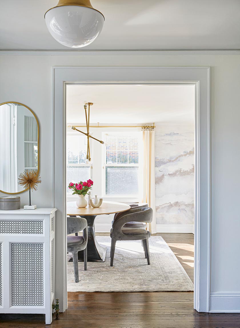
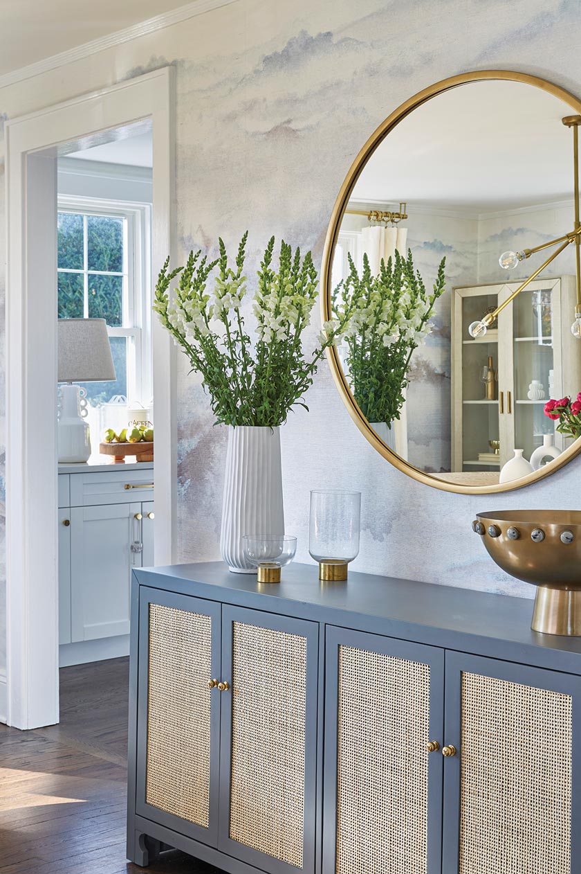
Color played a pivotal role in determining room designs. “The husband loves bold colors and the wife loves neutrals, so we kept the home mostly light and bright, with accents of bold color. There are blues, rust and fun artwork that really liven up the soothing palette,” Erin says. While the home has a neutral palette, there is plenty of cozy texture and fun pattern in every room. From the tilework to wallpaper to a rug in nearly every space, each room has interesting detail at every turn. In the dining room, for example, we installed a gorgeous watercolor mural, printed on grass cloth. This gave the space a soft texture and ethereal quality. In the living room and playroom, we focused on mostly natural textures, relying on the nubby sofa fabric, the jute rug in the playroom and the white-brick fireplace.”
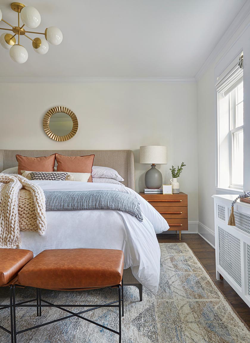
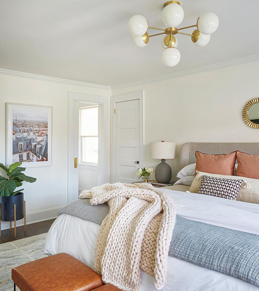
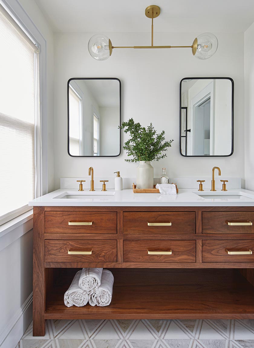
Adding the proper lighting fixtures to each space was also a major component in the room designs. “We mixed a lot of mid-century style lights with textural lighting to blend both the homeowners’ tastes,” Lina explains. “The light in the eat-in kitchen is made of cocoa beads and feels soft and feminine, while the light in the dining room is more angular, masculine and sculptural. We felt this consistent juxtaposition kept the space visually interesting and very balanced. In the primary bath, we had the idea to nix the typical vanity sconces and instead created a custom pendant light fixture. This made the whole vignette feel airier and added an unexpected element.”
The designers have found that the most rewarding aspect of the completed project is seeing how the family has settled into their renovated and redesigned home. “The best part was seeing how the actual experience of the homeowners changed so much given the new layout,” the designers say. “That in and of itself was a game changer for them regarding functionality and feeling like they live in a luxurious, thoughtful home.”
If you like this Colonial home update, don’t miss Revitalizing a Spanish Colonial Revival. Of course, don’t forget to follow us on Instagram, Facebook and Pinterest to get your daily dose of cottage inspiration!

